
NEW LOGOS EVERYWHERE?!
 Recently I was driving to work and I noticed something that shocked me, Quality Inn, an inn that had been near where I live for ages, decided to update its logo. Upon looking at it, I thought “hmm, that seems like an improvement. I’m not completely convinced, but it’s still more effective”. Now I am sure that there are plenty of people who will see the update and immediately think “No! Why did it have to join the rebrand train that every brand has done so far?”
There’s a trend that I have noticed that has been completely against the rebranding of logos. Why is this? Often logos need to be updated, but many people look at updated logos and often complain that the logos have become much simpler. People don’t always like the simpler design, but they don’t understand that when a logo is too complex it can cause a lot of problems, like the appearance of being ‘dated’.
And in design terms, that is typically a bad thing.
FAMILIARITY: the key to a successful brand
 Considering that we are talking about new logo appearances, then we must consider just why people are having such a strong response to updates in logos. It all comes down to the importance of familiarity.
If there is one thing that has caused so many businesses to gain a loyal following it’s familiarity. Obviously, the quality of the product, as well as the personability of the product is helpful, but familiarity brings with it a level of comfort as it is something you know. I remember being in high school and a speaker told us that insurance companies like Geico and Progressive created commercials that weren’t fit for adults but for children. They created silly skits and memorable mascots like a Gekko or some eccentric lady who was overly enthusiastic about her job to capture the attention of children. That way, after years of watching these ridiculous insurance commercials, when the time comes to seek out a decent insurance company, young adults will cling to things that they know. And it’s true. Young adults have no idea what they are getting into and are desperate to find something they know, so when they are looking for an insurance company to trust, who do they go for? The ones they grew up with.
FAMILIARITY FOR A DIGITAL WORLD
 So, if familiarity is so important, then why in the world are companies updating their appearance and changing what is familiar?
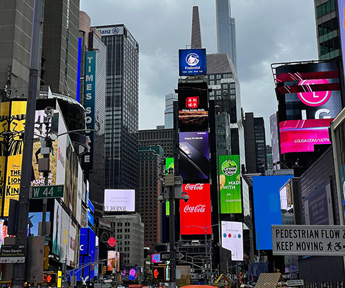
Well to begin with, the reason why many logos are having to change their appearance has to do with the very thing that caused them to appear the way they initially appeared in the first place: familiarity. There are logos that can stand the test of time, but often people prefer to go for the trendy look. Such was the case when design went digital. The first designers applied tons of effects and elements to things like logos to show off all of the new effects that were now possible with the new technology. That wasn’t the only thing that caused people to start searching for a hyper-realistic way to portray their designs though. What many of the new and innovative designers were striving for was to make things as familiar as possible for people who weren’t used to a world that was going digital.
Apple, for one, when introducing its apps, presented everything in a way that was as realistic as possible. Think of their ‘notes app’. The initial design looked exactly like a notebook with text that also was similar to handwriting. All of their apps followed this trend, incorporating things that were used in everyday life and making them look as realistic as possible in order to slowly allow people to integrate the new digital world into their lives without it being a huge shock.
All of these elements of design cultivated a look that was hyper-realistic and as time went on, people bought into it eagerly and started to love the digital world. However, as the internet rapidly improved, so did design appearances. In addition, people started taking practicality into the mix. As a result, the world of design, especially digitally designed works, has drastically changed in just a few short years.
IF IT’S DIGITAL IT NEEDS UPDATES
With the online world becoming more and more advanced, there became more efficient ways to present design. At the same time, the taste for a digital appearance online and the need for ‘realism’ started to change. People grew accustomed to the digital appearance and started to become familiar with and dependent upon it. At the same time, with the advancements came more ways to craft and perfect digital designs. With the increase in technology and the improvement in design processes, designs that utilized excessive amounts of elements for realism started to look like they were using an old-fashioned and limited style of design.
And so brought on trends of updating logos and brand appearances. All of these brands that were striving for a way to present new online designs in a way that was ‘advanced’ as well as ‘familiar’, found that their designs were now ‘dated’. At the same time, a number of other things changed as the world slowly became more and more digital. Suddenly people were able to start online businesses or showcase their products on social media.
It became essential to understand and utilize things like logos in the most effective way possible. To do this, meant people started to make note of the fact that logos were really supposed to be a snapshot of a company. This meant logos should be simple, to make a stronger impression, but also be versatile enough to work well on small screens and large posters. Companies began taking away elements that weren’t essential and didn’t take away from the meaning of the logo.
SIMPLICITY IS KEY
These are some major factors that have created a large trend in the redesign of things like logos. It isn’t just because they think simple is easier, but for the fact that logos make a stronger impact and are more versatile if they are simpler. Still, that doesn’t mean that people necessarily like them better, but for a good majority of these logos, it comes down to the fact that people don’t like the change of things that are familiar.

So now we come back to the topic of familiarity. It’s a double-edged sword. On the one hand, it was the familiarity often used in design that allowed people to integrate into the digital world more quickly. But people are also attached to that which is familiar which ultimately causes a backlash when the familiar is changed. Redesigning logos can be a thankless task, and it may seem like you will get more hate than love for it, but it also is essential for a business to grow and change. At the same time, this means it is crucial for a redesign to be impactful and doesn’t confuse customers, because if you redesign your brand correctly, it can make a hugely positive impact and help a brand get more recognition.
Also, I would like to think that backlash might sort of be a good thing. Because it means that a company has obviously made a strong enough impression to even cause people to have a reaction to any form of a redesign.
But this also proves to show just how powerful familiarity is, and the fact of the matter is that the simplicity that has been applied to many logos is responsible for assisting in recognition and familiarity. So in spite of the potential backlash, redesign inspires familiarity. So it’s a situation of the positives outweighing the negatives.
At least as far as a ‘good’ redesign– not like the time when Gap decided to redesign their logo in a way that was so bad it only lasted six days and cost them $100 million. Bad Gap. Don’t be like Gap.
REDESIGN FOR TIMELESSNESS
That’s the thing though, Gap’s logo redesign was unneeded. Their logo had lasted them for twenty years and it still looked good! It was a simple logo, being just text and a blue box, yet incredibly effective.
 The thing about logos that go for a ‘trendy’ look, is that they ultimately cannot last and will need to be redesigned. Trends only last so long after all. This then brings up the issue of distorting the public’s familiarity, as well as spending extra money and time on a redesign. Redesigns aren’t necessarily bad, they just cause a lot of issues and it’s best to fix the problem before it even happens.
See, Gap isn’t the only logo that hasn’t changed for years (save the one botched redesign before reverting back) there are logos like Coca-Cola, Chanel, Apple, and so on. The thing that all of these logos have in common is their simplicity. It is for that reason that they don’t need to be updated, and if they are, it’s very slight and barely noticed resulting in little backlash. Logos like these keep their recognition and comforting familiarity.
If you are thinking about whether or not you should redesign your logo, and what it is you can do in order to achieve a timeless design, then keep an eye out for part two where I will go into detail about the essential elements in a logo.
Either that or you could simply chat with us at Full Scope Creative and we can help you with all of your logo needs!
