
THE IMPORTANCE OF DIGITAL AND PRINT
 In the world of design, certain mediums take precedence over others at various points. It’s a fast-paced world, and you just have to get used to the fact that the minute you genuinely understand an art trend is when it abruptly changes.
The most recent medium that has taken precedence in the design world is all geared toward the web. So often it feels like printed design might drop off because of the priority of digital everything. And yet, there is something so important about physical printed design that will never go away: tangibility. It’s something you can hold and study and is far more memorable because it’s right in front of you and not blending in with screens.
And so, it’s these two art mediums that take center stage in the design world currently and likely for years to come. So, it may be surprising, if you are not well-versed in design language and understanding, that while these two mediums are essential to most brands and are seamlessly integrated into each other, it is not as easy to transition a design intended for the digital to print as a push of a button.
There’s an art to it… or rather, a few technical understandings and considerations that are demanded to transition from the digital to the physical.
Beginning at the digital canvas
 Maybe when you consider ‘printed’ and ‘physical’ work, it might seem like it should start in the physical world and end in the physical world, but in truth, everything starts digital these days.
Digital design has revolutionized the creative process indefinitely. Gone are the days when you have to use typewriters, place text stamps on a document and use an enormous printing press, or tediously paint everything and rely on rulers and a steady hand to get a perfectly straight line! While these things still have a place, (a small, niche place) digital design has introduced sophisticated software like Adobe Photoshop, Illustrator, Sketch, and so forth, so that artists can leave all of the tedious work to the software and focus on what truly matters: the design. Softwares make it easy to manipulate colors, shapes, textures, and so forth with unrivaled precision making digital design a hub for boundless experimentation and creativity to enable designers to create multiple iterations and refine their work to achieve the perfect result.
One of the most significant advantages of digital design is the flexibility. Designers can easily adjust dimensions, resolutions, and color spaces to suit whatever medium they want, whether it be web, social media, and print. Yep! There is a process to get the art you are creating to be suitable for the type of medium, and it’s not a simple ‘one size fits all’, you can consider the image size, the canvas size, and so forth.
However, with design being digital, and with technology getting more and more advanced, digital design becomes more accessible and easier with which to make updates. If everything were in the physical world, you could just find the correct parameters online and then click a few buttons and make a few changes, instead, you would have to start everything from scratch! So creating on a digital canvas empowers designers to cater to diverse audiences and platforms without the need for extensive redesigns and adjustments.
UNDERSTANDING THE PRINT MEDIUM
 Printing is the OG, the old school, the… MySpace to Facebook, Youtube to your TikTok, (though probably the best comparison is the book to a movie) so naturally, it adds a new layer of complexity to the design process.
Other than just looking at just transforming the pixels to inches or the resolution, and so forth, there are other factors to consider, like color management, resolution, paper choice, and printing techniques. So needless to say… it takes a minute to convert everything from the digital canvas to ink on paper, but with practice, it becomes second nature.
Color Management
 One of the most crucial aspects of translating digital designs to print is color management. The colors displayed on digital screens (using the RGB color model) differ significantly from those produced through the printing process (using the CMYK color model).
Before I go talking about how they differ let me first explain the difference. Starting with the familiar: print.
Print uses CMYK for its colors, and what this means is that to get all of the colors that are needed to prink it uses Cyan, Magenta, Yellow, and blacK and mixes them as necessary in your printer. Now think about how colors work, you have to mix colors on top of each other to get different shades and tones. It’s subtractive in that all colors start with white, but when you add certain colors together it ‘subtracts’ certain light wavelengths which causes the colors to change.
Then there is RGB which stands for Red, Blue, and Green. RGB is digital, and why it differs because it’s not using a mix of pigments to subtract wavelengths of light, instead it is using an ‘additive’ means of making color, meaning is it using red, blue, and green light to get different colors. Add the colors together and you get white! Now, RGB and a pixelated bright screen give you much more color options and much more vibrancy (I mean, we’re using light after all).
When converting RGB colors to CMYK, the shift in color gamut may lead to variations, and some vibrant digital colors may lose their brilliance in print. Designers must perform color tests, use color calibration tools, and make adjustments to ensure that the final printed output matches their digital vision as closely as possible, but there are limitations.
Sometimes we will view our designs online in how they would appear in print, it’s pretty jarring. It doesn’t look nearly as bad once printed, but screens are inherently vibrant and full of light and color, so placing the muted colors on the screen can appear out of place.
STRIKING THE BALANCE
 In digital design, high resolution is crucial to achieving crisp and clear visuals. However, when printing, an excessively high-resolution image may result in large file sizes, potentially causing performance issues and increased printing costs. Striking the right balance between resolution and file size is vital to ensuring optimal print quality without sacrificing efficiency.
Print resolution is typically measured in dots per inch (DPI), and the standard print resolution is 300 DPI for most commercial printing. Designers must ensure that their digital designs have sufficient resolution to avoid pixelation or blurriness when printed. The reason why this can conflict with digital design is the fact that online pictures, as a rule of thumb, are typically 72 DPI because the high resolution is not necessary for a small screen, and often 300 DPI is a higher file size that is not needed.
And then canvas size comes into play. Usually, when printing, we use measurements of inches or centimeters, while online, pixels are how the digital world measures everything. It is little things like this that can make all the difference when you mix them up. If print gets the digital treatment, it might have low resolution, and sizing, and appear off while holding it in front of you. And if digital gets the print treatment, it can lead to longer and unnecessary load times.
Choosing the Right Paper
 The choice of paper plays a significant role in the final printed output. Different paper types offer unique textures, weights, and finishes, which can profoundly impact the visual and tactile experience of the design. Factors like the type of design (e.g., poster, brochure, business card), intended use, and the target audience all influence the selection of the appropriate paper stock.
A glossy finish may enhance color vibrancy and create a modern look, while a matte finish lends an elegant and subdued appeal. Additionally, specialty papers, such as textured or recycled paper, can add a distinctive touch, adding depth and character to the design.
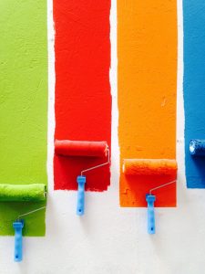
Printing Techniques
 Printing techniques have come a long way, offering designers an array of options to elevate their creations. From traditional offset printing to modern digital printing and specialty methods like screen printing and letterpress, each technique imparts a unique quality to the design.
Designers must consider the complexity and cost of each printing method, especially for projects with limited budgets or tight timelines. Moreover, certain printing techniques may require adjustments in the design to optimize their results. For instance, letterpress printing may necessitate thicker lines and larger fonts to accommodate the pressing process effectively.
Ensuring Consistency Across the Spectrum
 In the quest for a harmonious visual identity, consistency across various mediums is essential. Maintaining brand consistency demands that digital designs translate faithfully to print, ensuring that logos, colors, and typography retain their integrity. Designers should conduct thorough print tests to verify that their digital creations appear consistent across different materials, such as business cards, stationery, brochures, and advertisements.
So often when creating a brand guide, brands will use specific fonts and colors for digital and certain ones for print. The reason for this is that when it comes to fonts, there are certain that are not considered ‘web safe’ meaning that not all computers can load the font that is needed. This leads there to different fonts used when designing things digitally. While for print, the printer just copies and pasts the visuals.
And then there are the color factors. Companies should ensure they have a code that they want to represent their brand for digital and print. Sending over one hex code that an art program is supposed to convert to CMYK can lead to a level of disparity. Some art programs may translate the color differently from the next and may not do it to the company’s liking. To avoid this, most companies offer a hex code for their color (it looks something like this: #000000, a hashtag followed by 6 numbers. The numbers stand for their RGB color value) and then also offer an RGB solution and a CMYK color conversion.
Embracing the Art of Transformation
The journey from digital to print involves a vast understanding of the intricacies and details of both worlds to properly display eye-catching visuals. Designers must embrace the art of transformation, navigating the complexities of color management, resolution, paper selection, and printing techniques. The skillful navigation of this process leads to the fulfillment of a designer’s vision and the creation of captivating print pieces that truly come to life on paper.
