The Psychology of Color in Web Design
 Colors have power. On top of adding visual appeal, colors are tied to different meanings. We have associated certain colors with certain feelings and emotions to the point that our brains are triggered to experience a certain emotion when seeing a certain color. By understanding the emotions and behaviors associated with different colors, you can create web experiences that engage users and reinforce your brand identity. Whether it’s the bold red of a “Shop Now” button or the calming blue of a wellness blog, color plays a pivotal role in shaping the user experience.
So naturally, it’s important to try to understand how to go about choosing certain colors and using them appropriately and strategically to make a lasting impact on your audience.
It is… manipulation? Maybe, but you have to use the tools at your disposal in the cutthroat world of business and design! But more than anything, it’s just smart. So allow me to provide you with the basic tools for understanding the psychology of color.
Understanding Color Psychology:
Color psychology is the study of how different colors can influence human emotions, perceptions, and behaviors– yes, it is a legitimate study. Our brains process things in mysterious ways and we need to often study how we process even the most basic things as ‘color’ in order to rig the system.
So naturally, we must rig the web/graphic design system by attempting to understand colors and how they are typically perceived by the vast majority of people to create experiences that resonate with users on a deeper level.
The Role of Color in Branding:
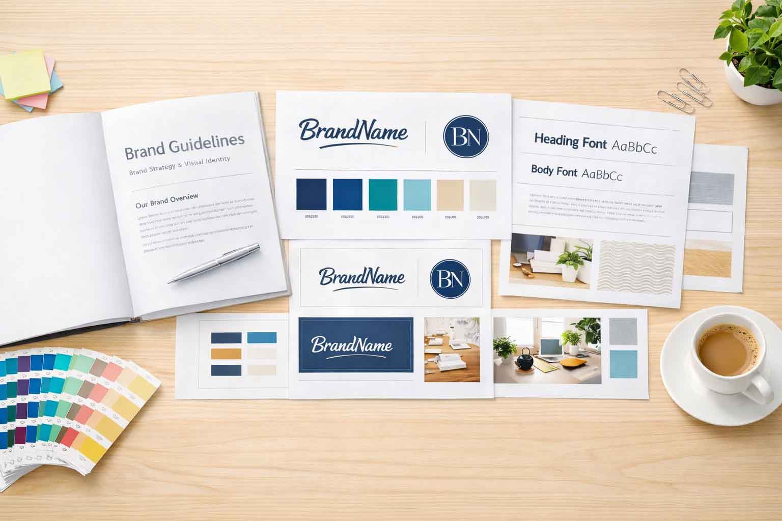
 Colors are integral to brand identity. Your choice of color palette can convey the essence of your brand and evoke specific emotions in your audience. Consider these examples:
Red: Often associated with energy and passion, red can create a sense of urgency (think “Buy Now” buttons) and evoke strong emotions. Think Stop signs and Stop lights, or love and fire. All of those things evoke urgency.
Blue: Blue exudes trustworthiness and calm, making it a popular choice for tech companies and financial institutions. Think of the sky and the ocean, both of those things are often viewed and considered as places of calm and peacefulness.
Green: Linked to nature and sustainability, green can promote feelings of freshness and eco-friendliness.
Choose colors that align with your brand’s personality, values, and target audience. Consistency in color usage across your website helps reinforce your brand identity.
Color and User Behavior:
 Color can guide users through your website and influence their actions. Yes, something as simple as color and lead people to make choices based on how certain colors stimulate the brain. Consider the following strategies:
Call to Action (CTA) Buttons: Make your CTAs stand out by using contrasting colors that draw attention and encourage clicks.
Navigation: Use color to differentiate between primary and secondary navigation elements, helping users find their way more easily.
Error Messages and Alerts: Employ colors such as red for error messages to clearly indicate issues that require attention.
Basically, the best way to understand this is to simply create a type of hierarchy of color with vibrant hues reserved for the most critical elements.
Evoking Emotions:
 As we have established, colors can affect behavior because they have the power to evoke emotions, and this can significantly impact user engagement. We have already gone over what certain colors evoke (red for passion and blue for calmness) but really there is a sort of… hierarchy for this. Red is like orange is like yellow. All of them have a certain type of ‘energy’ to them. They are warm colors. And then there are colors like purple, green and blue. They are all cool colors. So they evoke similar feelings to each other, but to different extents, but we’ll get more into that in a future article.
So, in summary:
Warm Colors (Red, Orange, Yellow): These can create a sense of warmth and excitement.
Cool Colors (Blue, Green, Purple): Cooler tones evoke feelings of calm and tranquility.
When incorporating this into web design, use color strategically to align with the emotional response you want to evoke in your users. For example, a wellness website might opt for soothing blues and greens to convey a sense of serenity.
Cultural Connotations:
 So naturally we respond to colors because for years certain colors have been associated to different elements. But this is often because we were taught to view colors in different ways based on how they are portrayed in the media. Basically, how we view colors where we live can be vastly different from how people view them on the other side of the world.
Colors carry cultural meanings and connotations. For example, white represents purity and simplicity in Western cultures but can signify mourning in some Asian cultures. Understanding these cultural nuances is crucial for global audiences. If your website targets an international audience, research cultural color associations to ensure your choices resonate positively.
Accessibility Considerations:
While color psychology is essential, it’s crucial to ensure your color choices are accessible to all users, including those with visual impairments. Utilize sufficient color contrast and provide alternative text for color-coded information. Use online tools to check color contrast ratios, and ensure text is easily readable against the background color.
Conclusion:
The psychology of color in web design is a nuanced and dynamic field. By understanding the emotions and behaviors associated with different colors, you can create web experiences that engage users and reinforce your brand identity. Whether it’s the bold red of a “Shop Now” button or the calming blue of a wellness blog, color plays a pivotal role in shaping the user experience.
So use this power of color wisely! Then you can see the power of color wisely, and watch as your web design captivates, informs, and resonates with your audience on a profound level. If you have any questions about what colors you should use and what they mean to your audience… or any web design questions, contact us at Full Scope Creative!


