
OVERVIEW:
Recently I went to a networking event and a speaker was talking about insurance. During their speech, they mentioned the insurance company “Aflac” and went on to express that the word “Aflac” was actually an acronym. Meanwhile, in my mind, I was struck with the fact that Aflac was an acronym and then proceeded to daydream the insurance’s logo and their titular duck quacking out “Aflac!” for the next thirty seconds or so.

It’s really clever because “Aflac” is not a word commonly used in conversation (and considering that it’s an acronym, I’d be concerned if it were) but in order to get it into people’s heads, they utilized the fact that the word sounds sort of nasally and like a “quack” sound. I don’t know who figured it out, but the branding works. I mean, it got me thinking about an insurance duck for a solid thirty seconds after it was mentioned.
That is the effect of proper branding and the fantastic utilization of a logo.
SO…WHAT IS A LOGO?
Before you think I have some sponsorship from Aflac, I do not, I have no association with them. But they showcase the end result of a catchy logo. So, what is a logo? According to the Cambridge Dictionary: “a design or symbol used by a company to advertise its products”. That’s a pretty good summary of what it is, but it doesn’t tell you all of the nitty-gritty details.
 A logo is a symbol, but what should go into that symbol? That depends upon what type of logo you are aiming for. If you search online “what types of logos are there” you will find websites that tell you the “ten types of logos” and websites that tell you the “seven types of logos” but all of that can really be boiled down to the three different types:
- Ideographs
- Pictographs
- Logotypes
These are the basic types of logos and all of the logos you will encounter will fall into one of those categories or even in a couple of those categories. Effective logos utilize more than one of the three categories– more on that later.
IDEOGRAPHS:
If you google search the word “ideograph” the definition google gives you is “another word for ideogram”. Ah yes, very helpful. I love it when the dictionary (or google in this case), defines a word by using that word, or part of that word in the definition. So thank you google! That perfectly explains it!
So… to give you a definition that will be actually helpful an ideograph logo is a logo based on an ideograph. Now into pictographs–
 Kidding, an ideograph is an abstract symbol representing a thing or idea. Given that they are abstract, ideographs aren’t typically understood upon viewing and have to be taught to the viewer in order for comprehension. This isn’t a necessity though, as an abstract symbol allows people to view the abstraction and associate it with the company. It may have a certain significance to the company but to the viewer, the ideograph’s definition is the company itself!
Many logos utilize ideographs. In fact, Full Scope Creative utilizes an ideograph in its logo! Our circular multicolored symbol next to the words “Full Scope Creative” is an ideograph that is meant to represent the ‘scope’ of a lens. While viewers may not necessarily understand that upon viewing it, they do associate the symbol with our brand which is the main point.
Ideographs are great when you want a unique symbol that is significant to your brand.
PICTOGRAPHS:
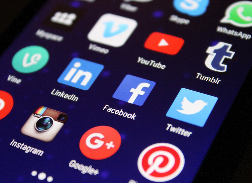
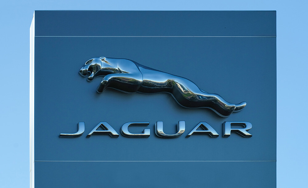
Now, if ideograph logos are abstract symbols, then pictograph logos are legitimately recognized symbols. It is meant to be seen as something rather than an abstract shape. A pictograph in a logo may be a cat, a house, or a duck like the one in Aflac’s logo.
While some pictograph logos utilize imagery that is based upon what the company offers, (like a library may utilize a book in its logo), others may use an image based on elements in their company name, like how Dove utilizes a ‘dove’ in its logo because of the company name even though it is a company for soap. Then there are companies like Aflac which utilize a mascot in its logo to draw interest in the otherwise dull topic of insurance. Not to mention “Aflac” sounds a bit like a quacking duck which helps people remember their name.
Many pictographs may seem nonsensical to the brand but have significance to the company for a variety of reasons that have to do with their branding– more on that later.
LOGOTYPES:
Logotypes are the most basic of logos and with the most simple of definitions: it’s text. That’s right! It’s all text, and whether that be a logo that is simply the company written out or a logo of the company’s initials, a logotype uses ‘type’ to represent the company.
 That doesn’t mean it has to be boring though, people can use type in a very creative way. Think of the interesting font that “Pinterest” uses in its logo. Yet some logos go even simpler, think of “Chanel” it’s just a simple font but is also timeless.
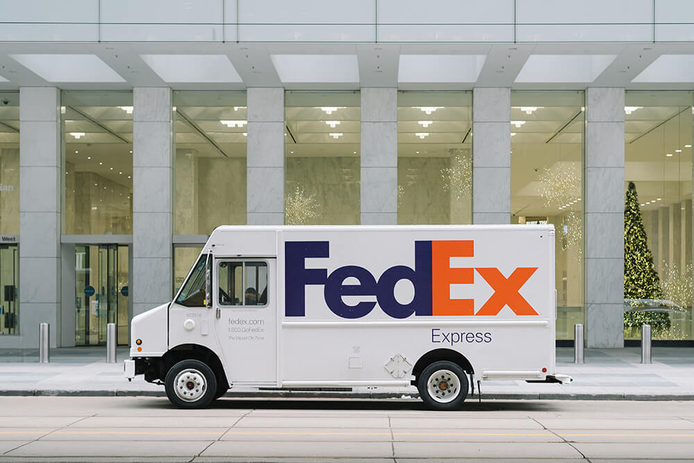
That doesn’t mean you can’t do incredible things with fonts either. Playing around with fonts and utilizing whitespace can incorporate some very cool elements in a logo. Think of Fedex, did you know there is a hidden arrow inside of its logo? The whitespace between the “Ex” create an arrow inside.
See? Logotypes may have the simplest definition, but they can be the most versatile and bend all of the rules. Similar to FedEx, If you utilize text and fonts correctly you can create pictograms or ideographs.
THE POWER OF COMBINATION:
Continuing with the idea of being able to mix logotypes with pictographs and ideographs, some of the best logos combine these categories. Take the Full Scope Creative logo for example (as I stated, ‘some of the best’ logos. And yes, I am very modest thanks for asking) we utilize an ideograph element as well as a logotype to formulate our logo.
As I mentioned earlier, ideograph logos are abstract, meaning they have significance, but not necessarily to the viewer. It’s the same sometimes with pictograph logos. Think of Aflac, what if it only had a duck for its logo? People would likely assume the company was called “The Duck”. For most companies, if they have imagery in their logo, they pair it with the logotype. The same goes for logotype, sometimes it can start out as just text, but then the whitespace is utilized to add pictographs or ideographs.
Now perhaps you are thinking “hey what about logos like Twitter?”, well remember, Twitter does utilize the text “Twitter” in its complete logo. Often logos will have one main and detailed logo, complete with text and illustrative elements, but depending upon the size needed to display their logo, they will create variations. Take the Disney logo for example. The complete logo has the logotype and pictograph of a castle, but as it breaks down, it eliminates the castle and only utilizes the word “Disney” and then in situations where they can only do a tiny representation of their logo, they utilize the letter “D”.
Combining elements allows you to do a lot with your logo so that you are prepared for any situation!
A LOGO FOR YOUR BRANDING:
 Now that you understand the basics of logos, it’s time for you to determine what your logo should be! And how do you do that? Simple! Start with your branding and then– wait what? You thought your logo was your branding? Well, based on how significant a logo can be, it may seem like that is the case but no, a logo is part of the branding.
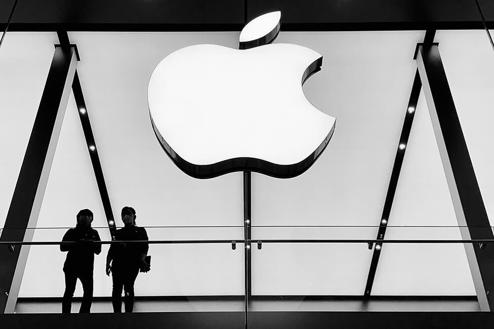
What does this mean? It means that you should have a grasp of what your target audience is, and what colors and feel you want to communicate whilst creating your logo. Your company’s logo and branding need to be consistent and work hand-in-hand in order to communicate the right message to your customers. If you keep this in mind and keep the branding consistent, then it won’t feel out of place. Think about “Apple”, they create computers, phones, and other tech and yet they utilize an apple in their logo and a bitten apple at that. It’s an unlikely combination but it works because of the cleanness of the apple, and even their neutral monochrome color scheme suites it.
Understanding your branding and the feeling you want to convey can also help you figure out the type of logo you want to primarily use: ideograph, pictograph, or logotype. It can help you understand symbols you want to incorporate, a mascot that could become integral to your brand, or if a simple font is the most effective way to get your point across.
THE BOTTOM LINE:
 The truest purpose for a logo is to create recognition. In the beginning, I talked about Aflac and how one mention had me thinking about the logo for as long as thirty seconds. That’s the effect you want to have on people, you want to create recognition of your brand so that it sticks with people. It makes you recognizable and when it comes to brands, people typically seek out the ones they recognize because recognition is familiar, and familiar is comforting. Subconsciously it becomes a level of reliability.
So get yourself recognized! Take time to understand your branding and use it to craft a logo that will get people to start seeing and picking out your brand from the millions that are out there. Don’t know where to get started? Talk with us at Full Scope Creative and we can help you out with that!
