UNIQUENESS IS UNFAMILIAR TERRITORY
 Uniqueness. We meet again old friend… or foe?
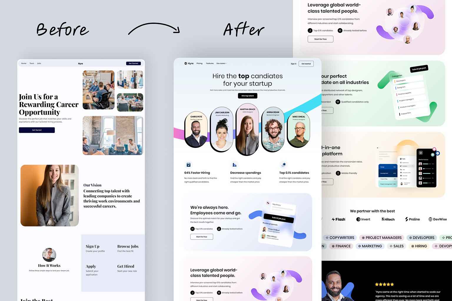
The art of being unique really is a tricky one. It’s what everyone wants and strives for but it can certainly bite! It’s true when it comes to most things and is especially true for website design and here’s why: Uniqueness is new, and different and therefore people are not used to it.
Many may want that quality of uniqueness, but they also are put off by it simply because it is a plunge into untread waters. In the instance of website design, applying something unfamiliar may throw off your viewers and confuse their browsing experience to the extent that they may think: “This is different and I can’t figure this out” and then seek out a different website in frustration.
Before you go thinking that you should avoid uniqueness with a ten-foot pole– that’s not what I’m trying to convey. What I am saying is that there is an art to adding that element of uniqueness, and the first step is to start with the exact opposite: familiarity.
A GOLDFISH NEEDS FAMILIARITY
A recent study came out that people have an attention span of about eight seconds and apparently this is even shorter than a goldfish’s nine-second attention span. That means you have to capture the attention of your viewer in the first eight seconds. And how are you going to do that?

Well, it is not going to be to confuse them, it is going to be with familiarity.
I know, it sounds like a contradiction and that uniqueness should start with something unfamiliar. But you don’t want to scare people away! You want to ease them in with something they already know. Think about what people need in order to properly browse your website: they need to be able to find the menu, your contact page, etc. If they have this basic level of understanding, then they will be more willing to view something new. After all, the purpose of your website is to get someone to believe that you have what they want, and they are going to need to find it in order to buy into that idea. Therefore, you need to keep the structure and basic layout of your website familiar.
Remember, you have eight seconds to grab the viewer’s attention, so keep the structure of your website simple, understandable, and familiar. If you want a deeper understanding of this, check out our blog about the 5 ESSENTIALS FOR A WEBSITE DESIGN USABILITY CHECKLIST.
MORE LIKE YOU-NIQUE
So first there needs to be familiarity, but then how do you bring the element of uniqueness to your website? A lot of factors come into play when ADDING PERSONALITY TO YOUR WEBSITE, but before you even think about planning your design, you have to start with the most crucial factor guaranteed to make your website unique… You!
That’s right! It isn’t a different website layout or crazy animations that cause confusion. And no, it’s not just an attractive website either–that can only get you so far. As cheesy and cliche as it sounds: it’s what you have to offer that truly makes your website unique! And what is it that you have? Only the most crucial: personal media and branding.
UTILIZING YOUR RESOURCES
Using personal media and branding is the most powerful way to stand out to viewers because it creates a level of authenticity and recognition. Personal media like photos and videos, are especially unique because no one else in the world can access them but you. Not to mention it helps you seem more legitimate. These photos and videos communicate that you are serious about what you do and have proof to show for it.
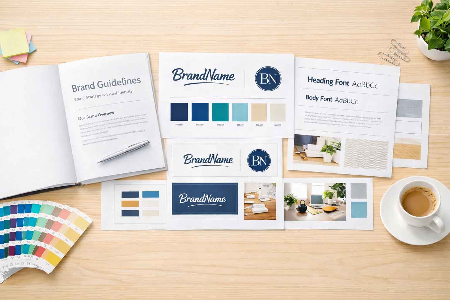
 Next is the importance of branding. Take for example a brand like Barnes and Noble. Throughout their website, they utilize their colors, fonts, and even their icons to ensure that visitors know that they are visiting their website. See, branding isn’t just the use of brand colors, it is also the proper use of all your brand elements.
And what are brand elements? They are things like a brand’s fonts or specific shapes and angles that are found in a logo and other branding materials. Often people take these elements and put them into icons (which, if you were wondering, are like your own personal emojis). Utilizing these unique elements assists in making your website recognizable and uniquely yours.
Perhaps you are thinking: “oh no, I don’t really have a lot of branding”. Well, not to worry! You can always chat with us here at Full Scope Creative, and we can help you get started!
THE RIGHT DESIGN TRENDS
After you have considered familiarity and consulted your resources, you can now start implementing them into a website design. You may be wondering what else you should incorporate into your design and fortunately, we already have a blog article about CURRENT WEB DESIGN TRENDS, which goes over the importance of responsive designs, minimalist layouts, natural colors, and textures, as well as incorporating videos.
There are a lot of current design trends and it is important to find the right ones as some can be confusing or are quick to go out of style. I know, I am talking about using trends when we are striving for uniqueness, but it is also important for the website to appear modern.
ENSURING BALANCE
So now the trick is taking all of these elements: the familiar, your unique branding, and considering modern trends, to create an appealing and unique website. And what is the best way to implement a balanced design like that? To get yourself a custom website of course!

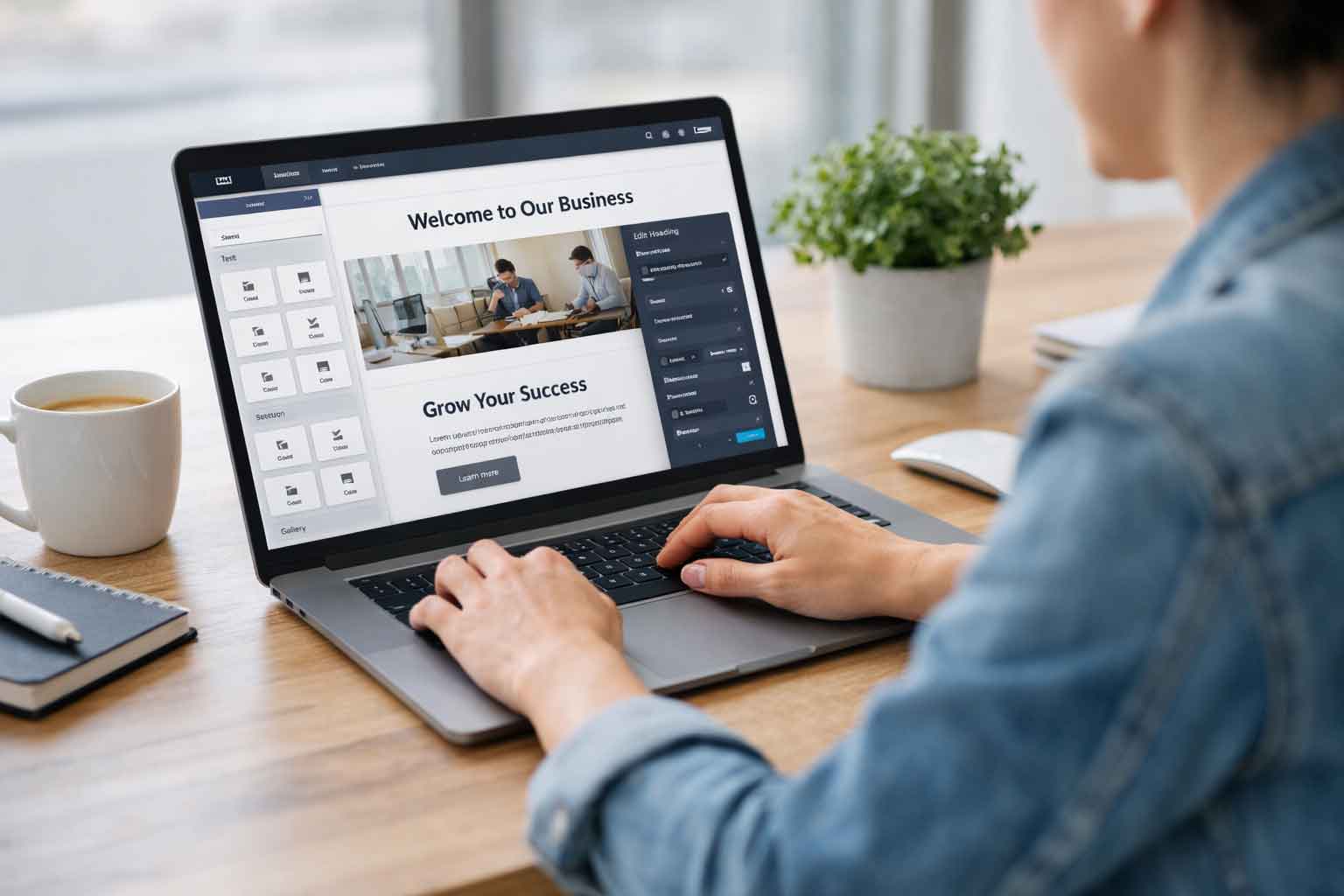
Premade website templates look pretty, but they lack originality and start to look like every other website because a lot of people use them. In addition, they follow the same trends and have very limited customization which impedes the implementation of your branding. This is exactly what you don’t want. With a custom website, you will be able to customize it all you want, and utilize certain design trends that assist in your website offerings therefore it will truly be your unique but also easy-to-understand website– provided that you are working with a designer who understands how to correctly balance familiarity and uniqueness.
And lucky for you, here at Full Scope Creative we work with designers that work hard to ensure these qualities are met– so feel free to contact us any time!


