No longer a fit for modern websites
Website design trends change rapidly. What’s hot today, is ice cold tomorrow. What was once a modern and sleek design can quickly turn to dusty and dated. One design trend that was at one point the most popular has now significantly (if not entirely) fallen out of favor is the use of middle channel layouts. With middle channel layouts, the content is centered on the page, leaving wide gutters on both sides of the main content. While this approach was once a very standard and go-to for designers, it no longer fits with modern website standards and user expectations.
Poor Mobile Experience
Today’s website experience is all about the mobile experience. If a site doesn’t work ideally on mobile, the odds of success are significantly limited. One of the biggest reasons middle channel designs have gone away is mobile browsing. When middle channel designs were prevalent, mobile traffic was much lower and even non-existent. Now, with such a significant portion of a website’s traffic coming from mobile devices, the website and its design simply must be mobile-friendly.
A middle channel layout simply doesn’t adapt or respond well to smaller screens. The gutters on the side either squeeze content into a too narrow and hard-to-read column, or they force the user to have to zoom and scroll horizontally to view the entire website. With responsive design being a mandatory rule in website design, layouts need to automatically adjust and respond as needed to different screen sizes and do so without sacrificing readability or functionality. Middle channel designs simply don’t keep up with the demands of the mobile experience.
Wasted Space on Larger Screens
Middle channel designs made sense and were more ideally used when there was more uniformity to the screen sizes commonly used. There was a time that monitor sizes didn’t vary all that much. As monitors got larger, 27 inches monitors and wider especially, middle channel designs performed poorly. Whitespace can make or break a site, but only if done thoughtfully and in the right ways. Leaving significant amounts of unused space on the sides of the screen not only makes a website look outdated and clunky,but it doesn’t add to the user experience. This is especially true when other websites are using full-width designs that take advantage of all the available screen real estate.
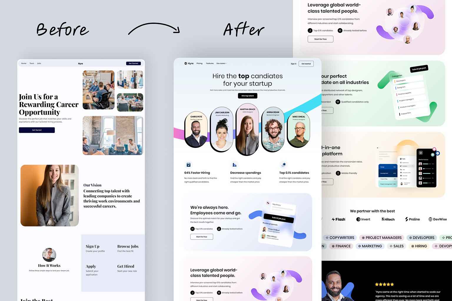
On larger monitors, users expect content to fit on the screen in a way that feels cohesive and engaging. While many modern designs, including many of the designs that Full Scope Creative develops for our clients, still use the middle of the screen primarily for content, there are sections that span the full width. This utilization of the full screen helps add in different features like images, call out section, parallax images, and more. Full-width images, banners, and even videos are now very common elements in web design. These elements offer a more dynamic and impactful first impression. Middle channel designs, with their narrow and confined content areas, don’t allow for the strong and immersive visuals that are popular for modern websites.
User Experience (UX) and Engagement
One of the major goals of web design is ensuring a seamless and intuitive user experience. Middle channel designs usually tend to lead to awkward navigation and scrolling that disrupts the flow of the user’s journey. Modern website users expect the websites they use to be easy to navigate and engaging. That often means breaking away from rigid, boxy, and dated designs in favor of more open and flexible layouts.
With a middle channel design, important calls to action (CTAs) can be more difficult to notice or feel awkward and disconnected from the overall design and content. Since better UX and higher engagement are such a key goal for website designers, these older design patterns have been replaced with more intuitive layouts that guide users smoothly through the site.
SEO and Content Placement
There is no secret that Google and other search engines greatly favor websites that provide a better user experience. This experience includes everything from mobile optimization, fast load times, easy navigation, and more. With the awkward content placement and layouts, middle channel designs will end up having a negative (or at least not positive) impact on SEO.
These layouts often make it difficult and clunky to place and add important content. Adding in things like keywords and CTAs is a key principal of SEO. Modern design layouts, techniques, and principles are much more focused on providing content that is well-distributed and accessible on all devices, which boosts both user experience and overall SEO rankings for the website.
Simple no longer meet the demands of the modern web
Middle channel designs had their moment in the spotlight. They were a great marketing design for the time. Today, they no longer meet the needs of modern users or devices. Mobile browsing, larger screens, the demand for user-friendly experiences have all made these layouts clunky and out of date. The middle channel designs, once a hot trend, have become ice cold and only getting colder. The trend today, and likely for a long time, are layouts that utilize space in more creative and engaging ways, making for a better user experience.