I never thought the day would come, but Andy Rooney recently gave a great bit of advice for web designers – use the right tool for the job. In a recent issue of An Andy Rooney Moment™, he mentions how “Nobody has ever gone to a restaurant website to be impressed by the web design.” Now, this is not to say that the design of a site is not important, we’ve blogged before about the importance of design. The key point Mr. Rooney is making in his article, is to be sure that we are using the right tools and technologies for the job.
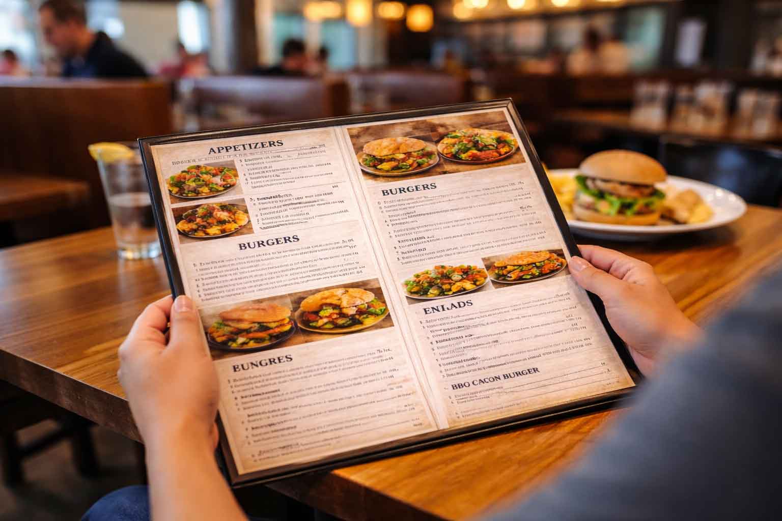
In his article, he focuses on restaurant websites, particularly the restaurant’s menus on those sites. Many restaurants, for one reason or another, like to have their menus (if not their whole site) designed in Flash. Now, those sites might be nice and pretty, but you run into a couple of major issues. In recent years, the number of people browsing with mobile devices (smart phones, iPods, iPads, etc.) has skyrocketed. Many of these devises don’t have the ability to run Flash based features. For many people, such as Andy Rooney, when they’re driving home from work and wanting to visit a restaurants website to view the menu and possibly order take out, if that menu is designed in Flash, they likely will not be able to go through and place an order. Another common choice for restaurant websites is to have their menu as a downloadable PDF. There are two major issues with doing this. First of all, same as with Flash, many commonly used mobile devices either can’t handle downloadable PDFs or, as Andy Rooney put it, “crazy inefficient.” The second problem, and the bigger of the two in my opinion, is that search engines can’t read and accurately index a PDF. This may not sound like a big deal, it is after all only the menu. However, if your restaurant has a signature dish, and that dish is only mentioned on that PDF, search engines will not be able to index that search term.
This problem of using the wrong tool for the job isn’t exclusive to a restaurant’s menu. Many times on contact pages, we’ll see websites that have a map to the company’s location. However, many times that map is a simple home made map. Why not include a Google Map? The benefits of using the Google Maps could be an article in and of itself. But to cover a few key points: visitors can get an interactive view of where you’re located, they can find directions from wherever they are to your location, and read reviews that other customers of yours have left.
Many times with sites, designers and business owners want to add an extra little bit of excitement to the pages. There’s nothing wrong with adding a photo slideshow, we do that on many of our sites. However, some designers and business owners opt to add background music or a video that begins playing as soon as the page loads. There are a couple problems with doing this. For one, if a visitor is sitting at work, and they load a site that starts playing music automatically, they are quite possibly going to leave and find another website. Also, these sites commonly don’t have a way to turn off the music, so even if the visitor doesn’t leave right away, they may be inclined to leave earlier than expected if they get annoyed with the music.
There are many aspects that go into making a good website. One of the key aspects is using the right tools for the job. Using technologies that you can be assured will work for your target audience, enhance their visit, and not scare them away are crucial to developing a productive website.

