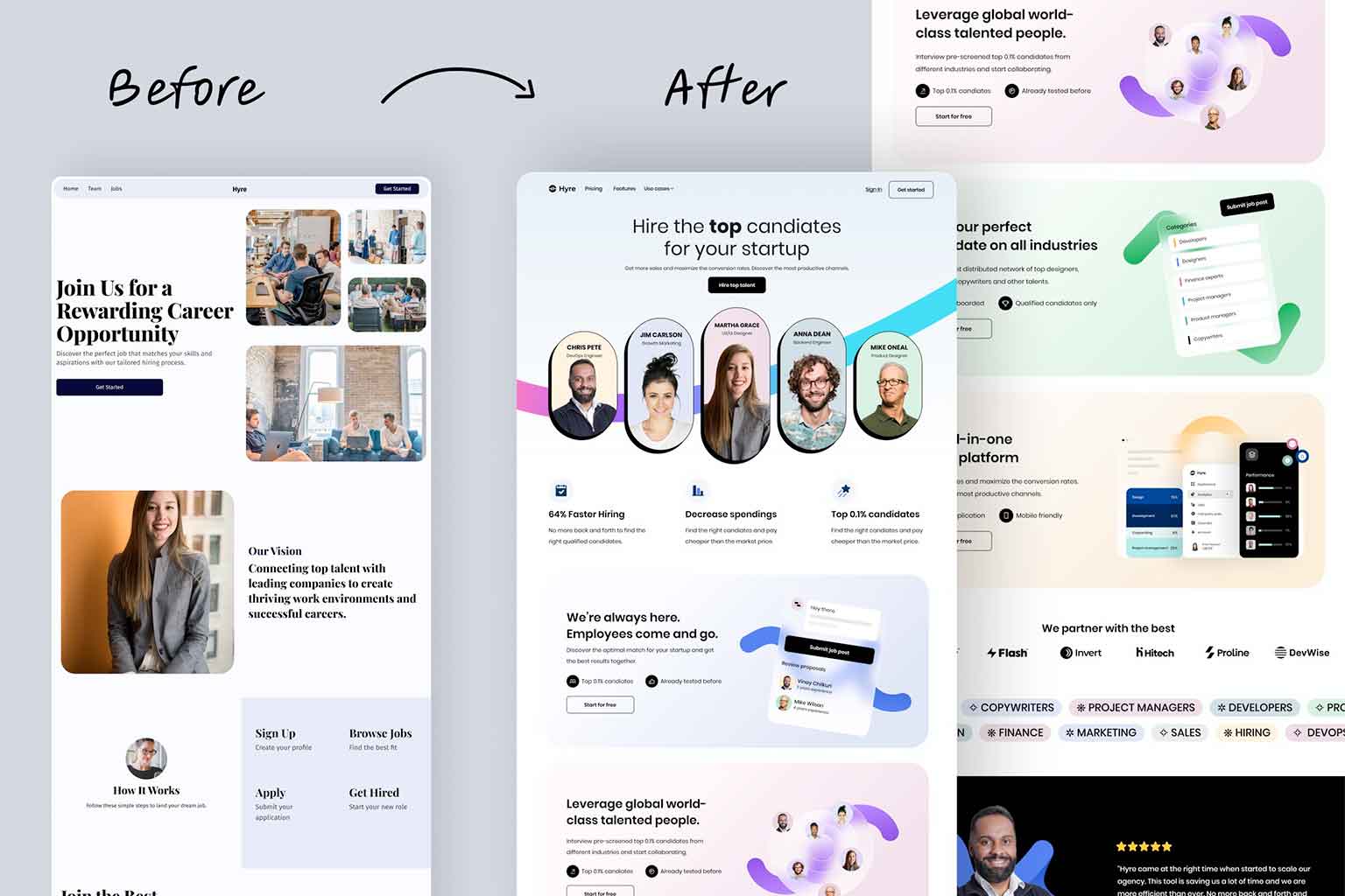
Why Businesses Should Think Twice Before Rushing a New Look
Whether a business is pivoting, modernizing, or just tired of that logo designed back in 2006 by a cousin, a rebrand can be a powerful move for a company. Before launching that great new brand, it’s important to look at how to do it right. Rebranding more than just looking different. It’s about looking right for who the particular business is and, just as importantly, who its ideal customers are.
Modern, Not Dated
One pitfall we’ve seen business fall into with rebranding is leaning too far into trends or, sometimes even worse, hanging on to visual elements that are simply outdated. The loud neon colors and clashing patterns that made The Max look so great in Saved By The Bell might not be the right choice for a business looking to appeal to today’s market.
Instead, modern brands focus on the use of clean and contemporary color palettes. Whether it’s subdued, muted earth tones or strong, bold minimal hues, the color choices should reflect the business’s identity and at the same match with current design expectations. The goal is to have a fresh and relevant look and not be stuck in a time capsule.
Fonts Speak Volumes
A key aspect that can be easily overlooked but is critical for a successful rebranding is typography chosen. Dated fonts like Comic Sans can make a business look dated and unprofessional. Modern brands tend to use clean, easily legible fonts that echo the tone and personality of the business. The right font can connect to a business approachability, sophistication, or tech-savvy. Font choice needs to be intentional, not just a unique or cute looking font.
Simplicity Builds Confidence
Many of the strongest brand resigns, especially in recent years, have one common trait: simplicity. Take Kia for example, when they dropped the embellishments and went with a bold, stripped down logo design that communicates confidence and modernity.
If a brand is too busy, it will be confusing and overwhelming to customers. By simplifying things like logos and other marketing collateral or even a brand message, can help to build clarity and trust in the marketplace. The leading brands today are ones that are big fans of white space, clean and crisp lines, and the less-is-more mentality.
A Brand Is a Bridge
A brand is more than a logo or color scheme, it is a bridge. On one side is the business and it’s mission, values, goals, and personality. On the other side, is the target audience and their expectations, choices, and beliefs. A successful brand is the bridge that connects these two.
When doing a rebrand, it’s important for a business to make sure that every design and messaging strategy serves that connection. The new brand needs to still be authentic to the business and who they are, but also speak directly to the customers they’re trying to reach. The new brand needs to in many ways be a bridge from the past to the present.
What Makes a Strong Rebrand?
Here are some key principles that any business should focus on when rebranding:
- Set a modern, relevant color palette
- Use contemporary, easy-to-read fonts
- Simplify the logo and brand design
- Align the visuals and messaging with the company values
- Appeal to the target audience’s values and beliefs
- Build a brand that bridges both sides—business and customer
A rebrand is more than just a cosmetic update. It is a strategic move that should be approached with care and purpose. When done correctly, it will elevate a business’s presence, clarify the message, and strengthen its connection to the customers it serves. It’s never about being trendy, it’s about being true and looking like it.