INTRO:
 Logos… sort of stress me out. Just a little bit. Why may you ask?
Only because they are the face of the company! They are the first impression– and if the logo is good then they are a strong first impression. They make your company memorable, stand out, and create a sense of familiarity, so I think that in any logo design, there needs to be a healthy amount of stress. Stress for the fact that you want it to look good, but never stress that keeps you from stepping out of your comfort zone.
I guess what I am trying to stress (see what I did there?) is that logos are incredibly important and are something that every successful brand needs. Yet at the same time, a successful brand also needs a successful logo, and a successful logo needs to be appealing, attractive, and modern in order to make a strong impact on people.
Clearly, there is an art to crafting a successful logo. You may be wondering “what is that art? What’s the secret?! TELL ME!!”
Just calm down for a second and let me smoothly make a reference to the first part of this blog article: in part one, I spoke about companies– including very successful companies– that have needed to majorly rebrand and redesign their logos. In these cases, a lot of companies opted for what was considered ‘modern’ but in a more… risky way.
THERE’S MODERN AND THEN THERE’S TRENDY
These companies went for  what is trendy and as a result, they had very detailed and inflexible logos which ultimately needed to be majorly updated– multiple times.
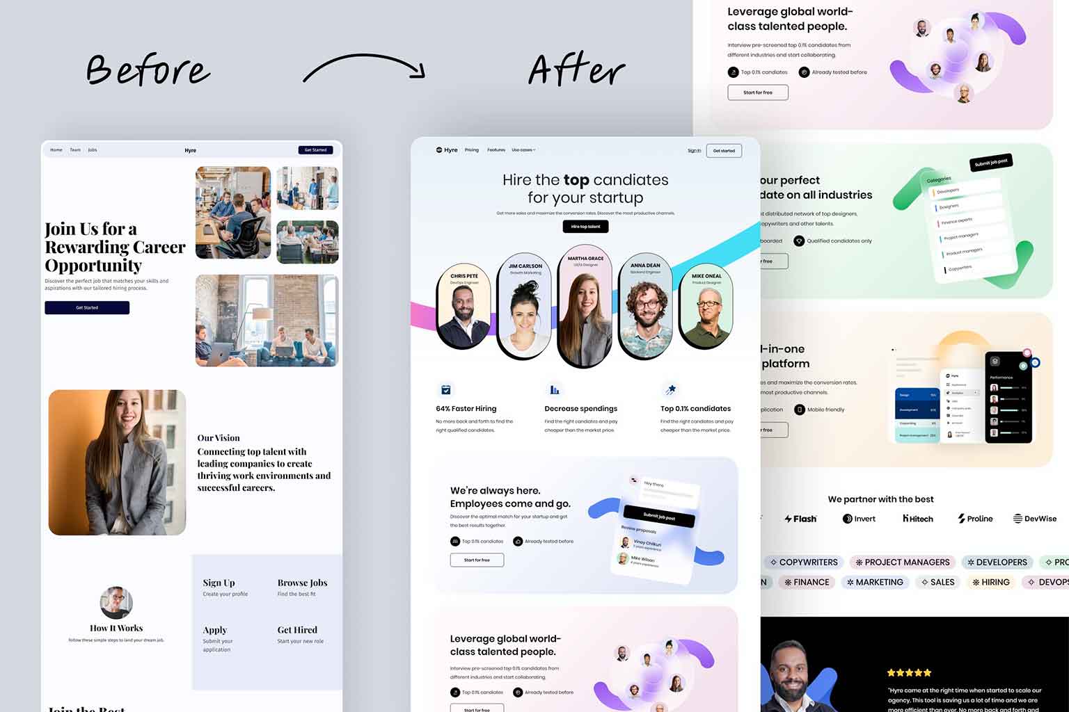
The thing about logos is that updating them is a good idea. It helps ensure you are keeping up with the times and looking to see what other companies are doing– change is a good thing! Still, it can be jarring to the viewer to see a large difference in logos, especially when familiarity is very important. That shouldn’t keep you from redesigning a logo, and if you haven’t touched your logo in ten years, you may want to look at it and see how it’s faring, because if it went the ‘trendy’ route of modern design, then it may look very dated and needs an update.
And when you update the logo (should it need it), that’s when you consider the most important aspects of a timeless logo that will keep your logo from needing excessive revisions in the future.
SO… WHAT IS THE KEY TO SUCCESS?
 How’s that for a long intro? Or at least to get to the point where I finally reveal the secrets that everyone has been dying to learn about logos.
Now without further ado, I will finally reveal the one and the only trait that any successful logo needs, and that is: simplicity.
That’s right! The key to a successful logo is simplicity!
I talked about the importance of longevity in a logo and how many companies have to deal with a logo redesign but let’s consider logos that have had little to no updates to their logo in years: Chanel, Calvin Klein, FedEx, and Apple. I wonder if you can tell me what it is they all have in common? That’s right! Simplicity.
Because when it comes down to it, the one thing that will always be timeless is simplicity.
SIMPLICITY IS… MEMORABILITY
But simplicity isn’t just for the sake of longevity, it’s also for memorability.
You may be thinking that you could lose something from your logo if you make it simple, and sure, some logos are really pretty with their abundance of detail, but logos aren’t supposed to be a painting, logos are meant to be a snapshot of your company. One thing that people have learned over the years is that the simpler the logo, the more memorable the logo. There are times when people will only be able to see your logo for one second, and should that happen, which do you think people are going to remember more: An elaborate image of a boat, complete with ten different colors and each flag individually painted– or a simple silhouette of a sailboat?

Well, after an hour goes by, ask them to draw one of the two. Which one do you think the person is going to have an easier time drawing? (Hint, it’s the simple sailboat).
I’m not just throwing this idea around either. A drawing test is a great idea when determining the effectiveness of a logo. Ask someone to study your logo for a minute (let them know you’ll ask them about it later) and then a couple of hours later ask them to draw your logo and pay attention to whether they are able to do so, and how long it takes. If they seem to have trouble with one or the other or both, that may be a good indicator that your logo is just too complicated.
Remember, logos aren’t supposed to tell you everything about your brand, there are a lot of logos that don’t. Think about the brand Apple. They are a massive tech company, and if I go into their store I’m expecting to get a computer or a great phone– not a bag of honey-crisp apples. Yet, that’s what their logo presents: a bitten apple. So… if they have nothing to do with fruit, why does this work? Because the logo is sleek and professional looking. It has a high-end feel. It presents those aspects of the company and uses the mark of an apple for memorability.
Remember, logos are for memorability and to be recognized, not to tell every little thing about your brand in one image. You can’t do that.
But you can use your logo to make people curious.
SIMPLICITY IS… FLEXIBILITY
In part one, I talked about how technology caused the design world to change, and one of those ways was understanding just what was essential in an effective logo. What people discovered was essential was flexibility.
 A logo was needed to be flexible for a variety of reasons. It needed to be able to grow and shrink. A logo needs to be able to be tiny and recognized on things like apps, or as a tiny mark at the bottom of the page. Think about things like the Twitter or Facebook logos that you see at the bottom of web pages in order to link to people’s Facebook pages or Twitter accounts. A logo needs to have the ability to be recognized when shrunk down.
Yet at the same time, these logos still make sense when they are blown up on huge posters. They don’t get distorted as they go from tiny to huge. They look good far away and close-up. They look good on t-shirts, mugs, brochures, cars, websites–
You get the picture. You want your logo to be everywhere in order to be recognized and to be memorable.
If your logo has a ton of effects and details then it’s going to get distorted at a distance or will be overwhelming when close-up. This is why you want to eliminate all unnecessary elements that may impede recognition. In addition to relying on certain elements like color.
I’m not saying to eliminate color in your logo, but if your logo is flexible enough, it will be recognized regardless of color.
SIMPLICITY… JUST WORKS
And will continue to work for years.
When it comes down to it, you want your logo to work in most circumstances. And simplicity will do that for you. It will allow your logo to work regardless of instances of blur or even when cropped… If a logo is simple enough it can still be recognized if it is blurred or cut in half.
That’s actually a really good test. Think about the Twitter logo, regardless of whether it’s blurred or chopped in half, you can still recognize it. Same with FedEx and… Full Scope Creative.
So, on top of just staying relevant and not ever really going out of style, simplicity just works! It keeps a clean and modern look, allows you to be flexible and work regardless of size distortion, and so forth. If you are reading this and are thinking “oh no, my logo is not very flexible… and I haven’t looked at it in years– oh my gosh what do I do?!” then talk with us at Full Scope Creative! I promise you we will be able to make you a cool, modern, simple, and memorable logo that will perfectly suit your brand needs!