It’s been said before — when it comes to an effective website, ‘content is king.’ I agree whole heartedly, content is king. But in website design, there’s a fine line to walk, with quality content on one side and visual aesthetics (eye candy) on the other. If you have too much of one and not enough of the other, your website is destined for failure.
Think about it. Have you ever visited a website and thought to yourself, “WOW! This site looks amazing! Wait… I can’t find the information I was looking for.” Or have you seen a website and thought, “Hey, now this is exactly the information I was looking for… but this site looks like it was made is 1999. Are they even in business anymore?”
Content is king, but it’s not everything. Your site needs to look clean, modern and professional. Using all the cool web design bells and whistles will, quite frankly, only impress myself and other web designers. Now, if that’s your target audience, go crazy. But, if you’re targeting any other audience, stick with what they’re looking for — and that’s quality content.
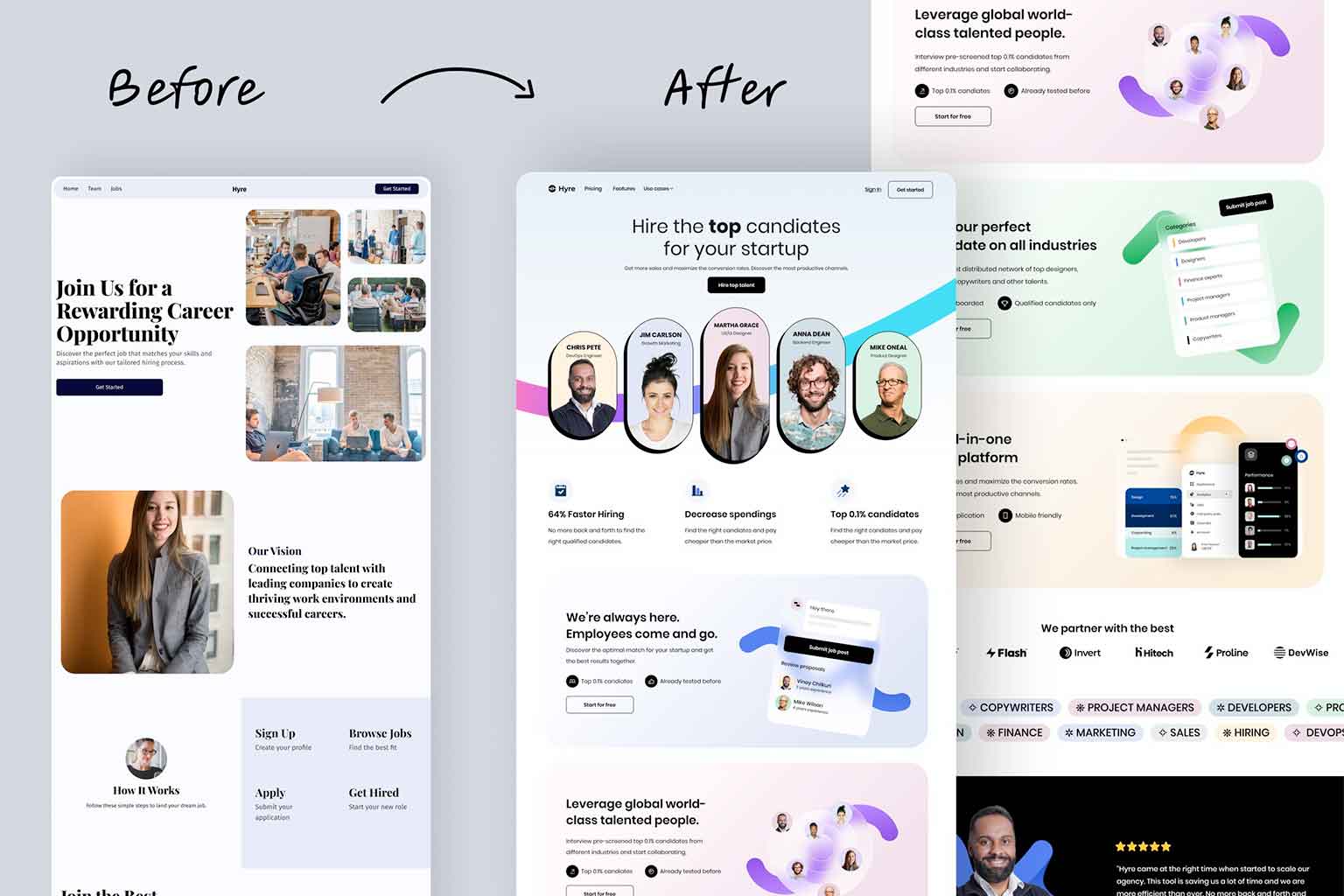
Keep in mind, however, that while content is king, if the king looks like he hasn’t showered or shaved in ten years, he’s going to lose a lot of his power. Your website is the same way. If your site has great content, but looks very dated, visitors will question you relevance in today’s society. On the other hand, if your site has impressive visuals but poor content, no one will know if it’s the right company to do business with.
The relationship between quality content and visual aesthetics is a crucial one, and like any successful relationship, it must be maintained. Keep your site (design and content) current and up-to-date. Don’t get caught looking like an outdated king, because you won’t be taken seriously.
If you don’t think your site is walking that fine line with relative ease, get in touch with us today and see how we can get your site back in balance.


