What Are the 7 Rules of Graphic Design?

Good graphic design is about more than looks. The seven rules of graphic design help guide attention, improve clarity, and build trust with your audience. From balance and contrast to white space and movement, these principles show up in every effective logo, website, and marketing piece. When one is missing, something always feels off.

The Core Design Principles That Make Visuals Clear, Effective, and Trustworthy

Graphic design is not just about making things look nice. Yes, your designs should look great. That part matters. But good design has a bigger job to do.

Strong design helps people understand your message faster. It guides their eyes. It nudges them toward action, whether that is making a purchase, filling out a form, or simply remembering your brand. These seven rules show up in every type of graphic design, from logos and websites to flyers, brochures, and social posts. When one is missing, something usually feels off even if you cannot quite explain why. These are not optional. Each one plays a role.

Balance

Balance is how visual weight is distributed in a design. It keeps layouts from feeling heavy or awkward. When balance is ignored, a design can feel like it is leaning too far in one direction, almost like it might tip over.

Symmetrical balance feels formal and structured. It works well for professional services and traditional brands. Asymmetrical balance feels more relaxed and modern, often using different sizes or elements that still feel evenly weighted. Balance helps guide the eye without overwhelming it. Poor balance makes designs feel cluttered or uncomfortable, like walking into a carnival mirror maze where nothing quite lines up.

Contrast

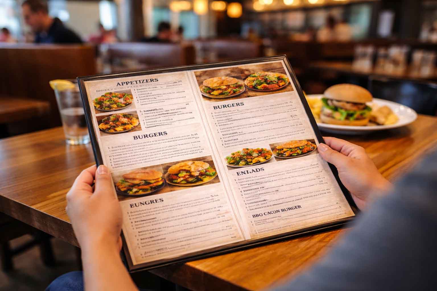
Contrast is about making elements clearly different from one another. If everything looks the same, nothing stands out. On the flip side, if everything is screaming for attention, nothing actually gets it.

Contrast can be created with color, size, shape, or font choice. You do not need all of them at once. Pick one or two and use them intentionally. High contrast improves readability, especially on websites and printed materials. Low contrast can make designs feel flat, boring, or hard to scan. Good contrast helps someone know where to look first, then second, and finally where you want them to act.

Emphasis

Emphasis highlights what matters most. Every design should have a single main point. Ask yourself what the one thing is that someone should remember or act on.

Headlines are a common way to create emphasis. They often carry the main message or call to action. Size and placement also matter. Important elements should be easy to find, not hidden. Too many focal points create confusion. When everything is emphasized, nothing truly is. Clear emphasis leads to clear messaging, which leads to better results.

Repetition

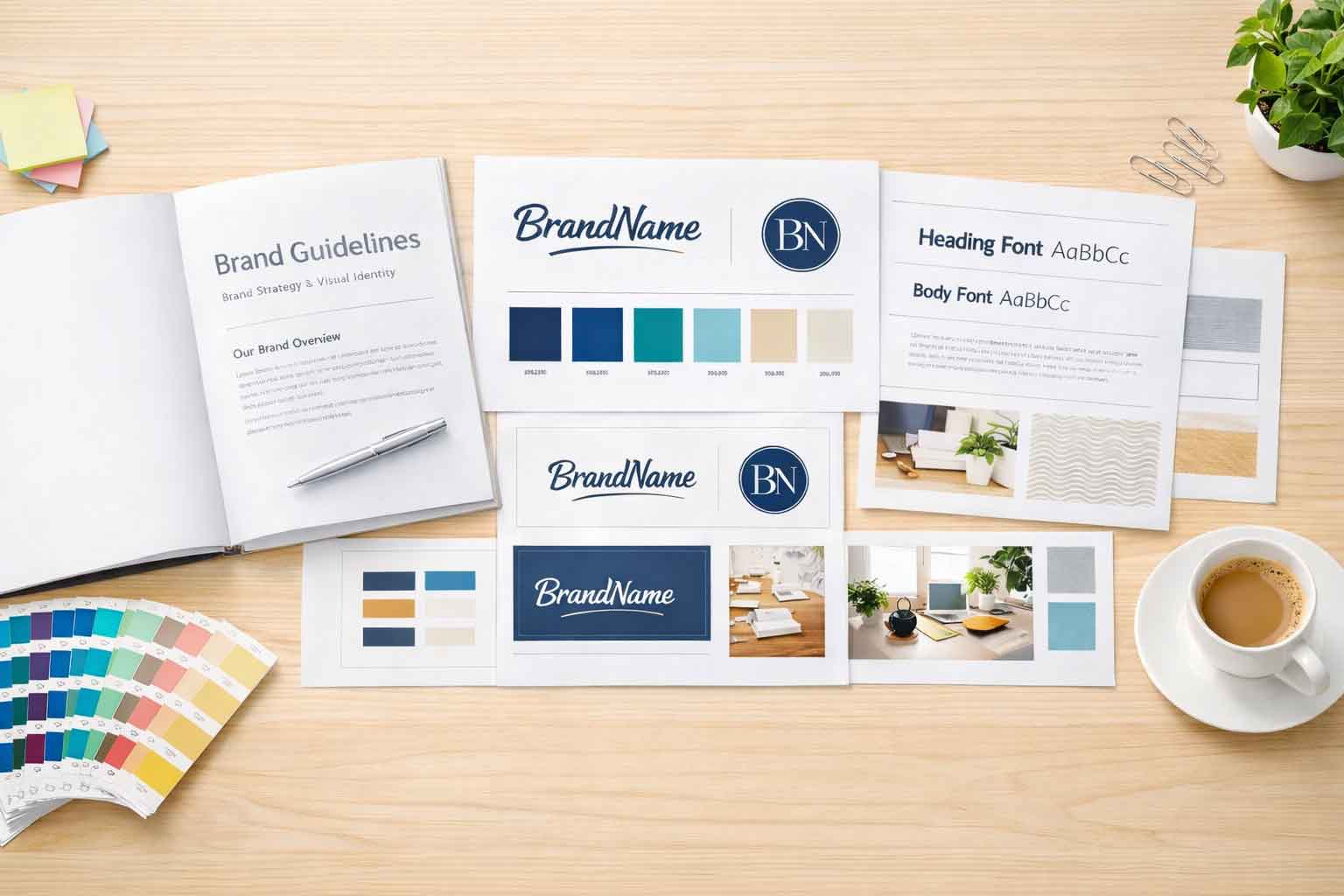
Repetition creates consistency across a design. It helps tie everything together. This is especially important for small businesses building brand recognition.

Repeating colors reinforces your brand and makes different pieces feel connected. Font consistency improves clarity and professionalism. Repetition across pages, posts, or printed pieces builds familiarity and trust. When designs constantly introduce new styles, fonts, or colors, they feel rushed and unpolished.

Proportion

Proportion refers to the size relationship between elements. It helps communicate importance without needing extra words.

Larger elements naturally feel more important. Smaller elements support the main message. When proportion is off, layouts can feel chaotic or confusing. Good proportion improves readability and makes it easier for someone to scan and understand your content quickly. This is especially important for websites, where attention spans are short.

Movement

Movement guides the viewer’s eye through a design. It creates a visual path. If a design has a stopping point that breaks the flow, the viewer may lose interest or miss important information.

Movement can be created through spacing, alignment, fonts, and color. Diagonal lines and gentle curves often imply motion and help move the eye naturally. Movement supports storytelling by leading someone from headline to supporting text to call to action. Without it, designs can feel static or confusing. And confusion almost always means missed opportunities.

White Space

White space is the space between elements. It does not have to be white. It can be any color, a subtle background, or even an image, as long as it is not busy or distracting.

White space gives content room to breathe. It allows the eye to rest. It improves focus and significantly increases readability. Crowded designs feel stressful and are often forgotten quickly. White space is not wasted space. It is often some of the most valuable space in a design.

Why These Rules Matter for Small Businesses

These seven rules work together, not on their own. Every effective design uses all of them in some way. Strong design builds trust before a single word is read. When a design feels clear, your message lands better and your business feels more professional.

If you are working on your own graphic design projects and something feels off, one of these rules is usually the reason. And if you ever want a second set of eyes or help applying these principles, we are always happy to talk through it with you.

Ready to discover how we can help make your website and marketing more successful?
Contact Us

Marketing Made Simple

Insights from Full Scope Creative

Our thoughts on website design, graphic design, marketing, SEO, website hosting, branding, business management, and more here in the Full Scope Creative blog!

Insights, Tips, and Strategies for Small Business Success

Our blog is packed with expert advice on website design, SEO, marketing, branding, and more. Whether you’re looking to improve your website’s performance, boost your online presence, or streamline your business’s digital strategy, you’ll find valuable insights and actionable tips right here.

Referees making sure the rules are followed

What Are the 7 Rules of Graphic Design?

Good graphic design is about more than looks. The seven rules of graphic design help guide attention, improve clarity, and build trust with your audience. From balance and contrast to white space and movement, these principles show up in every effective logo, website, and marketing piece. When one is missing, something always feels off.

Read More »
Everything will be OK if your keywords sound a little clunky or odd

Keywords Might Sound Clunky or Odd (And That’s Okay)

Keywords can sound awkward or unnatural, but they’re often the exact words people type into Google. Businesses and customers don’t always speak the same way, especially online. Understanding how people actually search helps your website get found, even if the wording feels a little clunky at first.

Read More »

What are the disadvantages of WordPress?

WordPress is a powerful website platform, but it is not without its drawbacks. Security, frequent updates, and plugin conflicts are real concerns when a site is not properly managed. The good news is that these disadvantages are easy to overcome. When WordPress is maintained intentionally, it becomes a flexible, reliable solution for small businesses.

Read More »

Setting the Timezone

One of the smallest WordPress settings can quietly affect how your site runs. Matching your site’s timezone helps keep contact form emails, scheduled posts, event calendars, and logs accurate. It’s a quick setup step, but skipping it can lead to confusion. At Full Scope Creative, it’s one of the first behind-the-scenes details we set for every client site.

Read More »

Relying Only on Facebook Is Risky for Contractors

Relying on Facebook as your only online presence puts your business at risk. While Facebook is useful for updates and visibility, it was never meant to be your foundation. This article explains where Facebook falls short for contractors, how it limits search visibility and clarity, and why your website should be your true home base.

Read More »

It’s in good hands

Your website shouldn’t just say you’re trustworthy, it should show it. From testimonials and portfolios to case studies and real team photos, the right elements help visitors feel confident reaching out. Learn how small changes to your website can build trust, reduce hesitation, and reassure people that they’re truly in good hands.

Read More »

Your Website Isn’t Just for New Clients

Your website should do more than attract new clients. It should support the people already working with you. From educational content and helpful resources to clearly listed services, a well-built website gives clients clarity, confidence, and direction. When your site continues to serve clients after the sale, it helps build stronger, longer-lasting relationships.

Read More »

Website Hosting vs Website Builder

Website hosting and website builders are often confused, but they play very different roles. Hosting is where your website lives and how it performs. A website builder is how it is created and updated. When the two work together intentionally, your website becomes faster, more secure, easier to manage, and far more effective for your business goals.

Read More »
Spammers and Hackers Aren’t Dumb

Spammers and Hackers Aren’t Dumb

Spammers and hackers are not guessing anymore. Their attacks are automated, fast, and designed to find weak shortcuts. Simple security habits are no longer enough. Strong passwords, trusted plugins, reliable backups, and layered protection all matter. Website security works best when it is intentional, consistent, and built to handle real world threats.

Read More »
Ready to discover how we can help make your website and marketing more successful?
Contact Us

Chris and his team at Full Scope Creative are the best! I have worked with Chris on two different projects. The first project was updating a website and the second project we started a website from scratch. Both are incredibly challenging without the knowledge and expertise of someone like Chris, but Chris and his team made the process exciting with all of his great ideas. Great ideas, responsive, quick turnaround time. Thank you, Chris for being so kind and so great at what you do!

~ Sarah Lueschow,
MHO Open, Inc.