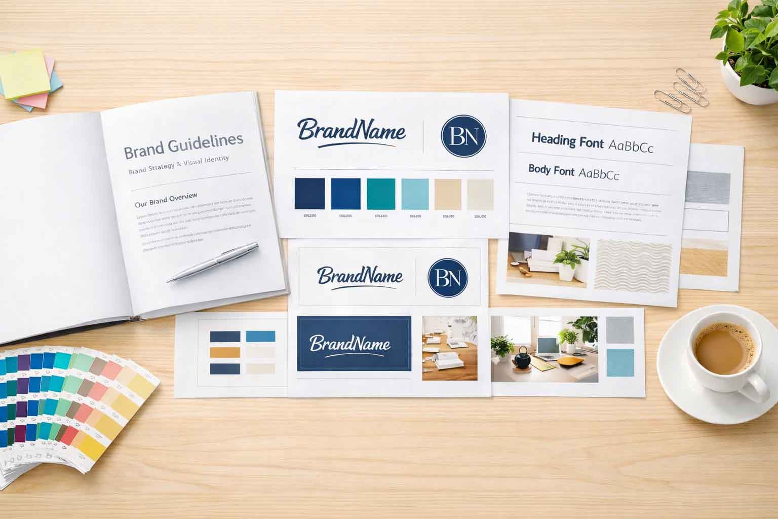
Striking the Use and Balance of Handwritten Fonts
One of the big goals for a website is to make a connection with the user. One way that some websites attempt this is by using handwritten fonts. While handwritten fonts can add a personal touch (all too easily a whimsical touch) to a website, their use can lead to issues with readability and other design challenges. While they can have a place in web design, using them thoughtfully is key to maintaining the website’s user-friendly experience.
The Challenges of Handwritten Fonts
Readability Issues
Handwritten fonts tend to lack the clarity and readability structure of standard fonts. This makes them harder to read on a website, particularly when used for long sections of text or even many headings. The unique and uneven strokes of handwritten text might look appealing but can quickly tire the reader’s eyes.
Accessibility Concerns
Accessibility is top concern for any website. Users with any number of visual impairments or learning disabilities may struggle to read the handwritten fonts on the website. This can quickly result in a less than positive user experience, alienating a portion of your audience.
Mobile Optimization
As mobile usage dominates most websites, designing with smaller screens and resolutions in mind is a top aim for designers. Handwritten fonts often don’t scale very well at all on mobile devices. With the often tighter and uneven strokes, they can appear cramped or pixelated. Having this further reduces their legibility and impact, hurting the overall user experience.
Potentially Dated Aesthetic
When I see handwritten fonts I almost always have flashbacks to horrible PowerPoint presentations I saw in school. Back then we used any font that just looked cool. Today, depending on the style and exact font, handwritten fonts can give a website a dated feel. Even if it isn’t a fully dated feel, it can make for an overly casual appearance. For businesses or brands aiming for a modern, relevant, and professional image, this may not align with their goals.
A Balanced Approach to Handwritten Fonts
While handwritten fonts have their fair share of challenges, they’re not completely without their charm and effect. The key is to use them strategically and, more importantly, in moderation. Here are some tips:
Selective Usage
Handwritten fonts work best and should be ideally only used as accents. Consider using them (sparingly) for:
- Logos or brand marks
- Callouts or special quotes
- Specific sections on your website meant to evoke emotion or personality
Avoid using them for all of the website headings or body text to maintain readability and balance.
Pairing with Clean Fonts
Combine handwritten fonts with clean, modern serif or sans-serif fonts. For example:
- Use a sans-serif font for the main heading, then use a handwritten font for a subheading or highlight
- Keep body text in a standard font to make the site easy to read, and use handwritten styles for decorative purposes only
Testing Across Devices
Always be sure to test (and re-test) your design on several different devices and screen sizes. If using a handwritten font, make sure that font is legible on smaller screens and does not detract at all from the user experience.
Modern Alternatives
If you really like the presentation and vibe of handwritten fonts and their aesthetic but want to ensure clarity, look into fonts that balance personality and legibility. There are modern script fonts that are designed specifically for digital use and can work well across platforms. You can explore https://fonts.google.com to find these fonts and more.
Perfect balance between creativity and functionality
While handwritten fonts can enhance a website and businesses personality and appeal, be sure to use them very thoughtfully and cautiously. By pairing them with a clean font, limiting their amount of use, and always focusing on readability, you can create a design that is both stylish and user-friendly. The goal for any website design is to communicate effectively to users and provide a seamless experience for your audience regardless of device size. When in doubt, test your typography choices with real users and on several devices to ensure your site strikes that perfect balance between creativity and functionality.


