Your Brand Needs More Than Just Bright Colors
In the show “The Joy of Painting,” Bob Ross would often say things like “don’t cover up all your dark color” or “don’t kill all your dark” because “you gotta have a little darkness to have light.” If he were to paint a nature scene with only bright colors, it would never look quite right. Something would always feel off. Without the contrast of bright and dark colors, there’s no depth to the painting and the bright colors are all lost.
That same color concept applies to your brand’s color palette as well. We’ve worked with clients and businesses where their branding is entirely of high-energy, bright, vibrant colors. Think electric greens and sunshine yellows and sunny orange colors. They are great colors and provide such a bright and cheerful feel, they make the brand feel overwhelming and from a design standpoint very tough to use. When the brand is designed, using bright colors is great – but in the design and branding service and setup, there needs to be thought put in from the start of a dark or neutral color to go with it.
Bright Isn’t Bad but It Can’t Stand Alone
Bright colors are great for a brand. They convey energy, excitement, happiness, and optimism. But when every color in your brand’s color palette is visually fighting to be the brightest or loudest, it can be visually exhausting. Things like your logo, website, and marketing materials all start to compete with themselves. Instead of creating a cohesive, professional look, you end up with a brand that feels chaotic or worse yet, juvenile.
That’s where the neutral tones and earth tones come into play. Those neutral or darker colors don’t just exist to be “boring.” They are there for support. A rich charcoal gray, a warm taupe, even a muted navy blue can make those bright brand colors stand out in the way they were meant to. Neutral colors and darker colors can give the eye of the user a place to rest and help establish a visual hierarchy. That visual hierarchy is key to building trust and guiding users through your content.
The Web Design Challenge
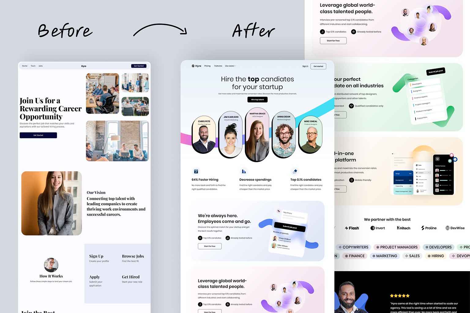
When creating websites for a brand that is all bright colors, we run into a couple real challenges. Creating buttons, headings, backgrounds, and call-to-action graphics when all the colors are so heavily competing for attention creates a design nightmare. Too often in these situations, it feels like users will need to wear sunglasses to look at the site just to navigate through and find the information they’re looking for.
When your brand doesn’t have dark or neutral tones, everything from your homepage to your product pages can feel flat or overly loud. There’s no visual “anchor” to ground the design. Even accessibility becomes a concern—many bright-on-bright color combinations fail contrast checks, making your site difficult (or even unusable) for some users.
It’s not as simple as just adding black
If you’ve already got a brand built around bright colors, you don’t necessarily have to toss it out and start over. You will need to take the time to set up a proper color ballet that can introduce supporting colors. Consider:
- Adding a dark or neutral tone to serve as a background or secondary element.
- Introducing a complementary earth tone for texture and warmth in print or digital designs.
- Using brightness more strategically, limiting it to key highlights or calls to action instead of making it the main background.
These small changes won’t take away from your brand’s personality—they’ll help it come through more clearly. The thing to remember is that it is not as simple as just adding black or gray into your color pallet. A color pallet only works when the colors are strategically aligned and work well together. You may want to work with a professional graphic designer to help with this process.
Once your brand has the proper neutral or earth tone color to balance the bright colors, you may want to reevaluate your existing marketing pieces and work in the new color pallet.
Let the Bright Shine by Balancing with Dark
Your branding should be like a Bob Ross painting: full of joy, but grounded with contrast. The dark spots don’t dull the beauty—they enhance it. At Full Scope Creative, we love helping clients find that balance, whether it’s through brand development, print design, or a new website layout. Bright colors are powerful—but they need a little darkness to make them truly work. Need help rebalancing your brand’s color palette or building a website that makes your colors shine (without overwhelming your audience)? Reach out—we’d love to chat about what your brand could become with just a touch of contrast.


