Key signs that point to a cluttered website design

I hate to admit it, but sometimes my desk gets a little cluttered. With too many stacks of papers, post-it notes, and random receipts, a certain sense of overwhelming confusion can set in and it is a clear sign that it is time to clean my desk off. That same overwhelming sense of confusion and lack of direction can easily happen on a website as well. When a website gets too overwhelmed with the digital version of too many stacks of paper, post-it notes, and random receipts, it is a clear sign that the website design is very cluttered.
Having a cluttered website design can be detrimental to the success of your online presence. It not only affects the user experience but also impacts your website’s performance and search engine rankings. Therefore, it is crucial to identify the signs of a cluttered website design and take the necessary steps to rectify them.
There are several key signs that point to a cluttered website design. Unorganized layout and content, lack of white space, and poor navigation are all common signs of a cluttered design.
disorganized layout and content
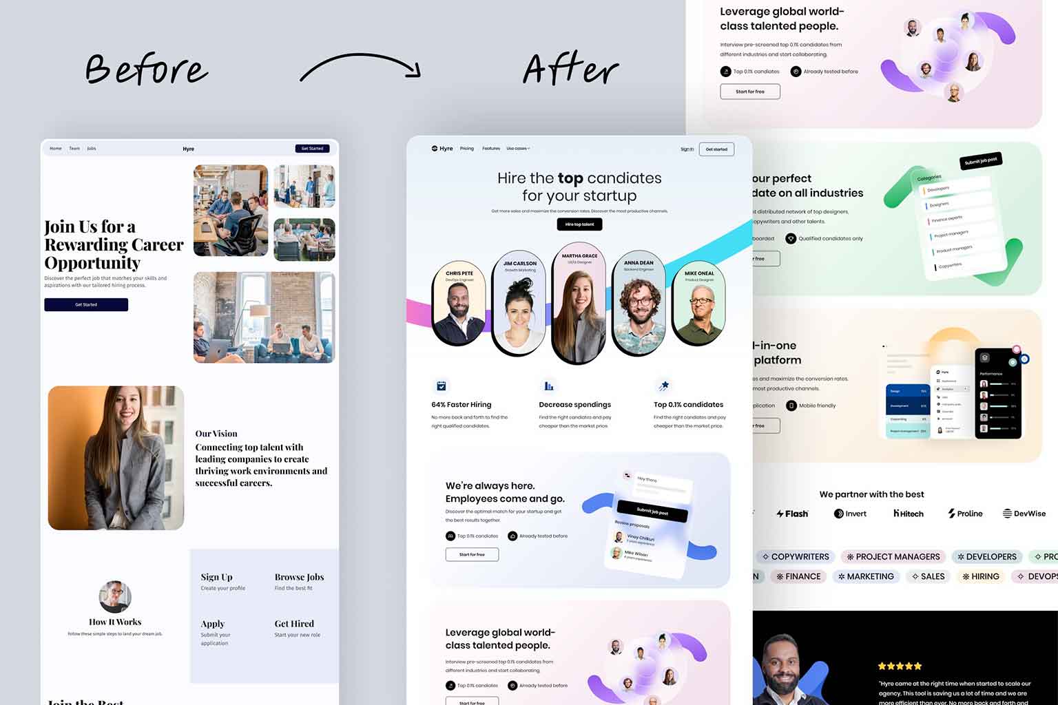
 When users visit your site, they should be able to quickly find what they are looking for without feeling overwhelmed by unorganized text or images. If your homepage is carelessly filled with content, it can confuse visitors and make it difficult for them to navigate through your site effectively. At Full Scope Creative, we are always in favor of having a lot of content on home pages. The difference is in the organization and care we take to arrange all of the content. Careful consideration is given to including page breaks, images, videos, and other visual ways to ease the flow of the content.
Furthermore, inconsistent spacing between text and images can contribute to an unorganized layout. If there are large gaps or overlapping elements on a webpage, it can confuse users and make them feel frustrated. Additionally, having excessive content without proper organization can lead to information overload for visitors. By not categorizing information effectively or providing clear navigation menus, users may struggle to locate specific details or sections on the site.
Lack of White space
 Along with poorly organized content, another common telltale sign of a cluttered website design is the lack of whitespace. There can be an urge to fill each available inch on a website with something. Those empty spaces are oftentimes what can make a design so effective. The technical term for those open areas is white space. When a design (website, book cover, flier, etc.) has no white space, it can easily become overwhelming and under-powering. Without white space, designs will give a feeling of having no room to breathe. As mentioned above, we often include large amounts of content on pages, but we always include plenty of white space. That white space provides the “breathability” that a page needs to have in order to easily allow users to navigate through the page.
When it comes to website design, whitespace is often an overlooked element that can make a significant impact. However, the lack of whitespace is a clear sign of a cluttered website design. When there is not enough whitespace, all the elements on the page seem to be squeezed together, resulting in a chaotic and overwhelming appearance. This can include text blocks crammed together, images placed too closely to one another, or navigation menus that are difficult to read due to excessive content.
Another indicator of a cluttered website design is poor hierarchy and organization. A lack of white space makes it challenging for users to differentiate between different sections or elements on the page.
Poor Navigation
 A third and very common sign of a cluttered page is the main navigation. A navigation should be easy for users to follow and get to the information they desire. A navigation that lacks organization, white space, and intent leaves users puzzled and unsure on what to do. I have visited websites that when looking at the main navigation, I have no idea what I am supposed to do. On many of the sites we design, we will include a drop down navigation off of the main links. A drop down navigation is perfectly fine and easy for users to navigate. However, having a drop down navigation and then a second fly-out menu is going one step too far. Very few users, this web designer included, have a tough time navigating such a complex and unorganized navigation and website.
A clear sign of a cluttered navigation is a long list or excessive number of menu items in the main navigation bar. When users are bombarded with too many options, it becomes overwhelming and difficult to find what they are looking for. It is important to streamline the navigation by categorizing content into logical groups and prioritizing the most important information.
Start de-cluttering for better results!
 A cluttered website design can have detrimental effects on user experience and overall success. Signs of a cluttered design include excessive use of graphics, crowded navigation menus, overwhelming amounts of text, lack of clear hierarchy, and disorganized layout. These elements can confuse and frustrate visitors, leading to high bounce rates and low conversions. It is crucial for website owners to regularly assess their design for clutter and make necessary adjustments to create a clean and intuitive user experience. By doing so, they can ensure that visitors are engaged and find what they need easily, ultimately leading to increased traffic and improved conversions. Take the time to review your website’s design today and start de-cluttering for better results! Speaking of de-cluttering, I think I have some receipts I need to file away properly.