Trends come. Trends go.
Have you ever cleaned out your closet and laughed at some of the clothing options you wore at one point in time? Admit it, you had a pair of MC Hammer parachute pants, didn’t you? Just as fashion trends can come and go, website design trends follow the same path. As I browse the world wide web, I sometimes have to laugh when I see some really outdated design trends. If you see any of these on your site, it’s time for an update.
Flash-based websites
This first one, having a Flash based site or even using any Flash animation on your site, is a huge sign you need a new site. In fact, you’ve needed one for years now. While it was once a staple of the website design toolkit, Adobe Flash animation is now long since discontinued and entirely obsolete. There is no saving anything in Adobe Flash, it is simply 100% time to upgrade to a new and modern site. One that can be responsive, easily indexed by search engines, and one that can actually be displayed in any browser.
Stock Photo Overload
There’s a time and a place for stock photos. Even on our own pages and blog articles we use some. But if your site is overloaded with stock photos, it’s clearly time for an upgrade. Stock photos rarely, if ever, do anything but scream “cheap and dated.” Investing in custom photography, while an expense, can set your site and business apart from the competition quickly and easily. You can elevate your company from being “entry level” to being the true expert you are.
Cluttered Layouts
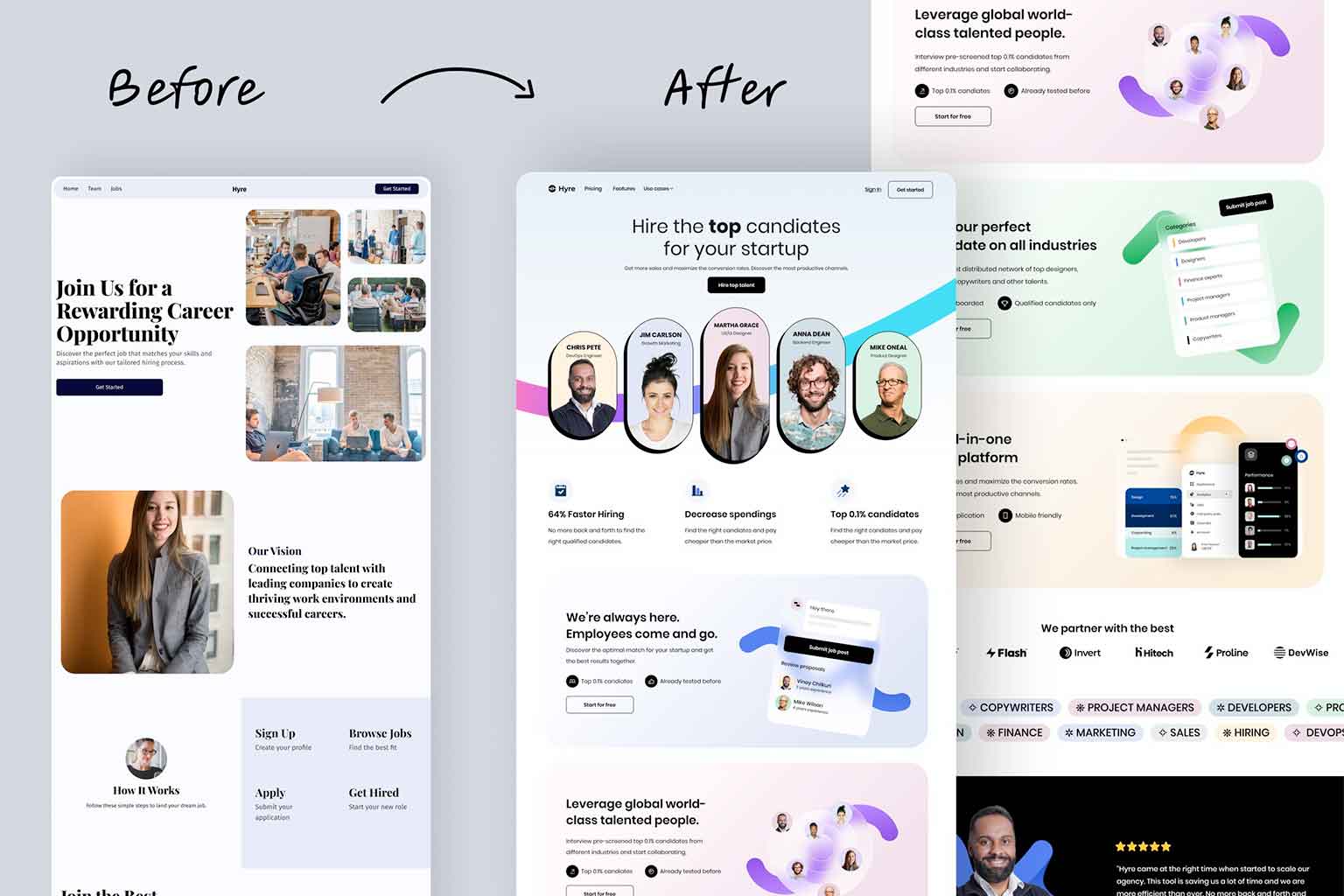
Websites that have a busy layout with far too many elements poorly arranged, can quickly (if not instantly) overwhelm and confuse your visitors and audience. As soon as that confusion sets in, it’s tough to come back from it. Today, while we still showcase a lot of information (we often build sites with 2000 words of content and dozens of images and videos), the layouts are done meticulously so they are easy to navigate and explore. As soon as we start to feel that a design might be getting too complex, we scale it back a few steps to keep it simple. “Keep it simple, stupid” is always great advice for website layouts.
Autoplay on Videos and Audio
I remember working at a job I had in college and looking to buy a new CD that was coming out from one of my favorite bands. I pulled up a site to order it and immediately the first single from the CD started playing. Without thinking twice I instinctively hit the big red X to close out of the screen and just bought the CD from another site. Not having audio or videos autoplay is still an incredibly important setting to have in place today. If a video is just a background video, that can certainly start immediately, but any sort of audio needs to be user controlled. With how on-the-go the web is now, users will browse sites anywhere and anytime. If they are caught off guard by audio playing right away, the odds of them leaving and never coming back skyrocket.
Hamburger Menu on Desktop
Hamburger menus work great on mobile devices. Great. The need for those three little horizontal lines that users know to click on to get to the main navigation bar on a site is beyond important on a responsive device. But on a desktop browser, where we have plenty of real estate, there is no need for them. Worse yet, far too often, the hamburger menu on a desktop can get lost in the design. Even if a hamburger menu on a desktop device is clearly displayed, it still tends to feel out of place and simply cheesy. If you have this on your site, spend the time to properly design for the desktop and include a proper menu.
Non-Responsive Design
I shouldn’t even need to mention this one, but if your site is still not responsive, the time is now to update. With such an ever increasing amount of traffic coming from mobile devices, your site needs to be tailored to fit those devices. Not only is the need for responsive design for human users, Google has been devaluing the sites that are not fully responsive for quite some time now. And if your site isn’t mobile friendly, the odds are the layout is dated and in need of a new design in its own right as well.
Pop-ups Galore
I am not a fan of any pop-ups on websites. Anytime I see one, no matter how beautifully styled and designed they are, no matter how amazing of an announcement it delivers to me, no matter how great the discount is I just qualified for, I always feel like it took me back 15 years in time. There’s no great way to do a pop-up and not have it feel cheesy 2002 style. With design techniques and technologies we have available today, we can very easily and more effectively display any pop-up box in a full width banner or call-to-action graphic. If your site uses pop-ups, it’s definitely time to at least review your strategies for how you’re using the website.
Create Website that are visually appealing
By avoiding these outdated web design trends and adopting more contemporary practices, you can create websites that are visually appealing, user-friendly, and optimized for the modern web landscape. Fashion trends come, and fashion trends go. Website design trends come, and website trends go. If your site is using any of these tired and worn out trends, it’s time to go chat with your web designer. And as soon as you do that, go clean out your closet and admire those MC Hammer parachute pants you still own.


