Writing content can be a bit of a laborious chore. For many readers, reading the content we write can also be a laborious chore. If you simply write paragraph after paragraph of content, odds are your site users aren’t going to eagerly read through it all. However, there are a couple of things you can do to make your text more readable.

Hire a Copywriter

One of the obvious things is to have a skilled writer proofread your writing. When a professional copywriter proofreads your content, they’ll check for the big issues – spelling and grammar – but they can also identify ways to make your writing easier to read. For example, keep your sentences simple. Short, uncomplicated sentences are easier to read. The same principle applies to your words. You could say, “The region of the atmosphere and outer space seen from earth is sky is azure…” – or you can say, “The sky is blue.” Which one gets your point across in the most clear, concise way? That’s the one to use.

In addition, there are some great free tools out there that can help you improve your writing. Grammarly, Grammar Girl, and Virtual Writing Tutor are three that come to mind. You can go to most of these for writing tips as well as just to get an answer for a specific issue, like the differences between the words “there”, “their” and “they’re”, or “your” and “you’re”.
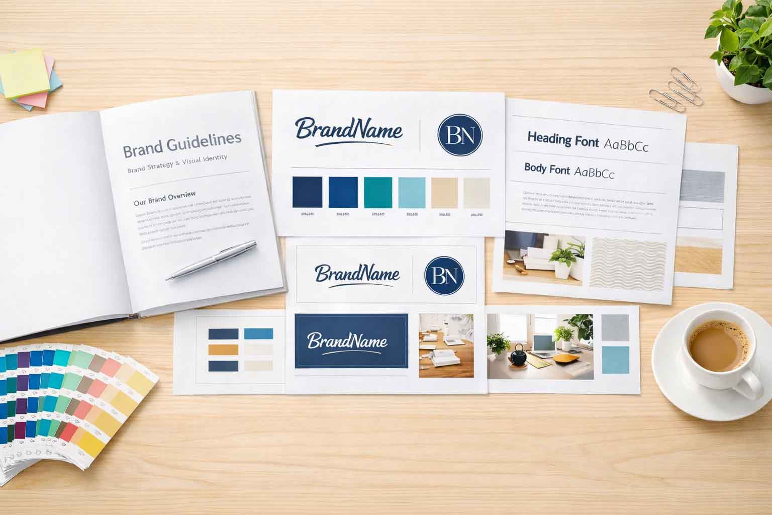
Use Images

If you don’t have access to a copywriter, there are a few other tricks that can help make your content easy to read. One thing you’ll find with just about every human being is that they’re visual beings. They would prefer to see something rather than read it. Even if it’s something as simple as including a photo to break up the content, the image can provide your user with something different to focus on for a moment. Images don’t have to mean strictly photos, either – charts and graphs are also a great way to reiterate the message you’re trying to get across.

Use Headings

Line after line of text can get a bit long. Doing something as simple as adding in headings with a larger or different font can be enough to break up content and make it more readable. Keep in mind that search engines tend to put greater significance on the words in a heading. Because of this, headings can be a great spot to add in some of your keywords for the given page as well.

On some pages, there might be certain portions of text that a user is looking for. By having specific headings set up, you can help those users more easily find exactly what they’re looking for on the page.

Some pages on your site might end up having a lot of content. If that content doesn’t need to be all on one page, it can be broken up to create additional pages, which helps visually and that can help, but sometimes it does need to all be on one page. Especially when you have pages with more information on them, working with a copywriter, using images, and using headings can help make your content more readable. More readable content tends to lead to higher conversion rates.

Ready to discover how we can help make your website and marketing more successful?
Contact Us

Marketing Made Simple

Insights from Full Scope Creative

Our thoughts on website design, graphic design, marketing, SEO, website hosting, branding, business management, and more here in the Full Scope Creative blog!

Insights, Tips, and Strategies for Small Business Success

Our blog is packed with expert advice on website design, SEO, marketing, branding, and more. Whether you’re looking to improve your website’s performance, boost your online presence, or streamline your business’s digital strategy, you’ll find valuable insights and actionable tips right here.

What Is a Mockup in Graphic Design?

A mockup in graphic design is more than a preview. It is a critical step where designers test how a design works in real-world situations like websites, signage, and print materials. This process helps uncover issues early and explains why professional graphic design involves far more than just making things look good.

Read More »

Easy Ways to Improve Your Site

Small website changes can make a big difference. You do not need a full redesign to improve readability and usability. Adjusting line height, adding white space, using clearer headings, and breaking up long paragraphs can make your site easier to read and easier to use. These simple improvements help visitors feel more comfortable and confident on your site.

Read More »

Blog Comments

Blog comments sound great in theory, but in reality they create more risk than reward. On most WordPress sites, open comments invite spam, add security concerns, and require ongoing moderation. That is why we turn blog comments off by default. It saves time, protects the site, and avoids unnecessary headaches for business owners.

Read More »
Referees making sure the rules are followed

What Are the 7 Rules of Graphic Design?

Good graphic design is about more than looks. The seven rules of graphic design help guide attention, improve clarity, and build trust with your audience. From balance and contrast to white space and movement, these principles show up in every effective logo, website, and marketing piece. When one is missing, something always feels off.

Read More »
Everything will be OK if your keywords sound a little clunky or odd

Keywords Might Sound Clunky or Odd (And That’s Okay)

Keywords can sound awkward or unnatural, but they’re often the exact words people type into Google. Businesses and customers don’t always speak the same way, especially online. Understanding how people actually search helps your website get found, even if the wording feels a little clunky at first.

Read More »

What are the disadvantages of WordPress?

WordPress is a powerful website platform, but it is not without its drawbacks. Security, frequent updates, and plugin conflicts are real concerns when a site is not properly managed. The good news is that these disadvantages are easy to overcome. When WordPress is maintained intentionally, it becomes a flexible, reliable solution for small businesses.

Read More »

Setting the Timezone

One of the smallest WordPress settings can quietly affect how your site runs. Matching your site’s timezone helps keep contact form emails, scheduled posts, event calendars, and logs accurate. It’s a quick setup step, but skipping it can lead to confusion. At Full Scope Creative, it’s one of the first behind-the-scenes details we set for every client site.

Read More »

Relying Only on Facebook Is Risky for Contractors

Relying on Facebook as your only online presence puts your business at risk. While Facebook is useful for updates and visibility, it was never meant to be your foundation. This article explains where Facebook falls short for contractors, how it limits search visibility and clarity, and why your website should be your true home base.

Read More »

It’s in good hands

Your website shouldn’t just say you’re trustworthy, it should show it. From testimonials and portfolios to case studies and real team photos, the right elements help visitors feel confident reaching out. Learn how small changes to your website can build trust, reduce hesitation, and reassure people that they’re truly in good hands.

Read More »
Ready to discover how we can help make your website and marketing more successful?
Contact Us

Switching to Full Scope Creative for our new website design was one of the best decisions we’ve made at the Ashwaubenon Business Association. From start to finish, their team made the process incredibly easy. The staff at Full Scope Creative is knowledgeable, responsive, and truly dedicated to delivering a great product.

What stood out the most was how seamless the transition was. They took the time to understand our needs and vision, ensuring every detail was covered.

We highly recommend Full Scope Creative to anyone looking for a top-notch web design team. They exceeded our expectations and made the entire process enjoyable.

~ Kelly Losey,
Ashwaubenon Business Association