The Early Bird and The Night Owl
 Which one are you? Personally, I’m a little bit of both, but honestly, I love mornings and the productivity it brings as well as coffee– but I hate getting up and feeling tired. It’s a little bit of give and take, but let’s be real here: everyone knows this. That is why people are generally one or the other.
Early bird or night owl? Tea or coffee? Books or movies?
Light theme or dark theme?
Which do you use?
Perhaps you don’t care a wit, or perhaps you are extremely passionate about one over the other. But before we get ahead of ourselves, I’m going to first introduce just what dark and light theme is (also called ‘dark and light mode’) for the people who are afraid to raise their hands and ask what they are afraid might be a stupid question: “What is the difference?”
Light Theme Vs. Dark Theme

So what is the difference then? Well, I believe in learning on the job so I decided to throw you right into the thick of things in this blog! That’s right ladies and gentlemen, what you are looking at right now is an example of dark theme. A dark background with light text. Usually, our entire site is purely light theme, but I made a few changes, and voila!
So there you have it, light theme is a light background with dark text, while dark theme is a dark background with light text. Usually, images and colors are chosen to complement both which can create a very different feel depending upon which theme you are using.
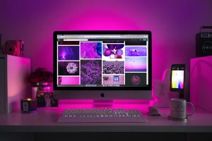
You find light themes on many different sites, like our site, Full Scope Creative, and you can find an example of dark theme on Netflix.
So… why the variety? And which is better?
Dark theme is the “cool kid”
If you asked the majority of people, dark theme is the way to go. A recent study found that over 80% of users prefer dark theme. That’s a pretty stark contrast.
So… where did this trend come from? Well, for starters, it’s something different. People like different and change and often defer to that which isn’t the default. Dark theme is thought of as modern, chic, and cool. But that isn’t the only reason. People say things like they can focus better with dark theme, that dark theme is easier on the eyes and doesn’t cause eye strain.

Personally, I thought ‘Oh it’s just a phase, one of those things people obsess over, and one is considered cooler and more popular–’ yada yada.
I thought I wasn’t as influenced– Until I realized that my google search was set to dark mode (you can change it under settings). I have my youtube page set to dark theme.
My emails are dark theme.
… How did this happen?! Well, the truth of the matter is that maybe I feel this way about dark theme too, that it isn’t so harsh on my eyes when browsing in dark mode– no it’s not just that, I feel more epic when using it. It feels more majestic like I’m in a movie and futuristic– but those might just be associations I’ve made from external factors.
We watch movies in the evening, and because of that, streaming services like Netflix, Disney Plus, and Hulu all use dark mode, because of that association.
So maybe that’s why many of us are enamored with the feeling we get with dark mode. That and given the Western audience views darker color schemes with luxury and elegance, it can feel like the superior option.
That being said, there is one thing that I haven’t switched to dark theme, and I have tried to change it in the past but immediately reverted it back, and that was my google drive. That’s right, as I type this out, I am using light theme.
Light Theme is Dependable
 When it comes to things like text and work activity, light theme is actually the better choice. Wired UK interviewed a professor of human-computer interaction, Anna Cox, and this is what she had to say about light theme and readability: “Black text on a white background is best since the color properties and light are best suited for the human eye … White text on a black background, or ‘dark mode,’ makes the eye work harder and open wider since it needs to absorb more light.”
Apparently, in the case of science, light theme is superior in many ways. Light mode really helps with productivity because it is very similar to what we know. We grew up reading white books with black text and it lends to our understanding in that way as well. In this way it is the ‘safer’ option, but for very good reason. Light mode makes things clearer and help with visual accuracy.
It’s also more ‘natural’. Going as far back as the caveman times, they weren’t finding white chalk to draw on black stones, no they were using a light cave walls for their drawing utensils of dirt, and charcoal. Dark mode is more ‘unnatural’.
In addition, it is easier for people to read who have color blindness while dark mode can often interfere with it.
That being said, light mode can actually have adverse effects on people with visual impairments like cataracts. Low and fuzzy vision actually performs better with dark theme. And light mode may factor into long-term myopia…
So now what?!
Which is better?
 The answer isn’t as simple as may think, there isn’t a ‘one size fits all solution’ because people see things differently. For all we know, none of us view colors the same way. Pink might be yellow for me, and green might be orange for you and none of us would know. Each person’s visual experience is different, but we can look at the pros and cons of each to gauge the big picture.
Light Theme Advantages:
- It’s the most natural to people
- Users with normal vision have higher productivity
- Clearer for people with normal vision
- Smaller font is easily viewed
- Because of the bright light, the eye has a greater depth of field, which makes it easier to focus on finer details
- Helps with visual accuracy for proofreading tasks
Light Theme Disadvantages:
- May be linked to myopia in the long-term
- Harder to read for people with foggy or unclear vision
- There is a higher blue-light emission
- Often associated with higher eye-fatigue
Dark Theme Advantages
- It’s popular
- It helps people with visual impairments like lower vision and foggier vision
- Longer battery life. Dark theme turns off a lot of pixels needed for light theme which in turn increases battery life on your computer or phone.
- Associated with lower eye-fatigue
- Good for reading in the dark, and emits less blue light and assists the circadian rhythm
Dark theme disadvantages:
- Harder to read for people with normal vision, color blindness, and myopia
- Increase eye strain in brightly lit areas
- May lower productivity and reading comprehension
Confused yet?
Well, how about I make it even more confusing? Because even with all the pros and cons there are exceptions. Some people do have a higher production rate with dark mode. And light mode can utilize different settings to reduce eye strain.
Depending on the type of interface, it can change the visual experience dramatically. If you used programs like Adobe, you will understand. They have a lot of toolbars that display a lot of text options– one may think that light mode would be the better solution right?
Wrong.
Dark mode actually makes it appear less intimidating and easier to navigate. Why is this? I don’t know, but it’s true. I tried switching to light mode and got overwhelmed. But of course, there are designers who use light out of preference.
There is an exception to everything, but that just means we have more options, so the question is, by and large, which is the theme that is best for you?
For Professionalism and Text-Heavy Sites… Light Theme
 Exceptions aside, light theme is just smarter when it comes to sites that rely on a lot of text. It is easier to read in light theme when there is small text, where there is often difficulty in dark theme. It is also often easier to differentiate between words and have clearer accuracy with light theme.
It’s associated with productivity for a reason, and people will likely have a greater focus on a text-heavy site if it utilizes light theme, and will likely have a better understanding of its content.
In addition, light theme is ‘safer’ in that dark theme can be a bit off-putting to some viewers as it is seen as ‘edgier’. So if you have a site leaning more on the ‘professional’ and serious side, dark theme may be more of a risk. It’s eye-catchy, but light theme may emit a ‘safer’ feel to the viewer which will allow your site to feel more reliable.
That being said, there are exceptions to everything. Maybe you do have a text-centric professional site and want to use dark theme, and it may work perfectly! Understanding your audience is crucial as well, and if you are geared toward college students who very often use dark theme, then you may just find that dark theme suits you best.
Got questions? Contact us and we can give you some top-notch advice.
For Entertainment and Visual Sites… Dark Theme
 There is a reason why Netflix, Disney Plus, Spotify, and the like all use dark mode, that is because they are a visual-centric site that is often used in the evening. Regardless of the time of day, images pop better against a dark background than against light.
But what time do you usually watch movies? No, it’s not the morning, it’s at night when it is dark. Or where do you usually watch shows? In a bright room? No, you watch it in a dark room, like in a movie theater. That is why sites like Netflix uses dark theme. It understands its audience and fits the atmosphere by using dark colors, which also help to make the video and shows pop.
Images and visuals display more pleasingly against a dark theme, which is why if you have a visual-centric site with limited text, then dark theme is very well suited to you.
As I said about light theme, there are exceptions to everything, and light theme may work for you in spite of your heavy use of visuals.
If you are confused at all about which one you should use for your website, call us and we can give you some input!
Conclusion
As I have stated, there is no one perfect solution. Dark mode may be popular but it may be terrible for your site. And you may hate dark mode but find it works perfectly for you. Whatever the answer, it’s out there and we are here to help you figure out what is best for your site! So contact us at Full Scope Creative!