We need balance…
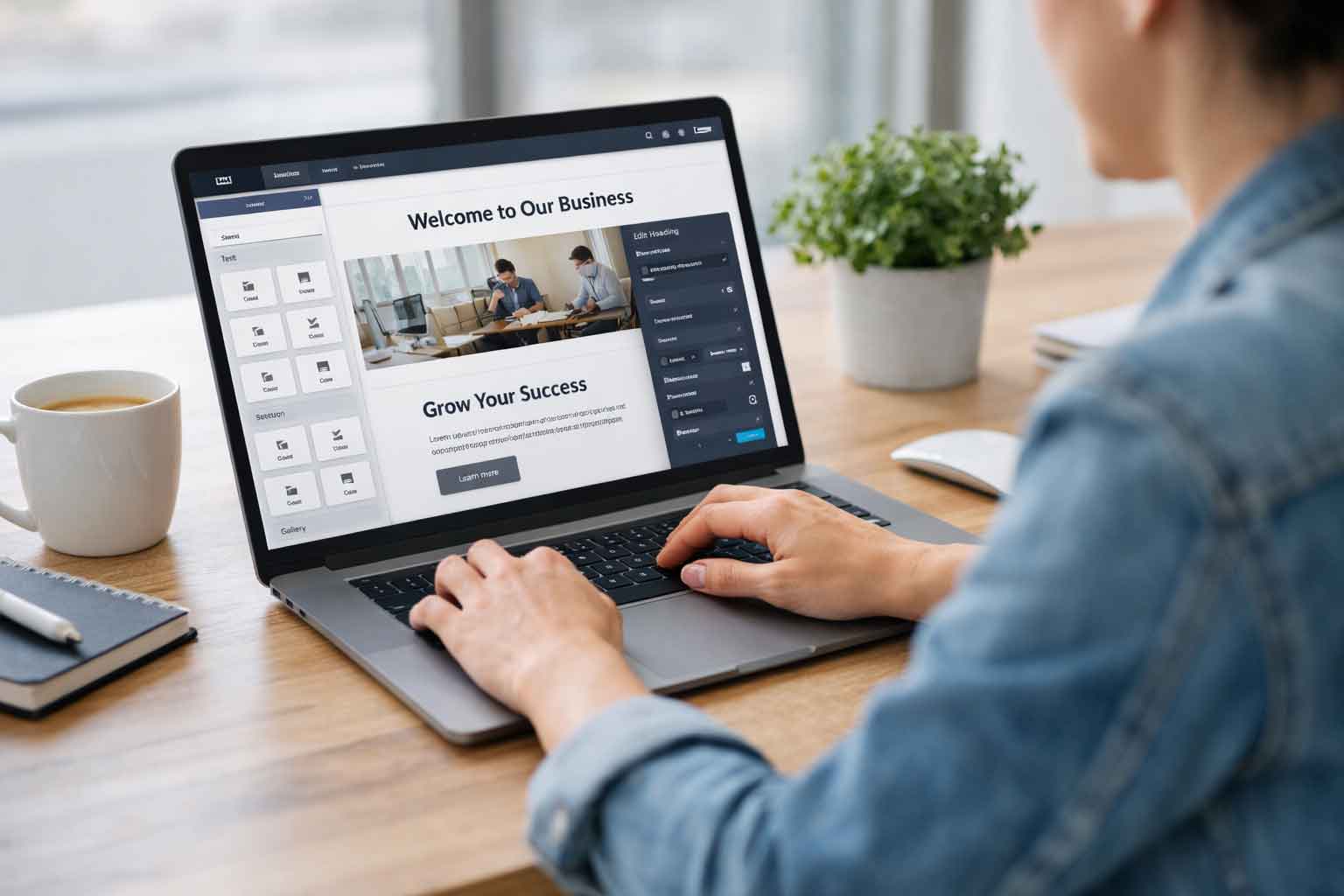
In today’s fast-paced digital realm, your website is essentially the online ambassador for your brand. It’s not just a pretty face; it’s the gateway to a fabulous user experience. It’s an intricate process that dances on the line of being both visually appealing and user-friendly. We’re not just here to create a website; we’re striving for balance, in that we need equal portions of pleasing aesthetics and stellar functionality. The goal is to create a harmonious online environment that not only catches attention but holds it. So, buckle up as we journey through the ins and outs of making a website that not only looks good but also works seamlessly.
First Impressions Last
In the digital world, first impressions matter, and visuals along with aesthetics are responsible for crafting that crucial initial moment. Your design serves as the welcoming committee, drawing users into your online space with its clean and engaging visual appeal. It goes beyond mere visuals; it crafts an environment that echoes your brand’s identity. Once the initial charm draws in the viewer, a well-thought-out design will seamlessly guide users through an enjoyable experience, making navigation intuitive and engaging, and content easily digestible. The fusion of style and functionality in your design isn’t just for show; it’s a narrative that captures the viewer’s attention, facilitates the journey, and creates a lasting impression. In a world where attention spans are fleeting, your design becomes the voice of your brand.
Prioritizing User Experience
Now, let’s dig into the nuts and bolts of functionality – a crucial element for a user-friendly website. Think smooth navigation, fast loading, and interactions that just work – the things that make using a site easy. The key player here is the user interface, making sure visitors find what they need without any unnecessary hassle.
When a website is designed for user-friendliness, it has a big impact. People stay longer, click around effortlessly, and you see fewer folks bouncing away. This combo of design and functionality not only makes for a better user experience but also leads to more conversions – basically, more people doing what you want on your site. It’s not just about having a website; it’s about making it user-friendly so your viewers stick around and get things done.
Aesthetics and Functionality
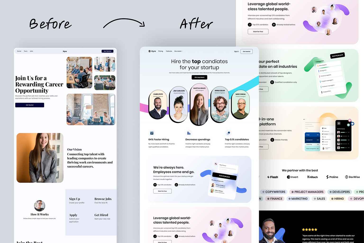
Crafting a successful website is a delicate dance between aesthetics and functionality. It’s not just about having a visually stunning site – if it’s a pain for users to navigate, you’re missing the mark. On the flip side, a highly functional but visually uninspiring site won’t capture and hold your audience’s attention. The real magic happens when you seamlessly integrate eye-catching visuals with a user-friendly interface. This creates an experience that’s both pleasing to the eye and easy to navigate, ensuring visitors stick around and explore what you have to offer.
In the world of web design, finding this sweet spot is a tricky thing but very necessary, and sometimes it’s trail and error, but when you find the right balance it’s worth it! Because it’s about more than just making a great first impression; it’s about building a site that people want to return to, creating a lasting connection between your brand and your audience. So, remember, it’s not just about looking good or working well – it’s about achieving the perfect blend of both.
Mobile Responsiveness –The Non-Negotiable Element
Let’s face it, we live in a smartphone-dominated age, so how a website looks and works on mobile devices is kinda a big deal. The move towards mobile isn’t just about a site looking good on a desktop; it’s about ensuring a smooth and enjoyable experience, whether you’re on a computer or thumbing through your phone. Aesthetics need to play well across different screen sizes, making sure users get the same vibe and ease of use, no matter the device. It’s not just about being pretty; it’s about being user-friendly, giving folks a hassle-free journey through your site, whether they’re on a laptop or a tiny phone screen.
Consistency in Branding
Maintaining a cohesive visual identity is fundamental for a well-rounded online presence. It’s not just about using the same colors, fonts, and imagery across your website; it’s more like creating a recognizable thread that ties everything together. Think of it as providing a consistent backdrop that guides your visitors through a seamless and familiar experience.
This visual unity isn’t just for aesthetics; it serves a practical purpose. When your audience sees the same visual elements throughout your site, it helps them navigate effortlessly and builds a sense of trust. Consistency in branding is like the steady beat in the background; it might not steal the spotlight, but it’s what keeps the rhythm and ensures your brand is remembered in the ever-evolving digital landscape. So, keeping it visually cohesive is more than just a design strategy; it’s a way to make your brand resonate with your audience.
User Testing
In the real world, the real judge of a well-balanced website design is the feedback you get from actual users. Engaging in usability tests, where people who aren’t necessarily tech wizards give your site a spin, can be a game-changer. Their insights might shine a light on areas where your site could use a little facelift in terms of aesthetics or functionality. Think of it like a collaborative effort; you take their input, make some adjustments, and repeat until you’ve got this polished product that marries good looks with practicality. It’s essentially about finding that elusive sweet spot where the visual appeal and the user-friendly experience shake hands and make your website a hit in the real world.
Conclusion
In the ever-changing landscape of web design, it’s like finding the sweet spot between looks and smarts. It’s not just about making your website look good; it’s also about making sure it works like a charm. Your website isn’t just a digital window display; it’s more like a cool journey for your audience. When you blend together the good looks and the brainy functionality, you’re basically creating a digital hangout that grabs attention and gives users a smooth and memorable ride. It’s not a fancy piece of art; it’s about turning your site into an effortlessly enjoyable experience for everyone who drops by. If you want more information or think you need help finding the right balance for your site, contact us at Full Scope Creative today.

