The Art of Visual Branding:
 In the world of design today, we tend to think of design in mostly a digital sense. And it’s true, the digital design format is the most popular design media for good reason, branding can now scale across countries allowing businesses to expand their reach exponentially. With all that said, the importance of visual branding cannot be overstated. A website’s design isn’t just about making it look aesthetically pleasing; it’s about creating a powerful, memorable brand identity. And maybe it will come as a surprise, but a lot of that identity doesn’t come from a website, but from graphic design, or in other words, the type of design that was initially, and still is, geared toward print.
So we must go back to the basics: the importance of printable design media and how it plays a crucial role in elevating your website design.
Establishing a Strong Brand Identity
Your brand identity is what sets you apart in a crowded digital landscape. It’s the perception that users form about your business. Graphic design is the vehicle through which you convey this identity. Here’s how different design elements contribute to establishing a robust brand identity for your website:
1. The Logo: Your Visual Signature
 A logo is often the first visual element users encounter, and it becomes the anchor of your brand identity. Think of iconic logos like Apple’s apple or Nike’s swoosh – they’re instantly recognizable. Your logo should be unique, memorable, and reflective of your brand’s values. A logo is basically the starting point for how you will portray your branding. It may introduce certain elements or visual cues that your overall branding will use to convey what is unique to your brand alone.
Think about Starbucks, the visuals in their logo, like the siren, are constantly used in their merchandise to help cement their branding and make them instantly recognizable. If you want to learn more about logos, check out our blog article: The Three Types of Logos.
2. Color Schemes: Conveying Emotion
Colors evoke emotions and associations. The right color scheme can create an immediate impression. For instance, blue can signify trust and reliability, while red can invoke passion and excitement. Consistency in color usage across your website reinforces your brand. On our Full Scope Creative website, we use colors of blues, greens, pinks, oranges, and purples throughout the website, as well as the exact shading that was chosen to assist in the cohesion and recognizable factor.
Then there are companies like McDonald’s, where their iconic red and yellow is so recognizable, that many people will think of the brand by merely seeing the colors.
3. Typography: A Silent Voice
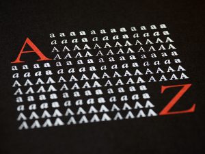
 Fonts have personalities. Serif fonts may convey tradition and professionalism, while sans-serif fonts offer a modern, clean feel. The fonts you choose for headings, body text, and other elements should align with your brand’s voice.
That being said, it also can be pleasing to the eye if you choose two contrasting fonts in your branding, it can add a great amount of visual hierarchy. Serif and sans serif can be combined to craft a visual offset that gives your eye a visual break. Fonts are their own kind of art form and we have a great blog article describing more about them: A Font of Information.
4. Design Elements: Reinforcing Identity
Icons, illustrations, and other visual elements should be aligned with your brand’s values and message. They play a crucial role in conveying your brand identity visually.
This would be the point where you would take all of your branding that you crafted already with your logo, color, and typography and attempt to craft graphics and visual elements that are visually appealing and consistent with those elements and your brand identity.
Aligning Graphic Design with Branding
Now that we’ve discussed how these elements contribute to branding let’s look at some practical tips for aligning graphic design with your website’s overall branding strategy:
1. Understand Your Brand’s Identity
 Before diving into design, have a clear understanding of your brand’s values, personality, and target audience. Think about your brand, why are you doing what you are doing? What’s the purpose? The core?
Hint: If it’s just to make money, your brand is going to struggle. Really think about why you are doing what you are doing, and then base your brand around that– people are more receptive to a brand if you explain your purpose and how it leads you to do your thing, rather than just telling people why your product is great.
Once you figure out your core, then consider the kind of people that would align with those values. It can be to a large group of people, but there should be a trend: a certain age group, certain gender, class, etc.
If you consider these factors it will help you devise the tone, the personality, and so forth that is needed to successfully portray your brand.
Your design choices should reflect these attributes.
2. Create a Design Style Guide
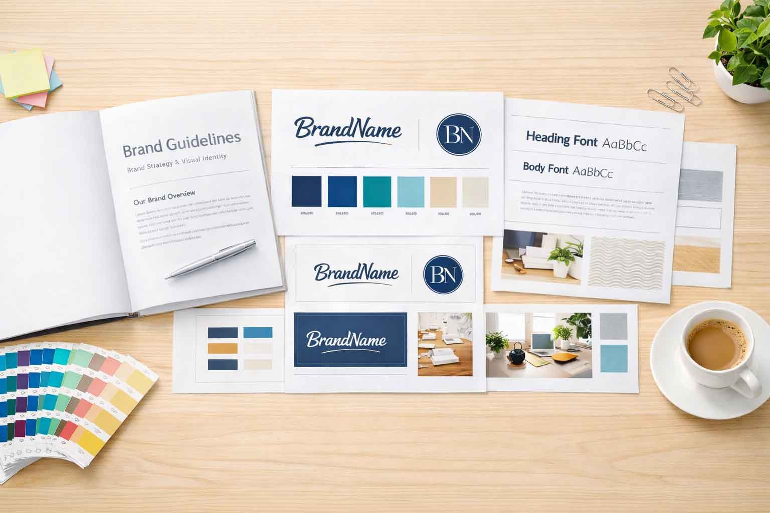
Develop a style guide that outlines logo usage, color palettes, typography, and design elements. This guide ensures consistency in design across your website and marketing materials.
It will allow people to look back to decide what size to create a logo for a certain type of media, how the logo can be altered, or what fonts or colors can be used. This way, if you are working with a group that will have to handle your brand elements, they will have a reference point and will likely craft your brand the way that you desire it to appear.
Otherwise, they may turn your logo the wrong shade of orange, and make the logo way too small. This makes everything so much more consistent in the long run.
3. Choose Design Elements Wisely
 Every design element should have a purpose and align with your brand’s message. Avoid clutter and choose elements that enhance rather than distract from your brand identity. There is a saying that ‘less is more’ and when it comes to design, this is very true. You will need your design to be recognizable at a distance, or to be broken down, etc. Your brand design should not be treated like an elaborate painting but as a snapshot of who you are.
That way your brand will seep it’s way into people’s heads and follow them for a long time without them even realizing it
4. Test for User Experience
Ensure that your design choices enhance the user experience. Elements like fonts and color schemes should be legible and accessible to all users.
There are times when I want to send off a design to a client. But I always take a step back and walk away before returning to it. I will often have people look at it so they can see things from a different perspective, and not with a designer’s eye.
They can give me great insight into how non-designers are going to view my work and let me know whether or not something looks different than how I intend it to be.
Real-World Successful Branding
Let’s take a look at a couple of real-world examples of websites that have successfully used graphic design to establish a strong brand identity:
1. Airbnb
 Airbnb’s logo is not just a symbol; it represents a sense of belonging and adventure. Their use of unique, hand-drawn typography and a distinctive color palette immediately conveys a warm, welcoming feeling.
2. Coca-Cola
Coca-Cola’s website is a masterclass in consistency. The iconic red color, the classic script font, and the use of imagery all reflect the brand’s timeless identity.
Conclusion
Graphic design is the cornerstone of visual branding for your website. It’s not just about aesthetics; it’s about creating a lasting impression, conveying your brand’s values, and connecting with your audience. By understanding the crucial role of graphic design in building a strong brand identity, aligning design elements with your brand strategy, and drawing inspiration from successful examples, you can elevate your website to new heights in the digital world. Remember, your website is more than pixels on a screen; it’s your brand’s virtual identity, and it deserves the best design possible.
If you have any questions or want help with your visual design, contact us with Full Scope Creative, we’d be happy to help.


