Creating a website for your small businesses is no easier and more available than ever. With products like Wix, Squarespace, and many other builders, turning to a DIY website is a step many businesses may take. While the DIY option can offer cost savings, it also comaes with it’s fair share of issues. There are several common mistakes that we see on DIY websites when small businesses opt for that route.
Cluttered Layouts
Possibly the most common design mistake we see on a number of DIY websites is having a cluttered layout. At Full Scope Creative, we’re always going to be advocated for having a lot of content on a webpage. We usually encourage businesses to have 2000 words of text or more on their home page. But more content does not mean cluttered. There’s a way to layout the content so that a page can show a great deal of content without being cluttered.
A key to remember with layout is to use whitespace. Whitespace doesn’t have to actually be the color white. It’s just any space that is used to create flow and breathing room visually on a page. Whitespace should always be used when two elements or rows line up together. When two elements or twos are together, there should be no less than 20 pixels of padding between the content. There are certain design situations that this might not be applied, but in DIY cases a good rule of thumb is to always keep that 20 pixels or more of space between any two elements.
A design should also include plenty of breaks or call out sections. These sections will often span the full width of a page and can include great content to help move a user along the conversion process. We have used these call out sections to showcase testimonials, quotes from ownership, product benefits, image galleries, and even a simple call to action. By including different breaks or call out sections, you can add plenty of content needed for a good SEO rankings, while not letting the page take on a cluttered feel.
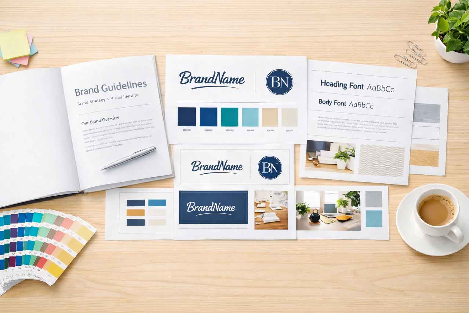
Inconsistent Branding
When I’m navigating through a DIY website, far too often it feels as if there are considerable changes from page to page. These changes might be changes in fonts, colors, or general styles throughout the site. These changes, while they may appear minor and insignificant, can dilute or lessen the impact of the brand for that business. To keep consistency strong from page to page, be sure to create a complete style guide that outlines your brand’s visual components such as fonts, colors, logo, and image options. By adhering to these guidelines, the website will keep consistent design elements from page to page, and not confuse or lose users along the way.
If a business doesn’t have a style guide going over fonts, colors, logo options, image choices and more, it’s probably a key indicator that the business should avoid a DIY website. A style guide like that is a clear starting point for any brand and business, regardless of size. Once the style guide is set, the logo, business card, website, and any marketing collateral or digital marketing should be based off of it.
Poor Navigation
Navigating a website, getting from page to page, from start to completion (whatever that may be) should be clear and effortless for users. DIY websites, however, fall far short on this step and neglect proper navigation and structure concepts. When doing a DIY website, be sure to keep the navigation at the top of the site, with clear organization, easy to use interface, and no – I mean zero – drop downs off of drop downs.
If a page navigation begins to feel too large or confusing, review your page organization and structure and if that content is really needed. Too often, DIY websites will have links to each and every page in the main navigation. Unless a site is fairly small, under 10 pages, not all of the links should end up in the main navigation.
Lack of Mobile Optimization
For so many reasons, a website must be optimized for mobile use. Google will view a site poorly if it is not optimized to work on all platforms and screen sizes. If a site isn’t optimized for mobile responsiveness it could pose many issues for ADA compliance as well. Today, it is essential that site designs are built with responsive readiness. If you’re going the DIY route, be sure to select a website builder that puts the proper importance on the responsive design.
And just beecause a website builder says that the site is optimized for mobile, you’ll want to be sure to double check. Navigate your website on a number of different mobile devices. If you only have a few to test on, you can always shrink the size of your browser window down to give a fell for what the site will work like.
When testing the mobile performance of a DIY site, be sure to check for things like the whitespace needs. On a desktop view, 20 or 40 pixels of whitespace might be perfect, but on a mobile device that might be too much or too little. With the DIY builder you choose, be sure that you can specify those various changes for many different platform and screen sizes.
Ignoring SEO Basics
You can build the most beautiful DIY website, and pour hours of time into it, but it will all be for nothing if you ignore the basics of search engine optimization (SEO). SEO is key for driving traffic to your website and increase conversions on the site. Sadly, far too often, businesses that opt for the DIY approach fail to follow SEO principles in their design. These principles can be things like ignoring ALT text, not optimizing meta tags, not using proper keywords, not implementing Heading tags, and more.
If you are doing a DIY website, be sure to take the time to familiarize yourself with SEO basics and best practices. You’ll want to follow those techniques on every page of the site. Depending on the DIY builder you choose, there might be limits as to what plugin options are available on the site to help get the best rankings possible.
We’ve had many businesses come to us to help with their SEO on the site after it’s been built. While we can always help out, there’s often limits or significant increases in expense on what we can do to help boost the site in rankings. Many of the issues mentioned in this blog, particularly cluttered layouts and poor navigation, can have a negative impact on overall search rankings.
Avoid common pitfalls
While DIY website design can be empowering and cost-effective, it’s essential to avoid common pitfalls that can undermine the effectiveness of your website. By steering clear of cluttered layouts, maintaining consistent branding, prioritizing navigation usability, optimizing for mobile devices, and implementing basic SEO techniques, you can create a professional-looking website that effectively communicates your message and engages your audience. Remember, investing time and effort into thoughtful design and optimization will pay off in the long run, helping you achieve your online goals more effectively.