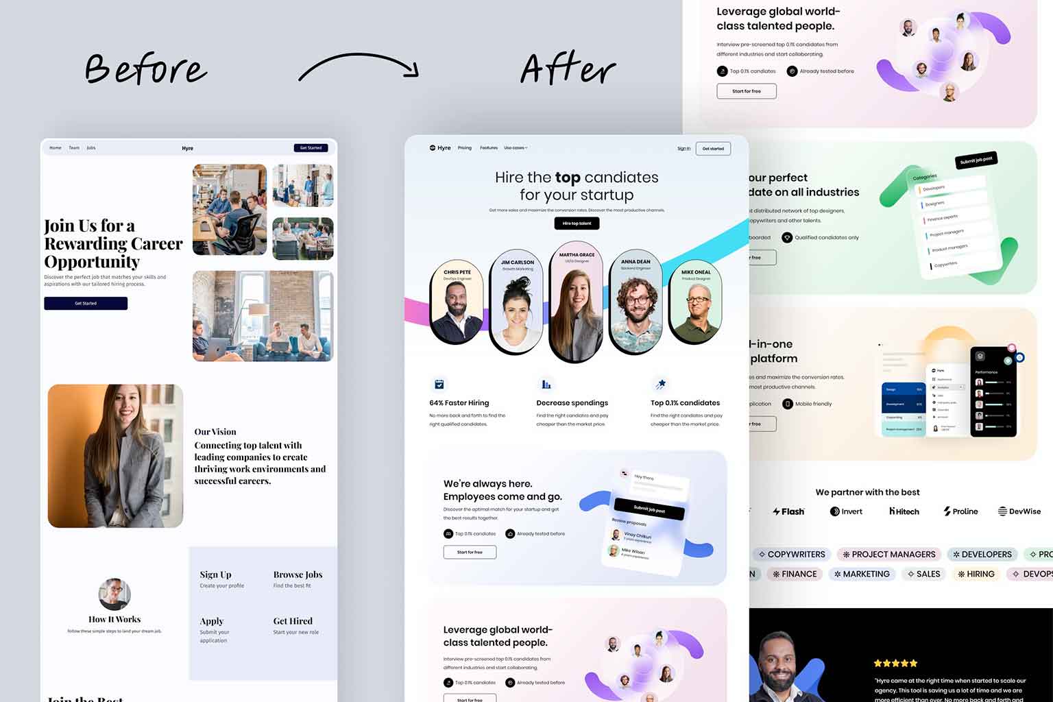
If you were to look through my portfolio and look at the contact link in the main navigation on just about every one of them, you’d find it to be the far right link in just about all of them. The reason for this is simple – it’s where most people expect to find it.
When you are looking to find the front door on a house, where do you look? The front of the house, right? I only know of one house where that isn’t the case. On a family friend’s house, the front door is actually located on the side of the house. Thankfully the sidewalk takes you right to the door and it is easy enough to find, but it is still a very odd layout and can be confusing to many people. I’d hate to be a pizza delivery driver going to their house.
On a website, the main thing people are looking for is your contact information. On most sites the contact link is located at the far right hand side of the main navigation. Because of this, I hardly ever, if ever, will put the contact page in a different location.
When people are looking at your site, there is a good change they are looking for your contact information. Don’t hide the link, place it as the far right link and make your users’ day that much easier.


