Design plays a very important role in marketing
Earlier this year, my wife and I took our 5 year old nephew to Bay Beach. If you’re not from the Green Bay area, Bay Beach is a local family focused amusement park with rides like the ferris wheel, bumper cars, trains, merry go round, and more. Our nephew, Sawyer, had no idea what all Bay Beach was while we were walking into the park. He was wide eyed and excited and almost didn’t know what to do. There were so many lights and sounds and rides to choose from, he didn’t know where to start. Thankfully, he had his (favorite) aunt and uncle with him and we were able to guide him to getting tickets and then to picking out the best rides to go on.
That awe and bewilderment that Sawyer had walking into Bay Beach, is a similar experience that people can have when looking at a number of marketing design pieces. I’ve seen an unfortunately high number of designs for pieces like flyers, brochures, business cards, and even websites that have a beautiful, detailed, and creative design, but end up missing the mark as a marketing tool. When it comes to graphic design and marketing, the design plays a very important role in how easily and efficiently your message reaches your audience. A great-looking design doesn’t always make it a great marketing piece or that it will even work well. Overly complex designs can often do more harm than good.
The Problem with Complex Designs
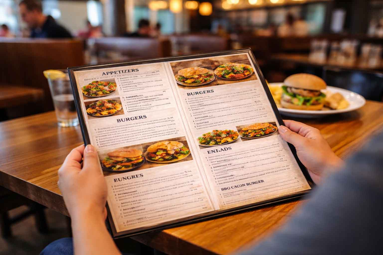
As business owners (and even as graphic designers), it can be tempting to go all out with a design. A visually complex flyer, brochure, ad, or website might look beautiful and impressive or showcase a designer’s skills, but it can far too easily confuse or overwhelm the intended audience. When a graphic design or branding piece includes too many competing elements—whether that is multiple fonts or an overload of colors or excessive images or a cluttered and busy layout—the message and story you are trying to share gets lost.
Marketing is about guiding your audience to take a desired action. That action could be wanting them to sign up for a newsletter, visit your store, or contact you for a service. The design should lead or encourage them to do just that. Overly complex designs tend to create distractions and cause confusion (and frustration for users), and eventually make it unclear what the next step should be.
Less Is More: Simplicity Wins
The most effective marketing designs are often those that are simple, clean, and have a clear and defined path for your audience to follow. This by no means a call or reason for making a design boring or plain. It’s a call to keep marketing designs purposeful and easy to navigate. Simplicity allows your marketing message to speak clearly and gives your audience a clear focus.
Think about some of the best ads or marketing pieces you’ve seen and been motivated by. They often have one strong visual or headline. Then further down follows a call to action (CTA) that directs you exactly what to do next. That’s the power of simplicity and organization. Designs with simplicity and organization will cut through the noise and chaos of the world and help the audience focus on what matters most.
Beautiful Design Doesn’t Always Mean Effective Marketing
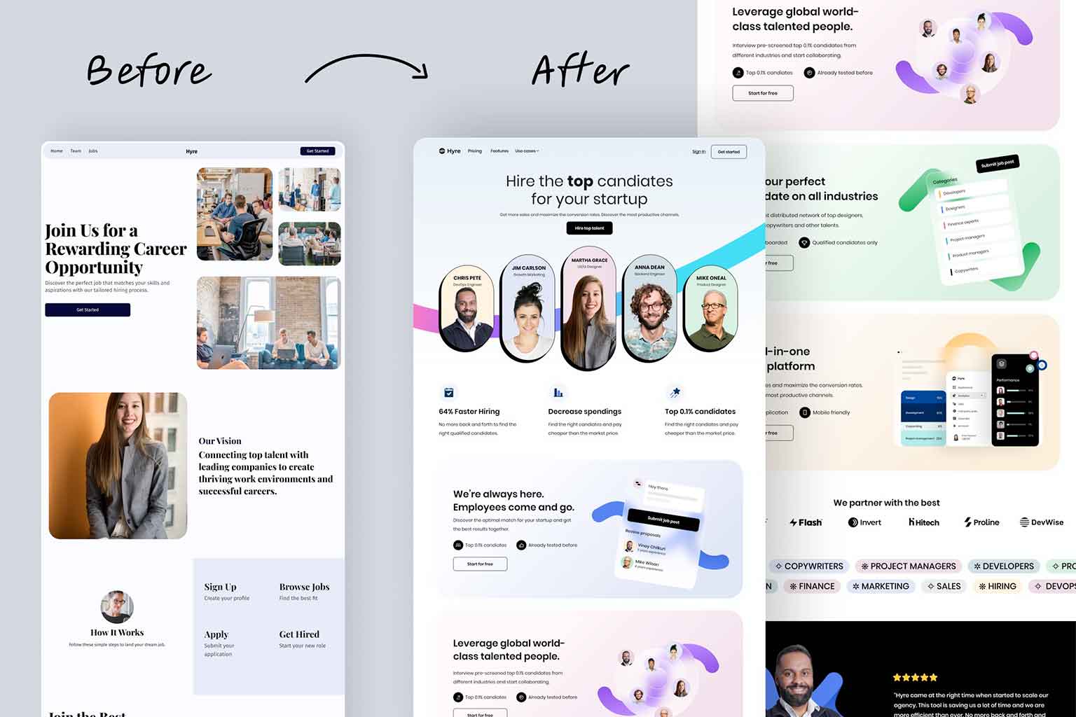
A similar issue is the assumption that just because a design might look beautiful on paper that it will translate well to other formats, such as a website. Print designs and digital designs, while they have similarities, are different in how they engage users. What can work on a flyer—elements like a large block of text or intricate detailed patterns—won’t always work well on a website, where users need to be able to and expect to be able to navigate quickly and efficiently.
A website should have a very clear layout with simple navigation, minimal distractions, and easy-to-find CTAs. Overloading a web page with complex designs or graphics or text-heavy sections can make it difficult for users to engage with the content or find what they are looking for. Beauty on paper doesn’t always promise to equal beauty or even effectiveness on a website. This can ultimately lead to a website that fails to produce results.
What Makes a Great Marketing Design?
For a marketing design to work, be sure to prioritize clarity and direction. Here are a few tips to follow:
- Focus on one clear message: Don’t try to “be everything to everyone” and say too many things in one small piece. If you’re advertising a promotion, make that the main (or only) focus of that marketing piece.
- Use whitespace: Any marketing piece needs room to breathe. Whitespace helps visually separate out important elements and helps to prevent the audience from being overwhelmed.
- Limit fonts and colors: Follow a cohesive and designed color scheme and use only one or two fonts on a marketing piece. Too many fonts and color variations can create visual chaos and confusion.
- Include a strong CTA: Whether it’s “Call us today,” “Sign up now,” or “Learn more,” a clear CTA ensures your audience knows what to do next. There should also be some actionable information included such as a phone number, website, email address or something to use in that action step.
Marketing is more than just a beautiful design
Great marketing design is about a lot more than just about looking beautiful. It’s about designing and creating a marketing piece that clearly communicates your message and guides your audience in what to do next. Keep it simple, clean, direct, and focused, and you can find your marketing efforts are much more successful. Without clarity and direction in marketing designs, confusion tends to follow. When we walked into Bay Beach with Sawyer, he was immediately confused and overly excited (overwhelmed). Thankfully Uncle Chris and Aunt Alicia were there to guide him and help him have a great time. Don’t let your marketing designs end in confusion and an overwhelmed audience.