Better Calls To Action On a Site

Clear calls to action help guide website visitors instead of leaving them guessing what to do next. Just like good signage in a new building, CTAs create clarity, reduce frustration, and lead users where they want and need to go. If your website feels confusing, stronger CTAs can make all the difference.

Why Clear Calls to Action Matter

When I went to a new doctor a few months back, the experience was different than I was used to. The check-in went fine eventually and the appointment itself was great, but parts of the visit were confusing. I wasn’t exactly sure which door to go in. I wasn’t certain which desk to check in at. I was told to go down hallway A, into room 25, and just wait there.

Nothing was wrong, but I was asking myself, “Am I doing this right?”

Fast-forward three months and my knee is feeling great thanks to surgery, but that first visit has always stuck with me. 

It reminded me of the feeling many people get when they land on a website for the first time.

I’ve visited plenty of websites that give me that same confusing experience.

Do I click this link?
Do I scroll down?
How do I get to where I actually want to go?

That hesitation is a problem, and it’s exactly what clear Calls to Action are meant to solve.

Call to Action buttons and graphics, often shortened to CTAs, guide users to where they want to go and just as importantly to where they should go next.

Guide Users Where to Go

Most visitors don’t arrive on your website knowing its structure. They don’t know what pages you have, how things are organized, or what the best next step is. What they do know is that they’re looking for something.

Your job is to help them find it.

Strong CTAs guide users to:

  • A product page
  • A service page
  • A contact form
  • A booking or inquiry page

That conversion doesn’t always mean buying something. Sometimes the goal is simply starting a conversation.

Clarity matters here. The user should know exactly where they’re going when they click a button. If they land on a new page and immediately think, “Why am I here?” the CTA didn’t do its job.

Good CTAs reduce uncertainty. They make the website feel easier to use and safe, even if the visitor doesn’t consciously realize why.

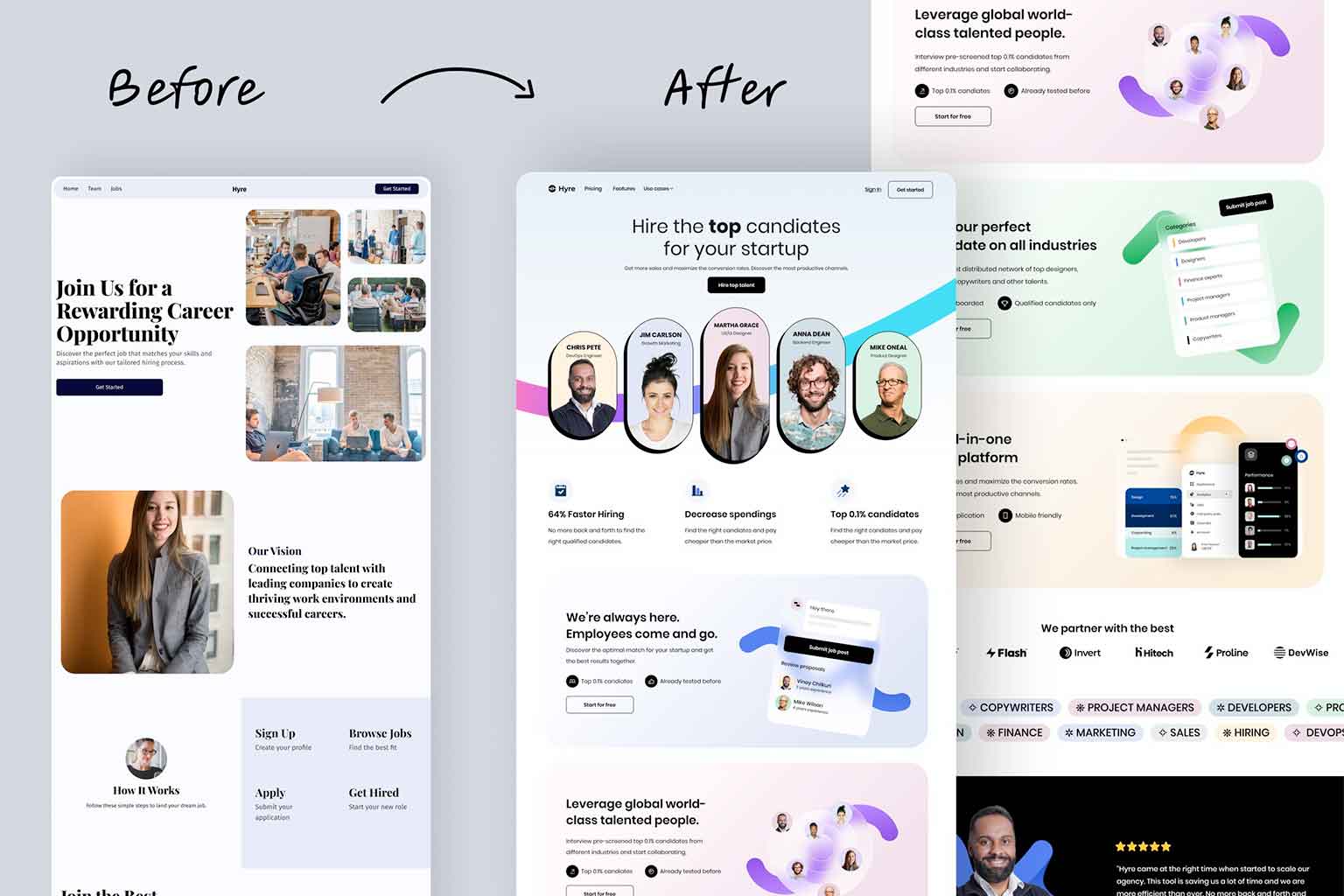
Guide Users Where You Want Them to Go

There’s also a strategic side to CTAs.

Once someone is on a service or product page, sending them to another page, like an About page, usually isn’t helpful. They’ve likely already seen your homepage, learned a bit about your company, and learned what you do.

What they need next is direction.

This is where conversion-focused CTAs come in:

  • Request a Quote
  • Schedule a Consultation
  • Get Started
  • Contact Us Today

For many small businesses, that last one is still incredibly effective. The contact page becomes the conversion point.

If your website doesn’t clearly guide users toward that next step, you’re asking them to figure it out on their own, and many won’t.

Not sure where users should be going next on your site? This is something we help small businesses sort through all the time at Full Scope Creative. Sometimes it just takes a little clarity and intention.

Don’t Be Annoying With Your CTA

Attention is good. Annoyance is not.

You’ve probably been to websites with flashing buttons, blinking backgrounds, or aggressive pop-ups. They might grab attention, but usually for the wrong reasons.

Drawing attention is good.
Being distracting or overwhelming is very bad.

A good rule of thumb is this. If you look at a CTA and think, “That might be annoying,” it probably is.

CTAs should feel confident and helpful, not pushy or desperate. In most cases, subtle emphasis works far better than loud visuals.

Use More Than One

Not everyone interacts with a website the same way.

Some people are drawn to buttons. Others notice imagery first. Some prefer clear text links, while others respond better to larger graphical elements.

That’s why relying on a single CTA style can limit how effective your site is.

Using a mix of:

  • Button styles
  • Section-based CTAs
  • Supporting graphics
  • Thoughtful placement throughout a page

…helps guide more users without overwhelming them.

At Full Scope Creative, we spend a lot of time thinking about this when we build sites, including our Premium Framework sites. Clear, intentional buttons make it obvious what to do next, and that clarity makes a real difference for users.
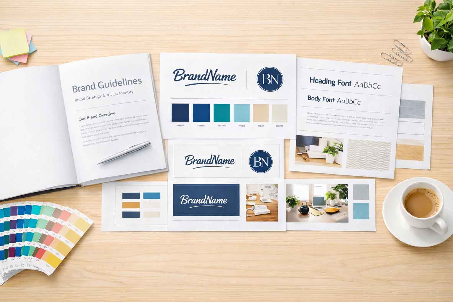
Stick to Your Brand

CTA buttons and graphics are not the place to introduce random new colors or fonts.

Your brand should already have a defined color palette, typography, and visual style. CTAs should be a natural extension of that brand, not something tacked on.

Consistency builds trust. When buttons look like they belong, users feel more confident clicking them.

Clear Direction Makes a Better Website

Clear calls to action don’t just help users navigate your site. They help turn interest into real conversations and real opportunities.

If you look at your website and think it feels confusing, cluttered, or unsure of what visitors should do next, it’s usually not a content problem. It’s a clarity problem.

Not sure what to do with CTAs on your website? Full Scope Creative can help give you ideas, direction, and a clearer path for your visitors. If you’d like a second set of eyes on your site, reach out. We’re always happy to talk it through.

Ready to discover how we can help make your website and marketing more successful?
Contact Us

Marketing Made Simple

Insights from Full Scope Creative

Our thoughts on website design, graphic design, marketing, SEO, website hosting, branding, business management, and more here in the Full Scope Creative blog!

Insights, Tips, and Strategies for Small Business Success

Our blog is packed with expert advice on website design, SEO, marketing, branding, and more. Whether you’re looking to improve your website’s performance, boost your online presence, or streamline your business’s digital strategy, you’ll find valuable insights and actionable tips right here.

An example of a brand design guide

What is a Brand Design?

What is a brand design? It’s more than a logo. Brand design defines your colors, fonts, textures, and overall visual style so every part of your marketing looks consistent and professional. For small businesses, strong brand design creates clarity, improves websites, and makes future marketing easier and more effective.

Read More »

Which Website Builder Is Best for WordPress?

Trying to decide which website builder is best for WordPress? Divi, Beaver Builder, WP Bakery, and Elementor all offer different strengths. In this guide, we break down what each builder does well, where they fall short, and why Elementor is our top choice for small business websites at Full Scope Creative.

Read More »
ACF and Elementor are easy to use and can add so much to a site!

ACF and Elementor

ACF and Elementor allow us to turn a basic WordPress site into a structured, easy-to-manage system. With custom fields, custom post types, and dynamic layouts, your content stays organized and simple to update. Full Scope Creative sets it all up so you can just fill out fields and publish with confidence.

Read More »
4 servers and the 4 different types of website hosting.

What Are the 4 Types of Hosting?

What are the 4 types of hosting? Shared, VPS, dedicated, and cloud hosting each offer different levels of cost, speed, security, and control. In this guide, we break them down in simple terms so small business owners can understand their options and choose a hosting setup that fits their needs and budget.

Read More »
business owner going over a checklist

Your Site Isn’t Ready for SEO If…

SEO can drive real growth for a small business. But if your website is slow, hard to use on mobile, thin on content, or not focused on the right keywords, you may be wasting money. Before investing in SEO, make sure your site is built and structured to support it the right way.

Read More »

List out all of your services

Many small businesses offer more services than their website lets on. When those services are hidden or scattered, potential customers never see the full picture. This blog explains why clearly listing every service matters, how to structure services pages, and how the right setup helps build trust and guide visitors toward the next step.

Read More »
a website with a good CTA button

Better Calls To Action On a Site

Clear calls to action help guide website visitors instead of leaving them guessing what to do next. Just like good signage in a new building, CTAs create clarity, reduce frustration, and lead users where they want and need to go. If your website feels confusing, stronger CTAs can make all the difference.

Read More »

Do I need to redesign my website?

Do I need to redesign my website? It’s a question we hear all the time, and the answer is usually “maybe.” Some sites are outdated but workable. Others are held together with digital duct tape. This article walks through how to tell the difference and why starting with the “why” matters more than jumping into a redesign.

Read More »
Illustration showing a website displayed on a computer screen with SEO elements like charts, content blocks, and targeting icons, explaining the question “Does Web Design Include SEO?” and how design and search optimization work together.

Does Web Design Include SEO?

Does web design include SEO? Not exactly, but the two work closely together. Web design focuses on structure, usability, and experience, while SEO focuses on visibility and how people find your site. A successful website needs both working together to reach its full potential and support long-term business growth.

Read More »
Ready to discover how we can help make your website and marketing more successful?
Contact Us
Chris was wonderful throughout the entire process of building my website! He is very knowledge, patient and attentive to details. Would definitely recommend him to help you get your business going 🙂
~ Inadia Clifford,
Melted Moo