Think of the Potentiality When You Add Personality To Your Website
Here at Full Scope Creative, we often feature a movie or a song that ties into the topic we want to discuss. So, here goes, without further ado.
Back in the early ages of music (No, not that far back) there was a song called “Personality” by Lloyd Price. In 1959 it reached number 2 spot of the Billboard Hot 100.
It’s a clever tune and the refrain goes like this… ‘Cause you’ve got Personality, walk (with personality), talk (with personality), smile (with personality), charm (with personality), love (with personality) And plus you’ve a big heart.
Yup, personality. Have you got it in your website? This is important to know. You see your business is a living, breathing, entity. It is an extension of your store front. More importantly, it is, to some extent, an extension of you.
You have a personality and probably a fairly enthusiastic, savvy one too. Otherwise, you wouldn’t be in business.
So today we are going to talk how to personally personalize your website to its fullest advantage.
You’re probably thinking, how the heck am I gonna do that? Three of the easiest ways are through:
- Photos
- Unique fonts
- Copywriting
If you’re ready, let’s put a little pizzazz in your website.
A Picture Is Worth A Thousand Words
We’ve all heard this saying probably many times over. Yet it’s so true. Think about it. You can read an hour or more on the devastating effects of war until your eye glaze over. But one image showing the ravaging effects of war on a town, city, or its inhabitants, can stay in your mind forever.
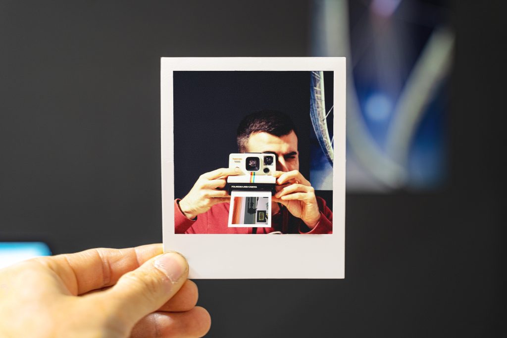
A photo that evokes an emotional response will far out-weigh the surrounding copy. That’s why when building a website, careful consideration of all the photos needs to be addressed. No matter what business you are in, quality photos will leave a deep impression.
If you don’t believe me, then let’s read what the experts say. Why Photography is Important in Marketing is an article from Guttulus The Marketing Internet Cat. This article makes some persuasive points as to the validity of using photos in your marketing message.
Here are the major takeaways:
- Great photography gets attention
- Establishes your brand identity
- Influences people’s emotions
- Improves understanding and increases engagement
- Promotes action and drives sales
Each one of the above bullet points are pretty self-explanatory. Of course, great photography will always get attention.
Great Photography Has Its Rewards
If you have been using your phone to do your pictures (and I’m not saying phones don’t take great pictures…they do), you might want to consider professional ones. Professional photography of highest quality down to the smallest detail, will capture the imagination while leaving lasting impressions.

There is no better way to get your brand out than through use of photos. This is especially true if the photos used create and put your audience in the right mood. Remember your website is all about promoting you and your brand. This will help to put your best foot forward.
It can’t be stressed enough how photos are instrumental in working on people’s emotions. This is extremely important, especially when you are trying to help a person to complete the sale. You definitely want your photos to bring out a positive reaction to your products and/or services.
Just like our picture being worth a thousand words, photos increase brain processing. With beautiful images you can help your customers to quickly process the data they are seeing. It reduces the lag time and moves a customer to engage faster.
Great photos do improve the way a person responds. When used in sales strategically it will promote the customer to take the action you desire, i.e., drive sales.
And one big rule with photos is your website needs to include pictures of you, your team, and possibly your office. Additionally adding how unique your products and services never hurts either!
How Fond Of Fonts Are You?
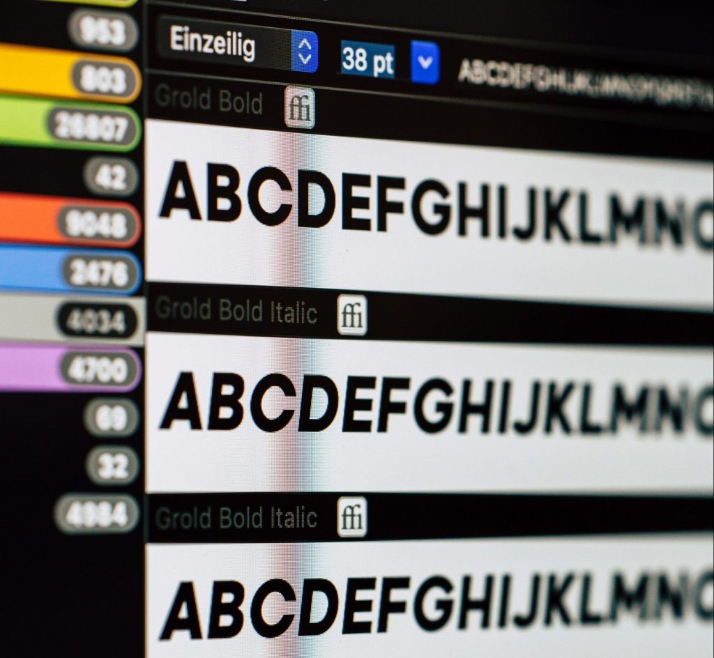 Not long ago I wrote a blog about fonts and why it’s important to understand the do’s and don’ts of font-ery (Hey, I made up a word!).
You probably already know that there is a plethora of fonts to choose from. What you might not know that, like many things in life, you can choose a font that speaks a certain mood or feel.
For example, if you are light-hearted and jovial, you might be more drawn to a more rounded or serif type of feel. More business-like, or on a serious side? I’d stay with a San-serif font, like a Helvetica. You probably are pulled toward the more modern, clean typeface. Basically, it is the opposite of the Serif (i.e., no rounded corners).
When delving into the fascinating fun of fonts, I discovered there is a whole psychology behind those funky guys (fonts).
What Your Font Is Saying About You
The following is from an article entitled, The Psychology of Fonts (Fonts That Evoke Emotion) by Grace Fussell. What is most amazing, (but one we can use to our advantage in web design strategy), is strategic use of fonts.
Apparently, designers and businesses have used font psychology in their advertising for some time (who knew?). According to this article, “An understanding of font psychology is key to shaping both how memorable a brand is, and how customers perceive it.”
However, there is more to it than that. Being the superior animal we are, we tend to be more engaged with the visual than the written.
So now it’s time to think about your brand and put some of this into context. This was mentioned briefly above but let’s dig a little deeper.
What Font You Align With And Why
Did you know that a font choice can affect a viewer’s mood and perception? Yes, it’s true. I have already touched on this above but I want to explore this a little more so you have a good understanding why you might be drawn to one font over the other.
There are 6 major font groups. Below is each font designation and the psychological benefits derived by using that particular
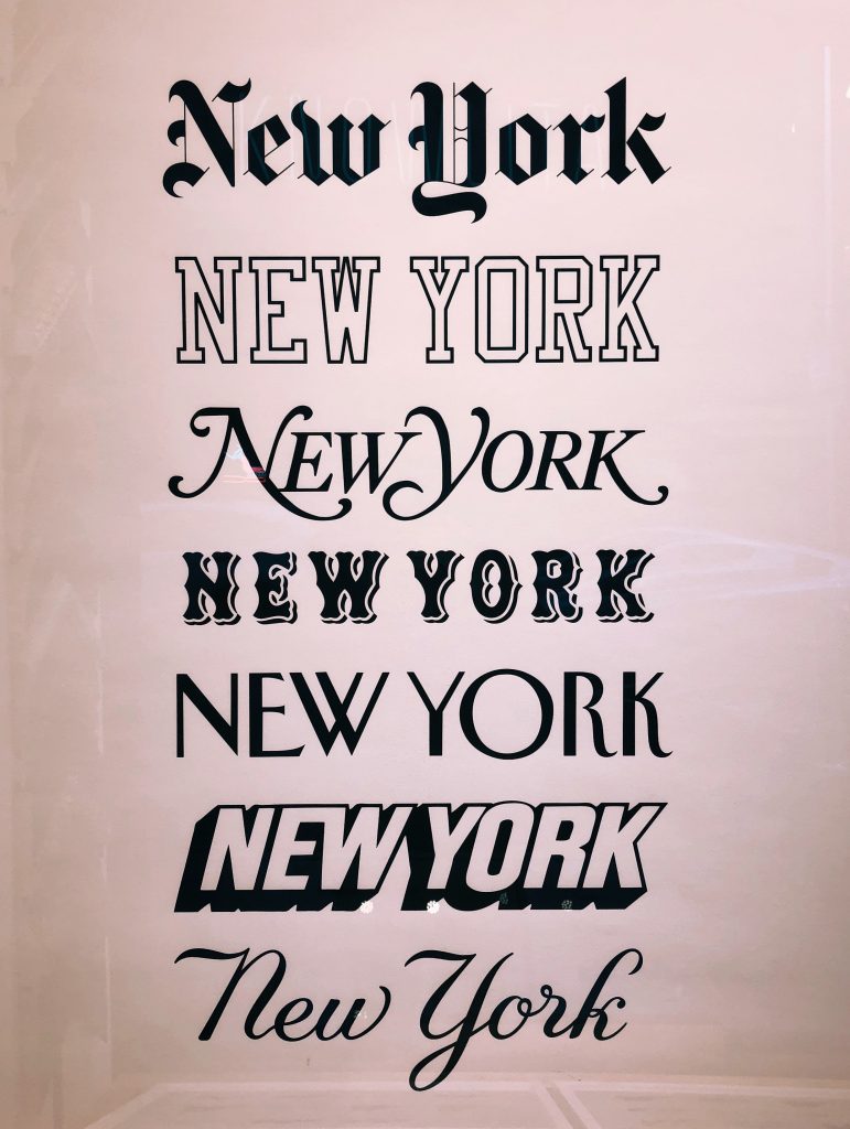
one:
- Serifs: Its all about trust. It’s built on tradition,coming mostly from the publishing companies. It also denotes intellect, formality, and dependability. Examples would be Addington, Baskerville, Caslon, and Garamond.
- Slab Serif: Think big and beefy. Very masculine, powerful, and strong. It’s natural to recognize this font right away. It’s thicker but borrows some of the serif traits in that it is still showing stability and tradition. Typically, it is a go-to font for electronic companies and car manufacturers (promoting that power-masculine feeling). But be careful with this one as it may come off as too confrontational used in the wrong setting. Good choices would be BW, Darius, Detroit, Glen Slab, and Rockwell.
- San Serif: This one is downright friendly. It’s progressive, informal, and open. So friendly in fact if this font were humanized you might invite it out for coffee. This font is popular with social media sites because it gives off the air of being forward-looking. Other adjectives used with this font might be progressive, modern, innovative, and adventurous. Fonts’ to try in this category are Arial, Modelica, and Open Sans.
- Modern Sans Serif: not to be outdone by sans serif, this font screams chic. It’s elegant with a touch of futuristic. This is your fashion forward font across the board (think Valentino, Dior, and Calvin Klein). However, it is popular with children’s brands evoking a sense of playfulness and innocence. If this one appeals to you look toward Futura, George Round, or Okana.
- Scripts: If you or your brand is all about fun, then you’ve come to the right place. Also known as being creative, amusing, childlike, fun, and romantic. Most often associated with Valentine cards or seen on wedding invitations. Popular brands that use Scripts are Coca-Cola, Ray-Ban and Budweiser, to name a few. Font-wise, stick with Seldoms or Sinisuka.
- Display: aka Independent Fonts. When you can’t place a font in a specific category because it’s novel, then it belongs here. Other ways to describe this font would be adaptable, unique, or trail-blazing. What makes it unique is that sometimes it uses a mixture of graphic images with text. Think Tour de France or the NASA logo. If this font appeals to you try CA Negroni (not the drink), Cheese Sauce, or Addison.
Alas, I’m out of gas on fonts which means it’s a suitable time to move on.
Do Your Words Create A Wealth Of Opportunity?
So far, I have barely touched on words. However, words do have a place of importance in your website. Remember, words can be used to:
- Create a story that is so inspiring that it…
- Connects with your customer’s inner compass. If done properly it will…
- Compel them to take the next step (hopefully to buy that product or service)
So far, we have written about how photos can inspire emotions and be used to sell your website. I would be remiss if I didn’t mention that sometimes powerful words can elicit feelings too. True, maybe not as fast as great photos, but ones that shouldn’t be dismissed.

Here’s the deal, with words you can put in a ton of personality into your website. The whole point of web copy is to draw your potential client in and keep them there. Maybe it’s telling your origin story or explaining the value you create Maybe it’s just telling a story that captures the imagination. Clever writing is needed throughout.
The point of your website is to deliver great content. If done correctly it will drive traffic to you which may lead to a conversion in sales. Additionally, when written, the content should help your visitors to navigate the site.
So, course adding in the all -important key words and long tail keywords will further move the needle toward more Ch Ching in your pocket.
But it all comes back to the words you use. They are powerful indeed. If you struggle writing, then talk to us at Full Scope Creative. We have a word or two up our sleeve that might be useful.
Leaving You With One Last Thought
The moral of this blog is…if you want to see epic gains in your website, find your personality. How do you do this? Through photos, fonts, and great copy. It’s like the sweet spot of all sweet spots.
Singularly each one is amazing. Combined, well let’s just say that’s when the magic happens. Remember, at Full Scope Creative, we are a fully optimized website design company, from start to finish.
We’d love to have a conversation on how we can assist you.

