FAMILIARITY IN LOGO VARIATIONS
 So… the last article I may or may not have unintentionally created one large Disney advertisement due to discussing the importance of nostalgia and how it stems from familiarity when it comes to branding. It was essentially another way–outside of the already present articles that were recently written–to depict how important familiarity can be for your brand and the effect it can have on people, including myself. I also mentioned in that article about the fact that when I think of the Disney logo I think primarily of its letter D and then proceeded to discuss my sentimental feelings over why that is and how it’s connected to my childhood belief that it couldn’t be the letter D and instead a G. However, I’m sure I’m not the only one who thinks of the titular “D” in Disney, and that is for several different reasons that don’t have to do with sentimentality, but with branding.
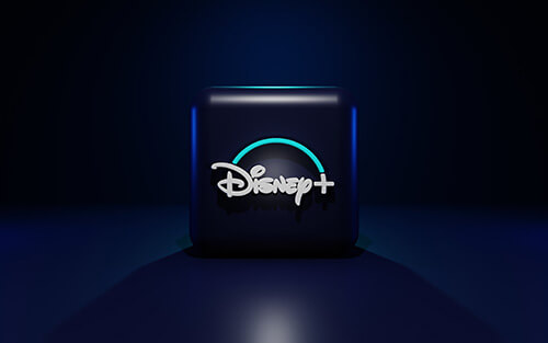
Disney has a very unique wordmark due to its customization. You don’t see that font anywhere other than Disney because it’s theirs. But secondly, Disney uses its letter D as an icon. Now I have discussed the importance of logos and how they need to be flexible and so forth in a recent article, and Disney is a great example of having a detailed logo that is very flexible thanks to its logo variations. The Disney logo is pretty elaborate with its castle and wordmark, but when it needs to be presented in the smallest fashion possible, like a favicon (the tiny logo you see in the corner of a browser tab. If you check your tab right now, you’ll see a tiny Full Scope Creative wheel, that’s a favicon) then Disney will use its titular letter D to represent itself. That is yet another reason why Disney’s first letter is so memorable from the logo, it is present no matter where the logo goes and creates a great sense of familiarity and memorability.
 Even Disney, with its elaborate logo, finds a way to be versatile when presenting its logo. And that is all thanks to its multiple logo variations. Now everyone talks about how you need a logo for your brand, but what you may not know is that logo variations are equally important. I stated that logo flexibility is essential for modern logos in order to spread your branding and to be able to show your logo to everyone in Logo Redesign Part 2: Is It Time to Update Your Logo? and having logo variations is all part of that.
SIX TYPES OF LOGO VARIATIONS
So what are logo variations? Essentially they consist of breaking your logo down into smaller different types that can work for all types of media and representation. It’s all in the name of being flexible and accessible in order to get your logo to work and make sense in whatever form it is shown. I mean, if you have a detailed logo (like Disney) how are you going to show it in things like an app icon? Or in a favicon? It has to be recognized no matter what. So that is why you should have as many as six types of logo variations and they are the following:
 Primary Logo
- Secondary Logo
- A horizontal or vertical version
- Wordmark
- Icon based
- Single Color
There are other options for what you can do with your logo, but these are the primary versions that all logos should have, and any others are to assist with additional branding purposes. Honestly, there are many different ways a company can portray its logo to assist in branding which makes for many more logo variations. If you have questions, contact us with Full Scope Creative and we would be happy to talk to you about more ways to utilize branding for your company!
PRIMARY LOGO
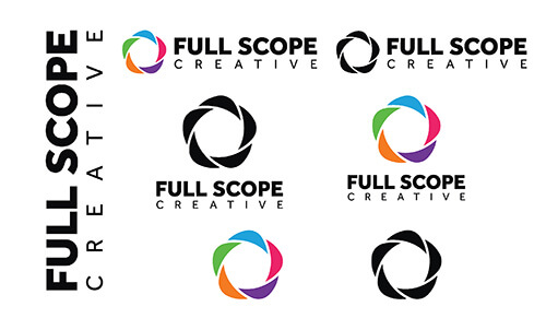
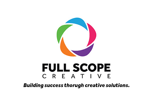 So… what is the primary logo? Well, it is essentially your main logo with all the bells and whistles! It has all of the logotype (this is another word for the text in a logo) as well as the logomark if incorporated (graphical symbol in a logo). For more information on different types of logos check out our article The Three Types of Logos. This primary logo also has taglines in it and any other information that may be included. Essentially this is your most recognized and widely used logo that all other variations stem from. For Full Scope Creative, your main logo is the colored wheel (or camera scope) symbol with the words “Full Scope Creative” as well as our tagline “Building success through creative solutions”.
SECONDARY LOGO
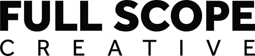
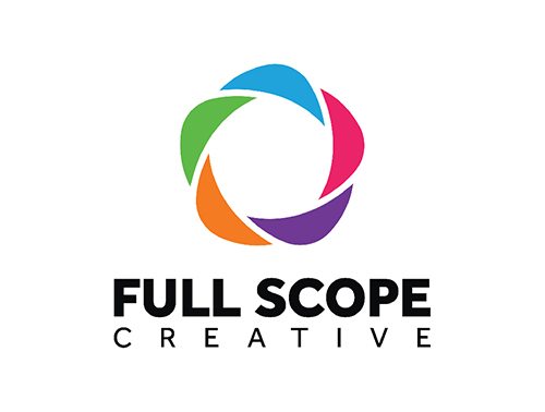 The next logo variation is only needed if your primary logo is excessively detailed, otherwise, you may not need a secondary logo variation. But some logos are more elaborate with taglines and sometimes even locations listed in them, and in these cases, a secondary logo is necessary because it is essentially the primary logo but simplified to just the logotype and the logomark. For Full Scope Creative it’s just our colored scope symbol and the company name “Full Scope Creative”.
HORIZONTAL OR VERTICAL VERSION
This logo variation depends on how your primary logo appears. Is it vertically or horizontally based? A good way of understanding whether your logomark is above or to the side of your logotype. Essentially you want one to have your logomark above your logotype and one with your logomark on one side of your logotype. This helps with versatility. Sometimes you will want a taller and thinner logo and other times you will need a longer and wider logo. A trend I have noticed is that people typically have their primary logo be the vertical version given it allows for them to make their logomark larger while in a horizontal version, the logomark is typically the height of the logotype. Horizontal logos are often used on websites given their shorter and wider aspects work best in navigation bars. Regardless of whether your logo is primarily horizontal or vertical, you will want an additional version of the other type.
And that includes a primary and a secondary logo variation. This way you will have a vertical and horizontal version of your primary logo and a horizontal and vertical version of your secondary logo.
Now, I know that not all logos have logomarks and logotypes, and just consist of logotypes. In these cases, then it depends upon the length of your logo. If your logo is multiple words, then a horizontal version would look like the words put together horizontally, and then stacked vertically. Otherwise, your logo may be only one word, and then there is no need for a different alignment variation. It all depends upon your logo, and one rule does not apply to all.
WORDMARK
So maybe your logo consists of just text and no symbols, if that is the case, then you are already covered, bro! Skip to the next variation type! However, if you have a logomark and logotype, then this version of your logo would be the one without the logomark and is just the logotype. Again, it is wise to have a horizontal and vertical version depending upon the length of your logotype. This is also generally just the logotype and not any tagline or any other additional elements.
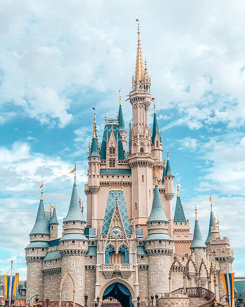
Perhaps you may wonder why it’s a good idea to ever present your logo without the logomark, but there will be times depending upon how much space you have to present your logo. Not only that, but a wordmark is incredibly important for the fact that it shows your company name and you want to get that out there! Think of Disney, more often than not, when they are presenting their brand, they will just use “Disney”. Often brands will use just their logomark, but Disney opts for their brand name over the castle in their logo. You want people to remember your name! Besides wordmarks offer beauty in simplicity. Sometimes you may just want to represent your logo in a simple way without any elaborate elements and using just your wordmark will certainly help with that!
ICON-BASED
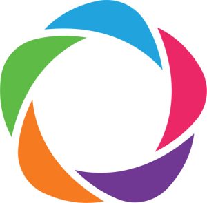 Now wordmark is important, but an icon-based variation of your logo is equally important. There are going to be times when you are only going to be able to offer just a symbol of your brand. Remember how I talked about favicons? The tiny little symbol in the tab of a browser? Well, then is what icon-based logo variations are for! It’s the smallest and simplest way to represent your company, and for many, their icon-based logo variation consists of their logomark.
But obviously, there are exceptions. Think of Disney, they use the first letter in their brand for the fact that their type is highly unique and recognizable, but also because the castle is excessively detailed. If your logomark is exceptionally detailed, it may be a good idea to use just a small and most recognizable portion of your logo. If your logo consists of just a logotype, then you could use the first letter of your brand or your brand acronym– you get the idea. No matter the type of logo you have, you have options for how to make an icon variation of your logo.
SINGLE COLOR
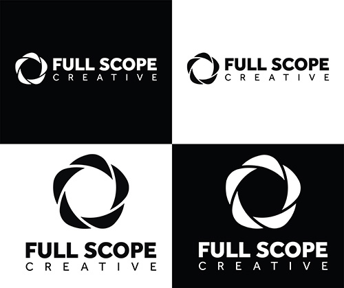 Alright, now this may be one of the most important aspects of having a versatile logo and that is to have a single-color version, particularly black and white.
If you have a very colorful version of your logo, there are going to be situations where you can’t use that logo. Maybe (like Full Scope Creative) you have orange in your logo but you need your logo to work on against an orange background. So what do you do? Ensure you have a single-color version of your logo of course! Now this could consist of a version of your logo in each of your brand colors, but that doesn’t work in all circumstances. It’s definitely a great idea to have a single-color version of your logo in all of your brand colors though.
But the biggest takeaway you want to get from this section is to have a black version of your logo and a white version of your logo. This is crucial! There are going to be backgrounds that will clash with your logo, so what will your solution be? To have a version that will work regardless of the background! And a back and a white version is the solution to this!
And when I say a single-colored version of your logo, I mean every variation of your logo. In case you aren’t getting the idea, you should have a lot of logo files.
VARIATIONS MEAN ARE PREPARED
So, as I stated, you will have basically a million logo files, but this means you are prepared for anything! You need your logo for a T-shirt? A large version on the back? Perfect here’s the vertical version! And a tiny variation for the front? Well, I got you covered! Here’s the horizontal version of my logo! Wait, that t-shirt is going to be the same color blue as my wordmark? Well, here’s the black version of my logo– wait, that blue looks bad with the black version because it’s a dark blue, well here’s the white version of my logo!
See? You are now prepared for anything, which means you have more ways of showing your logo to people and more ways of getting your brand out there. If you need help making your logo more versatile and getting more logo variations, or just need a logo in general, talk with us at Full Scope Creative! We got you covered!