Easy Ways to Improve Your Site

Small website changes can make a big difference. You do not need a full redesign to improve readability and usability. Adjusting line height, adding white space, using clearer headings, and breaking up long paragraphs can make your site easier to read and easier to use. These simple improvements help visitors feel more comfortable and confident on your site.

A Full Redesign Isn’t Always Needed

You do not always need a full redesign to make your website better. Some of the most effective improvements are small, practical changes that improve readability, clarity, and usability almost immediately.

If your site feels a little cramped, hard to read, or just not as easy to use as you would like, these adjustments are a great place to start. They are simple. They are approachable. And they often make a bigger difference than people expect.

Below are easy ways to improve your site without touching your branding or starting from scratch.

Increase the Line Height of Your Text

One of the most overlooked website settings is line height. When lines of text sit too close together, reading becomes tiring. Visitors have to work harder than they should, especially on longer sections of content.

Increasing line height gives text room to breathe. It makes paragraphs easier to scan and reduces eye strain. This is especially important for desktop reading, where blocks of text can feel dense very quickly.

A good rule of thumb is that your text should feel comfortable, not compact. If someone skims a paragraph and feels relief instead of pressure, you are doing it right.

Add More White Space

White space is not empty space. It is intentional space.

Space between sections, around images, and between blocks of content helps guide people through your page. Without it, everything blends together and feels overwhelming.

Adding white space makes your content easier to understand. It helps visitors see what belongs together and what comes next. It also makes your site feel more modern and less cluttered, even if the content itself stays the same.

If your page feels busy, the fix is often spacing, not removing content.
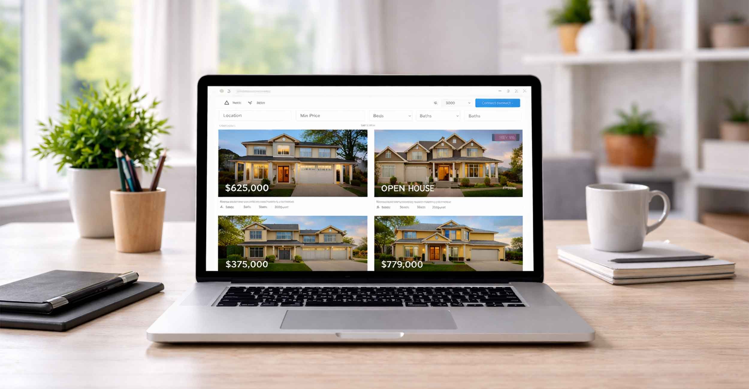
Use Bigger Buttons

Buttons should be easy to find and easy to click. Surprisingly often, they are not.

Small buttons get missed. They are harder to tap on mobile devices and easier to ignore visually. Bigger buttons create confidence. They clearly signal where someone should go next.

This does not mean turning every button into a giant banner. It means giving important actions enough size, contrast, and breathing room so they stand out naturally.

If a visitor has to hunt for what to do next, your button is probably too small.

Cut Paragraphs in Half

Long paragraphs are one of the fastest ways to lose attention. Even well written content becomes intimidating when it looks like a wall of text.

Cutting paragraphs in half makes your content more approachable. It encourages scanning. It invites people to keep reading instead of skipping ahead.

This does not mean dumbing things down or removing useful information. It simply means breaking ideas into smaller pieces that are easier to digest.

If a paragraph runs more than four or five lines on desktop, it is a good candidate for a split.

Add Clear Section Headings

Headings are signposts. They tell visitors what a section is about before they commit to reading it.

If you are debating whether a section needs a heading, add the heading.

Clear headings help people skim. They help readers jump to the part they care about most. They also improve accessibility and structure, which benefits both users and search engines.

Good headings do not need to be clever. They need to be clear. A simple, descriptive heading almost always performs better than a creative one that hides the point.

Make Your Content Easier to Scan

Most visitors do not read websites top to bottom. They scan first.

Using short paragraphs, clear headings, and intentional spacing helps your content work the way people actually consume it. Bulleted lists can help in the right places. Bold text can help sparingly. Structure matters more than word count.

If someone can understand the main ideas of your page in thirty seconds, you are on the right track.

Improve One Page at a Time

Trying to fix everything at once can be overwhelming. You do not need to do that.

Pick one page. Often the homepage or a key service page is the best place to start. Apply these changes there first. See how it feels. Then move on to the next page when you are ready.

Small improvements add up quickly when they are done consistently.

Small Changes Can Make a Big Difference

Better readability leads to better engagement. Better engagement leads to better results.

These changes are not flashy, but they are effective. They make your site easier to use, easier to understand, and easier to trust.

If you need help implementing these small improvements on your site, or want a second set of eyes to point out where changes would have the biggest impact, we are happy to help. Sometimes a few thoughtful adjustments are all it takes to make your website feel like it is working for you again.

Ready to discover how we can help make your website and marketing more successful?
Contact Us

Marketing Made Simple

Insights from Full Scope Creative

Our thoughts on website design, graphic design, marketing, SEO, website hosting, branding, business management, and more here in the Full Scope Creative blog!

Insights, Tips, and Strategies for Small Business Success

Our blog is packed with expert advice on website design, SEO, marketing, branding, and more. Whether you’re looking to improve your website’s performance, boost your online presence, or streamline your business’s digital strategy, you’ll find valuable insights and actionable tips right here.

Easy Ways to Improve Your Site

Small website changes can make a big difference. You do not need a full redesign to improve readability and usability. Adjusting line height, adding white space, using clearer headings, and breaking up long paragraphs can make your site easier to read and easier to use. These simple improvements help visitors feel more comfortable and confident on your site.

Read More »

Blog Comments

Blog comments sound great in theory, but in reality they create more risk than reward. On most WordPress sites, open comments invite spam, add security concerns, and require ongoing moderation. That is why we turn blog comments off by default. It saves time, protects the site, and avoids unnecessary headaches for business owners.

Read More »
Referees making sure the rules are followed

What Are the 7 Rules of Graphic Design?

Good graphic design is about more than looks. The seven rules of graphic design help guide attention, improve clarity, and build trust with your audience. From balance and contrast to white space and movement, these principles show up in every effective logo, website, and marketing piece. When one is missing, something always feels off.

Read More »
Everything will be OK if your keywords sound a little clunky or odd

Keywords Might Sound Clunky or Odd (And That’s Okay)

Keywords can sound awkward or unnatural, but they’re often the exact words people type into Google. Businesses and customers don’t always speak the same way, especially online. Understanding how people actually search helps your website get found, even if the wording feels a little clunky at first.

Read More »

What are the disadvantages of WordPress?

WordPress is a powerful website platform, but it is not without its drawbacks. Security, frequent updates, and plugin conflicts are real concerns when a site is not properly managed. The good news is that these disadvantages are easy to overcome. When WordPress is maintained intentionally, it becomes a flexible, reliable solution for small businesses.

Read More »

Setting the Timezone

One of the smallest WordPress settings can quietly affect how your site runs. Matching your site’s timezone helps keep contact form emails, scheduled posts, event calendars, and logs accurate. It’s a quick setup step, but skipping it can lead to confusion. At Full Scope Creative, it’s one of the first behind-the-scenes details we set for every client site.

Read More »

Relying Only on Facebook Is Risky for Contractors

Relying on Facebook as your only online presence puts your business at risk. While Facebook is useful for updates and visibility, it was never meant to be your foundation. This article explains where Facebook falls short for contractors, how it limits search visibility and clarity, and why your website should be your true home base.

Read More »

It’s in good hands

Your website shouldn’t just say you’re trustworthy, it should show it. From testimonials and portfolios to case studies and real team photos, the right elements help visitors feel confident reaching out. Learn how small changes to your website can build trust, reduce hesitation, and reassure people that they’re truly in good hands.

Read More »

Your Website Isn’t Just for New Clients

Your website should do more than attract new clients. It should support the people already working with you. From educational content and helpful resources to clearly listed services, a well-built website gives clients clarity, confidence, and direction. When your site continues to serve clients after the sale, it helps build stronger, longer-lasting relationships.

Read More »
Ready to discover how we can help make your website and marketing more successful?
Contact Us

The De Pere Area Chamber of Commerce partnered with Full Scope Creative when a new website was needed. The partnership has been great, with the response of Chris’ team being much appreciated. I was part of our website process as a Chamber Board member, and now that I am leading the Chamber, I am even more thankful for Chris and his team for what they provide us from a marketing standpoint with our website.

~ David Vander Bloomen,
De Pere Chamber of Commerce