What Is It That Makes a Logo Outdated and Why It Matters to Your Business
If a business’ logo looks like it was designed in the 1990s, it’s a pretty safe bet that it was. You’ve almost certainly seen logos like that before. The ones with clip-art gradients, neon color pallets that are straight out of Saved by the Bell. Let’s not forget the fonts that scream PowerPoint 95. While those design styles might’ve looked great and cutting-edge when they were designed, they often feel quite out of place in today’s sleek, modern world.
Logos don’t just communicate to people who you are. They show people when and why you are. A logo that looks as if it belongs in a few decades past will send the message that your business is stuck in that same decade.
There are some common things to look at for what makes a logo outdated. There are also a few ways to tell if it’s time for a redesign.
Telltale Signs of an Outdated Logo
The “Stuck in Time” Look
Just like with fashion, design trends come and go. If your logo has heavy shadows effects, stone or metallic bevels, or other trans that would make Clippy from Microsoft Word proud, it’s definitely time to take another look. Those effects once said “cutting edge” and “high-end.” Today, they say “stuck in 1998.”
Color is another giveaway. If your logo’s color palette looks like it was based on the décor from The Golden Girls living room, you’re due for an update. Colors like peach, teal, and mauve might have worked back in the day, but modern design focuses on clean shapes, bold colors, and a minimalistic focus.
Today’s logos need to look fresh, simple, and professional in both print and digital formats.
Fonts That Are Past Their Prime
Typography can so easily make or break a logo. Dated fonts like Papyrus, Comic Sans, or Brush Script might bring back some memories, but they don’t project “modern and trustworthy.” Fonts that were popular and trending can start to show their age after a few decades.
If your logo looks like it has fonts that were used in WordArt, it’s probably time for a redesign. Modern logos use clean and balanced fonts that are easy to read. Fonts used in today’s designs must be able to scale well across countless uses and platforms. Even a simple font change can make your entire brand look fresh and relevant.
Too Many Effects or Layers
There was a time when designers were known to use as many effects they could. Effects like drop shadows, outlines, gradients, embossing and more were used often. Sometimes all at once. Today, simplicity wins the day.
Your logo has to work in more places than ever before. It will be used on social media, websites, emails, print materials, videos, and more. If the logo only looks good when printed in full color at a large size, it’s not doing its job. A great logo will look just as strong in black and white, on a simple business card, or on a large outdoor banner.
If your logo loses clarity or detail when it’s resized, it’s time to simplify. Clean, flat design translates better everywhere your brand lives.
Complex Shapes or Letter “Hugs”
You might have seen logos where a few letters are connected by an almost upside-down parenthesis or swoop. Designers sometimes call this a “hug” or “ligature.” It used to be a clever way to connect letters, but it can make a logo feel overly busy or dated now.
Modern logos let their elements breathe. Each letter and symbol has room to stand on its own. That space gives the design confidence and makes it easier to recognize and read at any size.
Why an Outdated Logo Matters
An outdated logo does more than just look old. It makes your business appear out of touch. Even when you’re offering top-quality, state-of-the-art services, a dated logo will limit what you can do. A logo is often the first impression someone gets of your company. If it feels old, tired, dated, or cluttered, that first impression might not reflect who your business really is today.
Think about the storefront to a brick and mortar business. They could have the best products available, the best staff, the best everything, but if the sign out front is faded and cracked, people might assume what’s inside is the same way.
A modern, clean logo tells customers you’re active, relevant, and ready for business.
Modern Logos Have More Work to Do
When many older logos were designed, they were created for fairly simple uses: a business card, a sign, maybe a brochure. Today your logo needs to perform everywhere – even places and platforms we don’t know about (there was a day no one knew what Facebook was).
Website, social media profiles, digital ads, email signatures, videos. This list of places you need to use your logo today keeps growing.
A good logo will adapt easily to all those spaces and all of the new spaces coming out each year. It needs to look great in color or black and white. It should scale up and down without losing the crisp lines or getting blurry. It should look just as strong as a Facebook profile photo as it does on a billboard along the highway.
That’s one of the biggest reasons businesses need to refresh their logos today. The old one might not even be all that bad. It unfortunately just wasn’t designed for how logos are used now.
Keeping Legacy Without Losing Identity
Many small business owners hesitate to update their logos. This is especially true if the current one has been around for a while. Sometimes that can be decades. That concern and hesitation is definitely understandable. A logo can feel like part of your company’s story and identity.
A logo redesign doesn’t have to erase your history. And it shouldn’t.
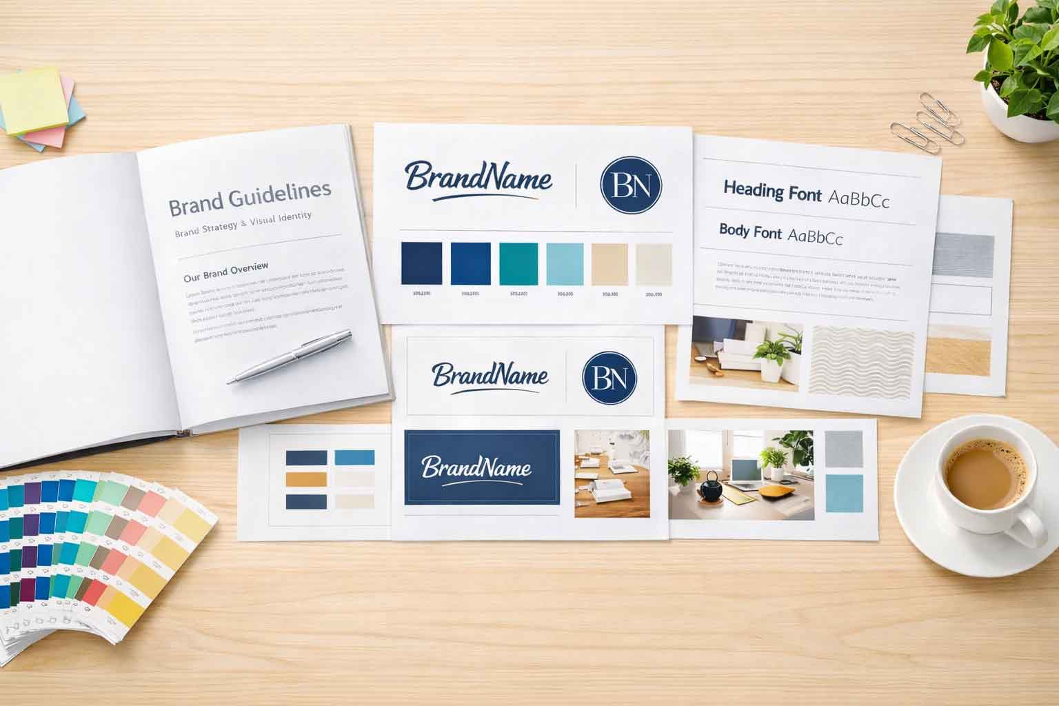
A skilled designer can create a new, fresh, modernized logo all while keeping the parts that matter most. Maybe it’s keeping the color scheme, the unique layout, or a symbol that your customers recognize. The goal doesn’t have to be to reinvent everything. The goal and aim can be to polish and evolve what already works and make it work for the next several decades.
Your logo can honor your past and still be ready for the next chapter.
How to Know When It’s Time for a Logo Redesign
There are a few easy questions to ask if you’re not sure if you rlogo is outdated or not.
- Does the logo still represent who we are and what we do today?
- Does the logo look good on both digital screens and printed materials?
- Is the logo still easy to read and recognize at any size?
Would a new customer get the right impression about our business from it?
If you hesitated or are unsure on any of those, it’s quite possibly time to start thinking about a redesign. Updating your logo isn’t about chasing trends and fads. It’s about keeping your brand relevant, professional, and aligned with who you are right now.
Ready to Bring Your Logo Up to Date?
Even if your logo has been around for 50 years or more, it’s never too late to refresh it. A modern and fresh logo design can improve brands recognition, attract new customers, and show that your business continues to grow and evolve.
At Full Scope Creative, our design team creates logos that are timeless, versatile, and ready for every platform. We can help you build a logo that honors your brand’s story while giving it the fresh, modern look it deserves.
If you’re curious about how our design process works or if it’s time to talk with our team of expert designers, get in touch with us today. Let’s make sure your logo doesn’t just tell your story, it tells it beautifully.


