A very important role in the overall user experience
When designing a website for your small business, one of the first and arguably most important choices you’ll need to make is deciding on the right layout. The website’s layout will affect things like how users interact with the site, how those users navigate the site, and even the rate at which they may take the actions you want them to such as making a purchase or contacting you. With so many layout options and designs to choose from, how do you select the one that’s right for your business?
Why Website Layout Matters
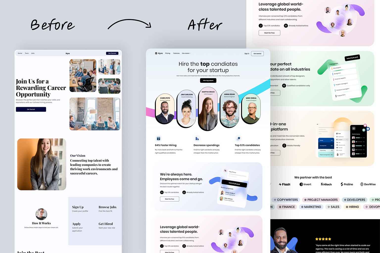
The layout of a website plays a very important role in the overall user experience. A good layout makes it easy for new and returning users to find the information they are looking for. This can then lead to higher engagement, better conversions rates, and even improved search engine rankings.
A well-organized and structured website layout will:
- Make navigation intuitive for all users
- Highlight your companies main offerings or services provided
- Keep visitors on your site longer and decrease bounce rates
- Guide users to take key actions like contacting you or making a purchase
Without a well-thought-out layout, the most beautifully designed and best developed website can fail to engage your audience and have a poor ROI.
Popular Website Layout Types
Let’s look at some of the most common website layouts and when they each might be best used.
- Grid-Based Layout: This layout divides the page into a grid, where content is placed into neatly aligned sections. This layout is great for businesses that have a lot of visual content, like e-commerce stores, portfolios, or photography websites. It helps showcase products or work in an organized, professional way.
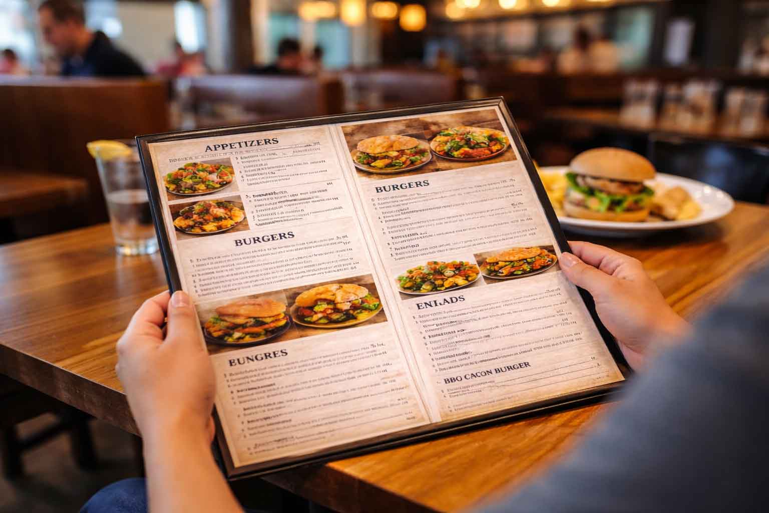
- Single-Column Layout: Often used in blogs or mobile-first designs, a single-column layout presents content in a straightforward, easy-to-read manner. If your site’s primary goal is to inform or tell a story, this clean, simple layout may be your best bet.
- Multi-Column Layout: Great for businesses with lots of different types of information, multi-column layouts allow you to present different content simultaneously, such as services, testimonials, and a call to action. This works well for service-based businesses or larger corporate sites with a lot of content.
Choosing a Layout Based on Your Business Type
The type of layout you choose should align with the goals of your business and how you want users to interact with your site.
- E-commerce Businesses: A grid-based layout works particularly well for e-commerce businesses, allowing you to display a large number of products in an organized manner. A clean, easy-to-navigate layout is crucial to help customers find and purchase products with minimal friction.
- Service-Based Businesses: Service businesses often benefit from a multi-column layout. You can showcase different service offerings, client testimonials, and calls to action all on one page. The goal here is to get users to contact you, so make sure the layout supports prominent, strategically placed calls to action.
- Portfolios or Creative Businesses: If you’re showcasing work, such as a graphic design or photography portfolio, a grid or visually focused layout helps your work stand out. Here, the goal is to let your visuals do the talking while keeping the layout simple and clean.
Balancing Aesthetics with Functionality
While it can be very tempting to focus solely on how your website looks, the overall functionality should always be your top focus. The best website layouts balance both the aesthetic look and overall functionality of the site.
A beautiful website can capture attention, but if it’s difficult to explore and navigate, takes to long to load, or doesn’t work well or at all on mobile devices, visitors (both new and returning) will leave before they reach any common conversion point. To make sure your website layout is beautiful and functional, ask yourself:
- Is it easy to find the most important information?
- Is my call to action clear and prominent?
- Is the layout simple enough for users to follow, even on mobile?
Mobile Responsiveness is Non-Negotiable
This point can’t be said enough – your website MUST be fully responsive. With more people browsing your website on their phones and tablet, mobile responsiveness is mandatory. This means your website’s layout must be able to adjust or respond seamlessly to what the device the user is using. If a layout that looks great on desktop but is difficult or clunky to navigate on mobile, you will lose valuable traffic, customers, and leads.
Responsive design ensures your website automatically and flawlessly adapts and changes to various screen sizes, keeping it user-friendly whether viewed on a smartphone, tablet, or desktop.
Choosing the right layout is key to website success
Choosing the right website layout for your website is key to your website’s (and maybe even your businesses) success. By weighing your business goals, users, and the type of content you plan on displaying, you can choose a layout that not only looks great but also functions great.