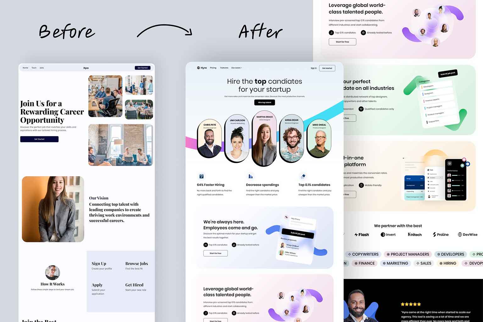
The importance of a usability checklist
Anybody who has ever created a website, no matter how small, knows that usability is important. If your site is hard to use, people will leave and never come back. Creating a usability checklist can help ensure that your site is as user-friendly as possible. Here are 5 essentials for a good usability checklist:
Website Functionality
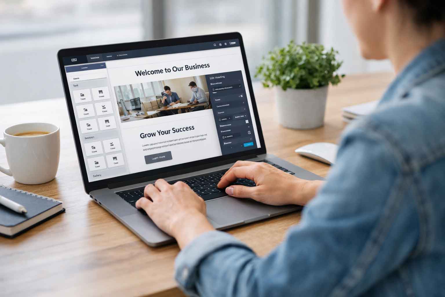
A website’s functionality is key to its success. There are a few things to keep in mind when designing your website:
- Keep it simple – don’t try to do too much. A website should have a clear purpose and be easy to navigate.
- Make sure all the important information is easy to find – put it front and center where visitors will see it.
- Use clear and concise text – no one wants to read walls of text. Get your point across quickly and effectively.
- Use visuals wisely – they can help break up text and add interest, but too many can be distracting. Use them sparingly and make sure they’re relevant.
- Don’t forget about mobile – more and more people are using their smartphones and tablets to access the internet. Make sure your site looks good on all devices.
Ease of use of website design
 A website’s ease of use is important for a number of reasons. First, if a website is difficult to use, people are less likely to visit it and/or spend time on it. Second, a website that is difficult to use can frustrate users and cause them to leave without taking the desired action. Finally, easy-to-use websites tend to be more successful overall, as they’re able to better engage and retain users.
There are a few key things that make a website easy to use. First, the site should be well-designed and organized in a way that makes sense. Second, the site should be easy to navigate, with clear and intuitive menus and buttons. Third, the site should be responsive and load quickly. And fourth, the site should be compatible with all major browsers.
Navigation
Your website is your company’s face to the world, so it’s important that navigation is simple and easy-to-use. Here are a few tips to make sure your website’s navigation is up to par:
- Every page on your website should be reachable from the home page in no more than three clicks.
- Use clear and concise labels for each page. Avoid using jargon or technical terms that your visitors may not understand.
- The navigation bar should be prominently displayed and easy to find. Make sure it stays consistent on every page of your site.
- Visitors should be able to tell where they are on your site at all times. Use breadcrumb navigation or some other method of indicating the hierarchy of pages.
Visual design
 A website’s visual design is one of the most important aspects of its overall design. It can help a website stand out from the competition, make a good first impression on visitors, and keep them coming back for more.
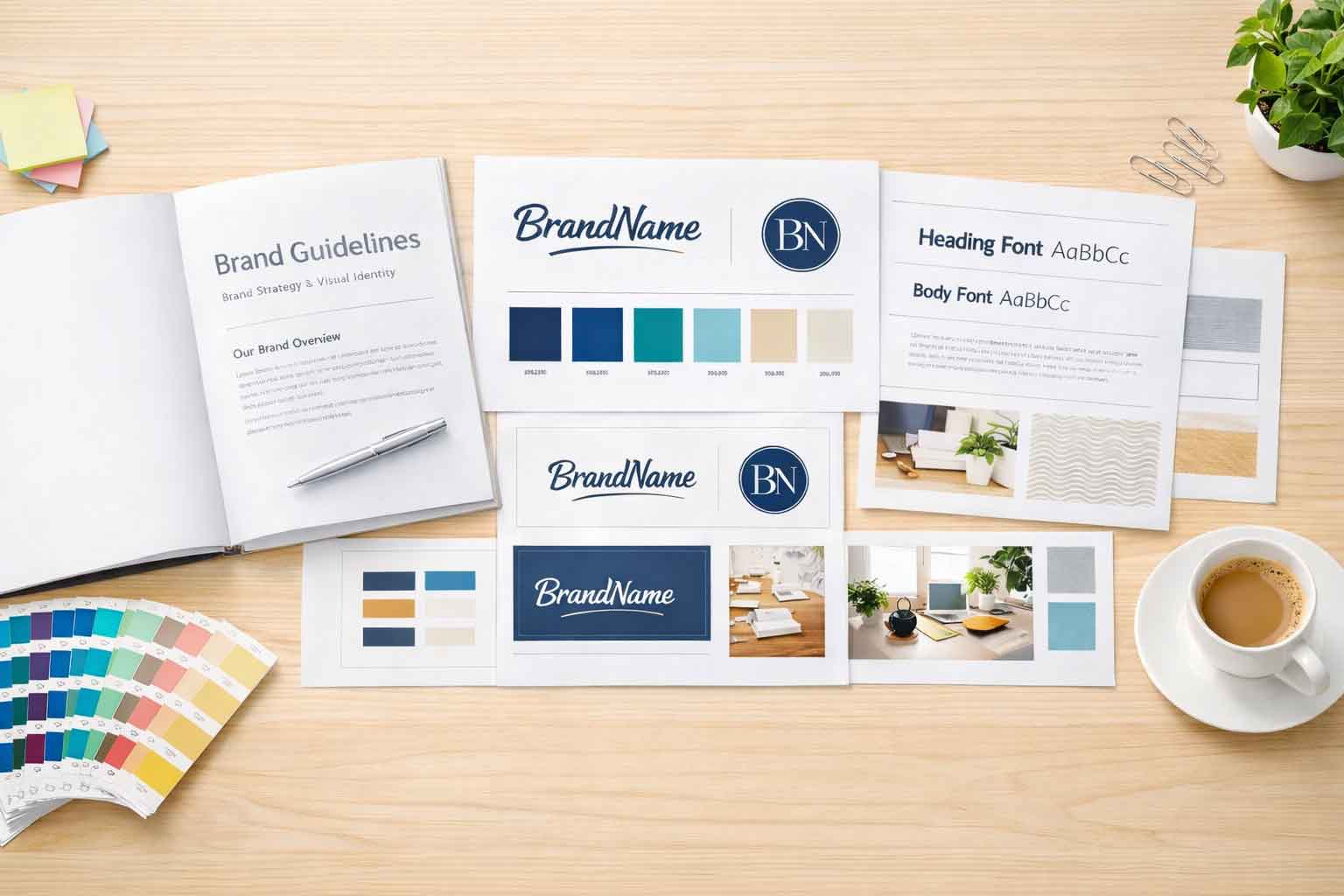
There are a few key elements to consider when it comes to visual design: typography, color, whitespace, and imagery. Each of these can be used to create a unique and visually appealing website.
Typography is the art and technique of arranging type to make it readable and visually appealing. A well-designed website will use typography to create a hierarchy of information, making it easy for visitors to scan and find what they’re looking for.
Color is another important element of visual design. The right colors can convey emotion, set the tone of a website, and help visitors navigate their way around.
Consistency
Inconsistency in web design can be frustrating for users and make it difficult for them to navigate your site. By being consistent with your web design, you can create a cohesive user experience that is easy to use and understand.
Consistency is important in web design for a number of reasons. First, it creates a sense of coherence and hierarchy on your website. By using the same colors, fonts, and layouts throughout your site, you can help users understand the relationships between different pages and content areas. Second, consistency helps build trust with users by making it clear what they can expect from your site. When users know what to expect, they are more likely to spend time on your site and come back in the future.
Finally, consistency makes it easier for users to find the information they need on your website.
Wrapping up our web design usability checklist
While there are many more things to focus on when building a website, these 5 form a basic usability checklist. Focusing on the functionality, ease of use, navigation, visual design, and consistency will help bring your site to the next level for your users and your business.


