The Key to it All
In the world of graphic design, creativity is key. I know this, you know this, we all know this. When you think graphic design you think visuals, and how do you get nice visuals? By using computer-generated images and art obviously—
*ahem* It’s creativity. The answer is creativity.
… And maybe some help with AI sometimes, I’m not stingy, but I will say that AI-generated things often lack the substance and the grit and the true idea that I need. It’s a great resource, but if you use AI enough it often can appear… generic. Remember AI art and the like all come from things people have already created before, and it’s because of this that art from AI can often look lifeless and like it’s missing that thing. Not to mention that the true way to capture someone’s attention is authenticity. You can only fake it till you make it for so long.
If you really want to elevate your visuals, you have to stand out and make a lasting impression, you have to make authentic, creative visuals.
But, how?
Well, why do you think I’m writing this article?
The key is keeping your eye open and exploring new ideas that spark inspiration to take your work to the next level. Here are ten ways that can help you elevate your visual content.
1. Minimalist Design
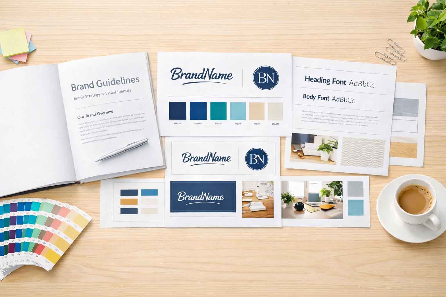
Less is more with minimalist design. Focus on clean lines, ample white space, and a limited color palette to create a sleek, modern look. Maybe you wonder why things that are sleek and limited are modern, well that goes back to art history as a whole. It used to be excessively detailed, but then people started to want to see less of things because when there is too much it becomes… well too much.
This was especially the case when the computer was first introduced— and when people started using logos. In the beginning, people wanted to see things that were true to life rather than something artificial. People just weren’t used to technology. Not to mention that with all of the new technology, it was almost a contest to see who could out-design and outcomplicate the other. Hence things were very very over the top and visually loud. And to make things true to life, you had to add extra shading and all sorts of additional visuals.
But then people got used to technology and started to like the artificial. So it didn’t take as much convincing and over time people started to simplify their designs. Also, there were studies that showed that the simpler things were, the more recognizable and easier they were to view.
It’s ✨Psychology✨.
So now when things are overcomplicated it can make things look outdated and can be hard for someone to pay attention to. If you want to quickly get your message across you can do it with some complexity but minimalism really emphasizes simplicity, and clarity and can help make your message stand out without the unnecessary distraction.
Plus it can make you look luxurious and high-end. Depending on how you use it. It can also just be downright satisfying.
Example: Apple’s advertising often uses minimalist design to highlight their products’ elegance and functionality.
2. Retro and Vintage Styles
I know I mentioned “modern modern modern” and how people don’t often like things that look dated. But there is a huge difference between dated and retro.
Retro takes what’s best about old-school designs and uses them in a visually appealing way. This style doesn’t focus on the modern but capitalizes on the one thing that is keeping Hollywood alive right now: nostalgia.
I will say that using a retro and vintage visual can be helpful but be wary, if your design primarily uses clean modern visuals you will need to find a certain balance before you jump right into using retro design. You want consistency in your designs after all. Find what fits for you.
At any rate, if you want the vintage feel, strive to use things like old-school fonts, grainy textures, and muted color schemes to evoke nostalgia. This style can add a timeless appeal to your projects and resonate with audiences who appreciate the charm of yesteryear.
Example: Vintage posters, old movie advertisements, and classic record album covers.
3. Bold Typography
Make a statement with bold typography. This has been a highly utilized trend in recent years, especially on websites, and for good reason. Use large, eye-catching fonts to draw attention to your headlines and key messages. Pair bold type with contrasting colors to enhance readability and impact. It’s a great way to quickly capture the audience’s attention.
Example: Magazine covers and billboard ads often use bold typography to capture attention quickly.
4. Abstract and Geometric Shapes
Experiment with abstract and geometric shapes to create visually striking designs. These shapes can add a modern and dynamic feel to your projects. Use them as background elements, in patterns, or as focal points.
Example: The work of Piet Mondrian, with his use of primary colors and geometric shapes, can serve as a great source of inspiration.
5. 3D Design and Typography
Add depth and dimension to your work with 3D design and typography. This technique creates a more immersive experience and can make your designs pop off the screen or page.
Example: Movie posters and video game covers often use 3D effects to create a sense of realism and excitement.
6. Hand-Drawn Illustrations
Incorporate hand-drawn illustrations for a personal and authentic touch. Remember, it’s all about authenticity and the more you make things authentic, the more eye-catching it can be, and creates a certain amount of trust with the client. It helps to ground the design. This style is perfect for conveying a sense of craftsmanship and uniqueness. It works well for branding, packaging, and social media graphics.
Example: Illustrated logos, custom icons, and sketched backgrounds can add a whimsical and approachable feel to your designs.
7. Duotone and Gradient Effects
Use duotone and gradient effects to add depth and vibrancy to your designs. Duotone involves using two contrasting colors to create a visually appealing effect, while gradients blend colors seamlessly for a smooth transition.
Word to the wise, however, this can be a jarring effect if not utilized in a visually appealing manner. The more subtle the gradient is, the better. I’m not saying not to use vibrant colors, but it has to balance out the foreground in order to properly bring this design affect to life.
Example: Spotify’s playlist covers and various digital art pieces utilize these effects to great success.
8. Photography and Text Overlay
Combine stunning photography with text overlay to create compelling visual narratives. This technique is great for social media posts, website headers, and promotional materials. Ensure the text is readable by using contrasting colors or adding a slight shadow.
Example: Travel blogs and lifestyle brands often use this technique to showcase destinations and products compellingly.
9. Collage and Mixed Media
Mix different media elements such as photographs, textures, and illustrations to create unique collages. This technique allows for endless creativity and can result in visually rich and engaging compositions.
Example: Fashion magazines and art posters frequently use collage techniques to create dynamic and layered visuals.
10. Isometric Design
Isometric design offers a three-dimensional perspective without the complexity of 3D rendering. It’s perfect for infographics, technical illustrations, and icons. This style helps convey complex information in an easily understandable and visually appealing way.
Example: Infographics and explainer videos often use isometric design to break down intricate topics into digestible visuals.
Conclusion
Exploring different graphic design styles and techniques can significantly enhance your visual content. By incorporating these ideas into your work, you can create designs that not only stand out but also communicate your message effectively. Whether you prefer the clean look of minimalism or the rich detail of mixed media, there’s a style to suit every project. So, let your creativity flow and start experimenting with these ideas to elevate your graphic design game!


