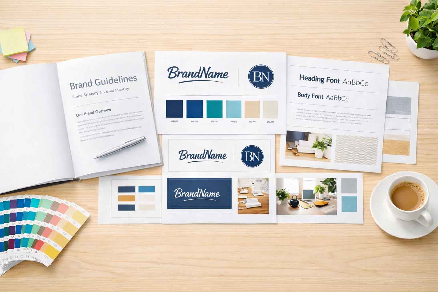
PNG vs EPS vs JPG vs PDF

Not sure whether to use a PNG, EPS, JPG, or PDF for your logo, photo, or print design? This quick guide breaks down the strengths of each file type and where they work best—whether you’re posting on social media, updating your website, or sending something to print. Clear answers without the tech jargon.
The Importance of Color Balance

Bright colors can bring energy and excitement to your brand—but without balance, they can overwhelm. Just like Bob Ross said, ‘gotta have a little darkness.’ In this blog, we explore why neutral and earthy tones are essential to support your brand’s brighter colors and how they create harmony in everything from logos to websites.
Rebranding Done Right

Rebranding isn’t just about a new logo—it’s about telling the right story. At Full Scope Creative, we help businesses align their visual identity with their mission, creating cohesive designs that resonate with their audience. From logos to marketing materials, we make sure your brand looks and feels just right.
Graphic Design Tips for Consistent Branding

Consistency is key when it comes to branding. Using the same colors, fonts, and logo styles across all materials builds recognition and trust. This blog shares practical tips for maintaining brand consistency in your graphic design—from setting up a brand guide to aligning printed and digital pieces. At Full Scope Creative, we help businesses create cohesive designs that strengthen their brand and leave a lasting impression with every piece.
Complex designs can do more harm than good

When it comes to graphic design, less is often more. Overly complex layouts and crowded visuals can overwhelm your audience and dilute your message. This blog explores the pitfalls of overdesign and offers tips on keeping your materials clean, clear, and effective. At Full Scope Creative, we focus on smart, strategic design that communicates your message without the clutter—making it easier for your audience to connect and engage.
Creating Consistent Visual Language

A consistent visual language makes your brand instantly recognizable across all platforms. This means using repeatable design elements like typography, color, and layout styles that reflect your brand’s personality. In this blog, we cover how to establish and maintain a strong visual identity that keeps your marketing materials aligned. At Full Scope Creative, we help brands look and feel consistent—whether it’s a website, brochure, or social media post.
Using Visual Metaphors

How Symbolism Can Convey Brand Values In the world of branding and design, visual metaphors play a powerful role in communicating complex ideas and emotions. They are the blacksmith of design, melding the essence of a brand’s values and personality to forge a blade that is expertly crafted and sharpened to cut a deeper connection […]
Designing for inclusivity

Not all Eyes are Created Equal It is a truth universally acknowledged that not all eyes are created equal. I remember back when I was taking a psychology class in high school and we were trying to determine if we all saw the same green, or if my green was actually pink and the other […]
10 Creative Graphic Design Ideas to Elevate Your Content

The Key to it All In the world of graphic design, creativity is key. I know this, you know this, we all know this. When you think graphic design you think visuals, and how do you get nice visuals? By using computer-generated images and art obviously— *ahem* It’s creativity. The answer is creativity. … And […]